This documentation is available as Markdown for AI agents and LLMs. See the full Markdown index or append .md to any documentation URL.
This is documentation for the next SDK version. For up-to-date documentation, see the latest version (SDK 57).
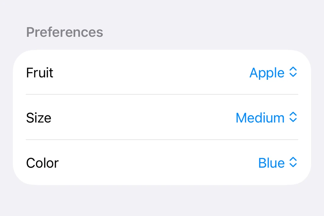
Picker
A SwiftUI Picker component for selecting options from a list.
For cross-platform usage, see the universalPicker— it renders the appropriate native component per platform.
Expo UI Picker matches the official SwiftUI Picker API and supports all picker styles via the pickerStyle modifier.
Installation
- npx expo install @expo/uiIf you are installing this in an existing React Native app, make sure to install expo in your project.
Segmented picker
import { useState } from 'react';
import { Host, Picker, Text } from '@expo/ui/swift-ui';
import { pickerStyle, tag } from '@expo/ui/swift-ui/modifiers';

const options = ['Apple', 'Banana', 'Orange'];

export default function SegmentedPickerExample() {
  const [selectedTag, setSelectedTag] = useState(options[0]);

  return (
    <Host matchContents>
      <Picker
        modifiers={[pickerStyle('segmented')]}
        label="Select a fruit"
        selection={selectedTag}
        onSelectionChange={selection => {
          setSelectedTag(selection);
        }}>
        {options.map(option => (
          <Text key={option} modifiers={[tag(option)]}>
            {option}
          </Text>
        ))}
      </Picker>
    </Host>
  );
}
Menu picker
import { useState } from 'react';
import { Host, Picker, Text } from '@expo/ui/swift-ui';
import { pickerStyle, tag } from '@expo/ui/swift-ui/modifiers';

const options = ['Apple', 'Banana', 'Orange'];

export default function MenuPickerExample() {
  const [selectedTag, setSelectedTag] = useState(options[0]);

  return (
    <Host matchContents>
      <Picker
        modifiers={[pickerStyle('menu')]}
        label="Select a fruit"
        selection={selectedTag}
        onSelectionChange={selection => {
          setSelectedTag(selection);
        }}>
        {options.map(option => (
          <Text key={option} modifiers={[tag(option)]}>
            {option}
          </Text>
        ))}
      </Picker>
    </Host>
  );
}
Wheel picker
The wheel variant is not available on Apple TV.
import { useState } from 'react';
import { Host, Picker, Text } from '@expo/ui/swift-ui';
import { pickerStyle, tag } from '@expo/ui/swift-ui/modifiers';

const options = ['Apple', 'Banana', 'Orange'];

export default function WheelPickerExample() {
  const [selectedTag, setSelectedTag] = useState(options[0]);

  return (
    <Host matchContents>
      <Picker
        modifiers={[pickerStyle('wheel')]}
        label="Select a fruit"
        selection={selectedTag}
        onSelectionChange={selection => {
          setSelectedTag(selection);
        }}>
        {options.map(option => (
          <Text key={option} modifiers={[tag(option)]}>
            {option}
          </Text>
        ))}
      </Picker>
    </Host>
  );
}
API
import { Picker } from '@expo/ui/swift-ui';
Component
Type: React.Element<PickerProps<T>>
Displays a native picker component
Example
<Picker modifiers={[pickerStyle('segmented')]}>
  <Text modifiers={[tag('option1')]}>Option 1</Text>
  <Text modifiers={[tag(0)]}>Option 3</Text>
</Picker>
React.ReactNodeThe content of the picker. You can use Text components with tag modifiers to display the options.
unionA label displayed on the picker.
Acceptable values are: string | React.ReactNode
(selection: T) => voidCallback function that is called when an option is selected.
Gets called with the selected tag value.
SFSymbolThe name of the system image (SF Symbol). For example: 'photo', 'heart.fill', 'star.circle'