This documentation is available as Markdown for AI agents and LLMs. See the full Markdown index or append .md to any documentation URL.
This is documentation for the next SDK version. For up-to-date documentation, see the latest version (SDK 57).
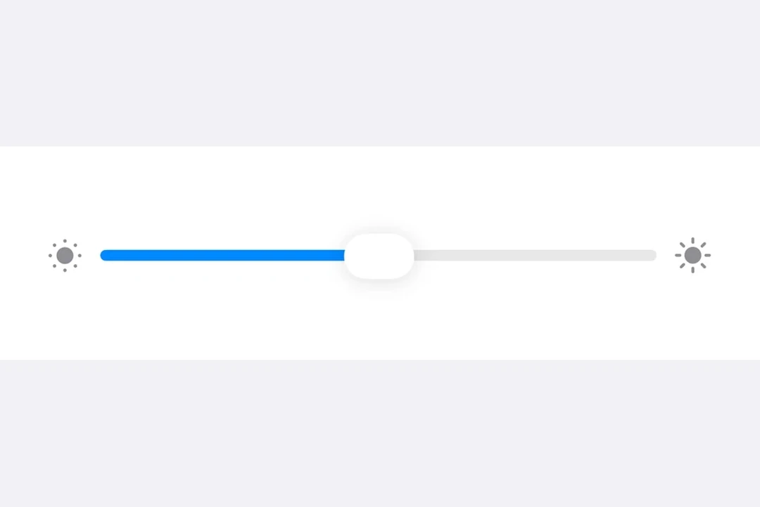
Slider
A SwiftUI Slider component for selecting values from a range.
For cross-platform usage, see the universalSlider— it renders the appropriate native component per platform.
Expo UI Slider matches the official SwiftUI Slider API and allows selecting values from a bounded range.
Installation
- npx expo install @expo/uiIf you are installing this in an existing React Native app, make sure to install expo in your project.
Usage
Note:
Slideris a flexible-width component, it expands to fill available horizontal space and does not have an intrinsic width. When usingmatchContentson theHost, you should apply aframemodifier on theSliderto give it an explicit width. Alternatively, give theHostan explicit size usingstyle(for example,style={{ width: 300 }}orstyle={{ flex: 1 }}), or place theSliderinside a SwiftUI container likeFormthat provides width constraints.
Basic slider
import { useState } from 'react';
import { Host, Slider } from '@expo/ui/swift-ui';

export default function BasicSliderExample() {
  const [value, setValue] = useState(0.5);

  return (
    <Host style={{ flex: 1 }}>
      <Slider value={value} onValueChange={setValue} />
    </Host>
  );
}
Slider with custom range
import { useState } from 'react';
import { Host, Slider } from '@expo/ui/swift-ui';

export default function CustomRangeSliderExample() {
  const [value, setValue] = useState(50);

  return (
    <Host style={{ flex: 1 }}>
      <Slider value={value} min={0} max={100} onValueChange={setValue} />
    </Host>
  );
}
Slider with step
Use the step prop to define discrete increments. Set step to 0 for continuous values.
import { useState } from 'react';
import { Host, Slider } from '@expo/ui/swift-ui';

export default function SteppedSliderExample() {
  const [value, setValue] = useState(0);

  return (
    <Host style={{ flex: 1 }}>
      <Slider value={value} min={0} max={100} step={10} onValueChange={setValue} />
    </Host>
  );
}
Slider with labels
You can add labels to describe a slider's purpose and to mark the minimum and maximum value positions.
import { useState } from 'react';
import { Host, Slider, Text } from '@expo/ui/swift-ui';

export default function LabeledSliderExample() {
  const [value, setValue] = useState(50);

  return (
    <Host style={{ flex: 1 }}>
      <Slider
        value={value}
        min={0}
        max={100}
        label={<Text>Volume</Text>}
        minimumValueLabel={<Text>0</Text>}
        maximumValueLabel={<Text>100</Text>}
        onValueChange={setValue}
      />
    </Host>
  );
}
API
import { Slider } from '@expo/ui/swift-ui';
Component
Type: React.Element<SliderProps>
numberLower limit the user can drag the thumb to. The visible track still
spans min..max, but the thumb stops at lowerLimit during drag.
numberThe maximum value of the slider. Updating this value does not trigger callbacks if the current value is above max.
numberThe minimum value of the slider. Updating this value does not trigger callbacks if the current value is below min.
(isEditing: boolean) => voidCallback triggered when the user starts or ends editing the slider.
(value: number) => voidCallback triggered on dragging along the slider.
numberUpper limit the user can drag the thumb to. The visible track still
spans min..max, but the thumb stops at upperLimit during drag.