This documentation is available as Markdown for AI agents and LLMs. See the full Markdown index or append .md to any documentation URL.
This is documentation for the next SDK version. For up-to-date documentation, see the latest version (SDK 57).
TabView
A SwiftUI TabView component for paged or tabbed content.
Expo UI TabView matches the official SwiftUI TabView API and switches between styles via the tabViewStyle modifier.
Note: For routed bottom-tab navigation across full-screen routes, use
expo-router/unstable-native-tabsinstead.
Installation
- npx expo install @expo/uiIf you are installing this in an existing React Native app, make sure to install expo in your project.
Usage
Each page is a <TabView.Tab> child, identified by a value prop. TabView does not impose its own height — give it a frame, or place it inside a parent that does.
Page style (swipeable pager)
Use tabViewStyle({ type: 'page' }) for a horizontal pager with optional dot indicators. Pass defaultSelection to start the pager on a specific page without controlling it from React.
import {
  Host,
  Spacer,
  TabView,
  Text,
  VStack,
} from '@expo/ui/swift-ui';
import {
  background,
  font,
  foregroundStyle,
  frame,
  tabViewStyle,
} from '@expo/ui/swift-ui/modifiers';

const fillFrame = frame({
  maxWidth: Infinity,
  maxHeight: Infinity,
});
const pageFrame = frame({ minHeight: 320, maxHeight: 320 });

export default function PagerExample() {
  return (
    <Host style={{ flex: 1 }}>
      <TabView
        defaultSelection="1"
        modifiers={[pageFrame, tabViewStyle({ type: 'page' })]}>
        <TabView.Tab value="0">
          <Page label="Page 1" color="#6200EE" />
        </TabView.Tab>
        <TabView.Tab value="1">
          <Page label="Page 2" color="#03DAC5" />
        </TabView.Tab>
        <TabView.Tab value="2">
          <Page label="Page 3" color="#FF5722" />
        </TabView.Tab>
      </TabView>
    </Host>
  );
}

function Page({ label, color }: { label: string; color: string }) {
  return (
    <VStack
      alignment="center"
      modifiers={[fillFrame, background(color)]}>
      <Spacer />
      <Text
        modifiers={[
          font({ size: 28, weight: 'bold' }),
          foregroundStyle('#FFFFFF'),
        ]}>
        {label}
      </Text>
      <Spacer />
    </VStack>
  );
}
Controlled selection
Pass selection and onSelectionChange to drive the active tab from React state. Each <TabView.Tab>'s value is matched against selection. Add the animation modifier to animate transitions when selection changes from JS.
import { useState } from 'react';
import {
  Button,
  Host,
  Spacer,
  TabView,
  Text,
  VStack,
} from '@expo/ui/swift-ui';
import {
  animation,
  Animation,
  background,
  font,
  foregroundStyle,
  frame,
  tabViewStyle,
} from '@expo/ui/swift-ui/modifiers';

const fillFrame = frame({
  maxWidth: Infinity,
  maxHeight: Infinity,
});
const pageFrame = frame({ minHeight: 320, maxHeight: 320 });

export default function ControlledTabViewExample() {
  const [selected, setSelected] = useState('0');

  return (
    <Host style={{ flex: 1 }}>
      <VStack>
        <Text>Selected: {selected}</Text>
        <Button
          label="Go to page 3"
          onPress={() => setSelected('2')}
        />
        <TabView
          selection={selected}
          onSelectionChange={setSelected}
          modifiers={[
            pageFrame,
            tabViewStyle({ type: 'page' }),
            animation(Animation.default, Number(selected)),
          ]}>
          <TabView.Tab value="0">
            <Page label="Page 1" color="#6200EE" />
          </TabView.Tab>
          <TabView.Tab value="1">
            <Page label="Page 2" color="#03DAC5" />
          </TabView.Tab>
          <TabView.Tab value="2">
            <Page label="Page 3" color="#FF5722" />
          </TabView.Tab>
        </TabView>
      </VStack>
    </Host>
  );
}

function Page({ label, color }: { label: string; color: string }) {
  return (
    <VStack
      alignment="center"
      modifiers={[fillFrame, background(color)]}>
      <Spacer />
      <Text
        modifiers={[
          font({ size: 28, weight: 'bold' }),
          foregroundStyle('#FFFFFF'),
        ]}>
        {label}
      </Text>
      <Spacer />
    </VStack>
  );
}
Page indicator dots
Use the indexViewStyle modifier together with tabViewStyle({ type: 'page' }) to control the dot indicators. Set indexDisplayMode to 'always', 'never', or 'automatic', and backgroundDisplayMode to render a translucent pill behind the dots.
import {
  Host,
  Spacer,
  TabView,
  Text,
  VStack,
} from '@expo/ui/swift-ui';
import {
  background,
  font,
  foregroundStyle,
  frame,
  indexViewStyle,
  tabViewStyle,
} from '@expo/ui/swift-ui/modifiers';

const fillFrame = frame({
  maxWidth: Infinity,
  maxHeight: Infinity,
});
const pageFrame = frame({ minHeight: 320, maxHeight: 320 });

export default function PageIndicatorExample() {
  return (
    <Host style={{ flex: 1 }}>
      <TabView
        modifiers={[
          pageFrame,
          tabViewStyle({
            type: 'page',
            indexDisplayMode: 'always',
          }),
          indexViewStyle({ backgroundDisplayMode: 'always' }),
        ]}>
        <TabView.Tab value="0">
          <Page label="Page 1" color="#4F8DF6" />
        </TabView.Tab>
        <TabView.Tab value="1">
          <Page label="Page 2" color="#34C759" />
        </TabView.Tab>
        <TabView.Tab value="2">
          <Page label="Page 3" color="#FF9F0A" />
        </TabView.Tab>
      </TabView>
    </Host>
  );
}

function Page({ label, color }: { label: string; color: string }) {
  return (
    <VStack
      alignment="center"
      modifiers={[fillFrame, background(color)]}>
      <Spacer />
      <Text
        modifiers={[
          font({ size: 28, weight: 'bold' }),
          foregroundStyle('#FFFFFF'),
        ]}>
        {label}
      </Text>
      <Spacer />
    </VStack>
  );
}
Bottom tab bar
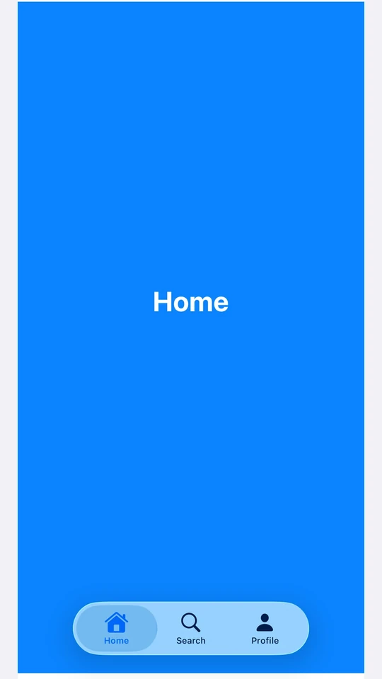
Use tabViewStyle({ type: 'automatic' }) for the SwiftUI default tab bar. Each tab's label and systemImage populate the bar item. Use the badge modifier on a tab to attach a badge to its bar item.
Note: For routed bottom-tab navigation across full-screen routes, use
expo-router/unstable-native-tabsinstead.
import { useState } from 'react';
import {
  Host,
  Spacer,
  TabView,
  Text,
  VStack,
} from '@expo/ui/swift-ui';
import {
  background,
  badge,
  font,
  foregroundStyle,
  frame,
  tabViewStyle,
} from '@expo/ui/swift-ui/modifiers';

const fillFrame = frame({
  maxWidth: Infinity,
  maxHeight: Infinity,
});

export default function BottomTabsExample() {
  const [selected, setSelected] = useState('inbox');

  return (
    <Host style={{ flex: 1 }}>
      <TabView
        selection={selected}
        onSelectionChange={setSelected}
        modifiers={[tabViewStyle({ type: 'automatic' })]}>
        <TabView.Tab
          value="inbox"
          label="Inbox"
          systemImage="tray.fill"
          modifiers={[badge('3')]}>
          <Page label="Inbox" color="#4F8DF6" />
        </TabView.Tab>
        <TabView.Tab
          value="sent"
          label="Sent"
          systemImage="paperplane.fill">
          <Page label="Sent" color="#34C759" />
        </TabView.Tab>
        <TabView.Tab
          value="drafts"
          label="Drafts"
          systemImage="square.and.pencil">
          <Page label="Drafts" color="#FF9F0A" />
        </TabView.Tab>
      </TabView>
    </Host>
  );
}

function Page({ label, color }: { label: string; color: string }) {
  return (
    <VStack
      alignment="center"
      modifiers={[fillFrame, background(color)]}>
      <Spacer />
      <Text
        modifiers={[
          font({ size: 28, weight: 'bold' }),
          foregroundStyle('#FFFFFF'),
        ]}>
        {label}
      </Text>
      <Spacer />
    </VStack>
  );
}
API
import { TabView } from '@expo/ui/swift-ui';
Component
Type: React.Element<TabViewProps>
A SwiftUI TabView. Pair with modifiers to choose the appearance:
tabViewStyle({ type: 'page' })— swipeable pager.tabViewStyle({ type: 'automatic' })— bottom tab bar.tabViewStyle({ type: 'sidebarAdaptable' })— sidebar on iPad, tab bar on iPhone.
Use <TabView.Tab> children to define pages. Each tab is identified by its
value prop, which is used for selection.
For routed bottom-tab navigation across full-screen routes, prefer
expo-router/unstable-native-tabs.
stringIdentifies this tab. Matched against the parent TabView's selection
and defaultSelection props.
union<TabView.Tab> elements defining the pages.
Acceptable values are: ReactElement<unknown, string | JSXElementConstructor<any>> | ReactElement[]
stringThe initially selected tab when the component is uncontrolled
(no selection prop). Ignored if selection is provided.
(selection: string) => voidCalled when the selected tab changes.
stringThe selected tab (controlled mode). Pair with onSelectionChange.
Pass defaultSelection instead to let the native view manage state.