This documentation is available as Markdown for AI agents and LLMs. See the full Markdown index or append .md to any documentation URL.
Progress indicators
Jetpack Compose progress indicator components for displaying operation status.
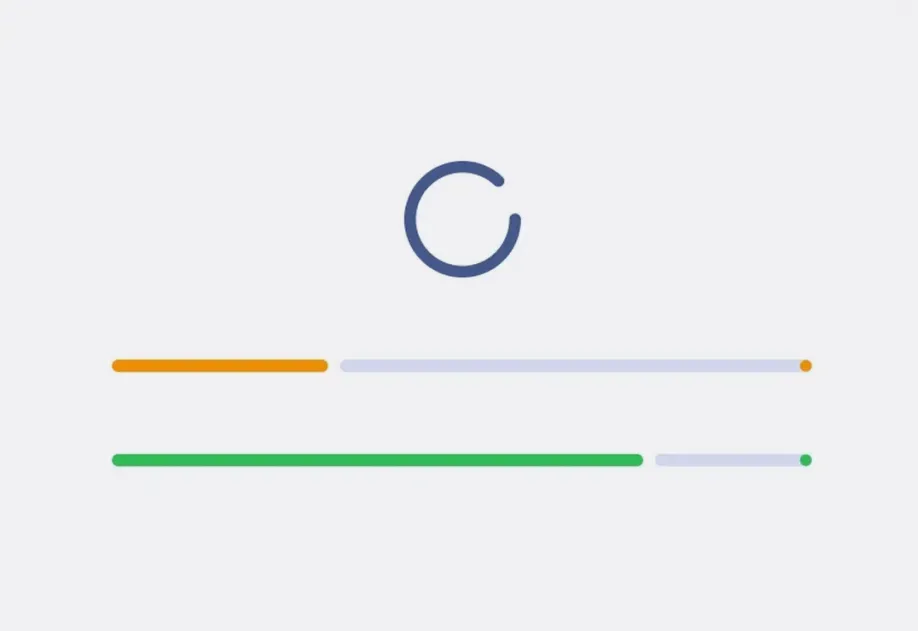
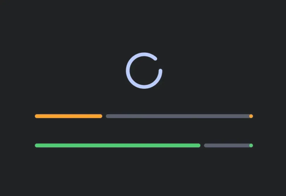
Expo UI Progress Indicators match the official Jetpack Compose Progress Indicator API.
Installation
If you are installing this in an existing React Native app, make sure to install expo in your project.
Usage
Linear progress
A horizontal bar that fills to indicate progress. Provide a progress value between 0 and 1 for determinate mode.
Circular progress
A spinning circle whose stroke grows to indicate progress.
Indeterminate
Omit the progress prop to animate continuously without indicating a specific completion level.
Custom colors
Use color for the indicator and trackColor for the background track.
Wavy variants
LinearWavyProgressIndicator and CircularWavyProgressIndicator add an expressive wave animation from Material 3 Expressive.
Wave configuration
Use amplitude to set the wave height, from 0 for a flat line to 1 for the full height. Use wavelength to set the length of a single wave in dp, and waveSpeed to set how fast the wave travels in dp per second. waveSpeed defaults to wavelength. Set waveSpeed={0} to render a static wave.
API
import {
  LinearProgressIndicator,
  CircularProgressIndicator,
  LinearWavyProgressIndicator,
  CircularWavyProgressIndicator,
} from '@expo/ui/jetpack-compose';
Components
Type: React.Element<ComponentType<CircularProgressIndicatorProps>>
A circular progress indicator that displays progress in a circular format.
Matches the Jetpack Compose CircularProgressIndicator.
StrokeCap • Default: 'round'Stroke cap style for the indicator ends.
Type: React.Element<ComponentType<CircularWavyProgressIndicatorProps>>
A circular progress indicator with wavy animation style.
Matches the Jetpack Compose CircularWavyProgressIndicator.
Type: React.Element<ComponentType<LinearProgressIndicatorProps>>
A linear progress indicator that displays progress in a horizontal bar.
Matches the Jetpack Compose LinearProgressIndicator.
DrawStopIndicatorConfigConfiguration for the stop indicator dot at the end of the determinate progress track.
StrokeCap • Default: 'round'Stroke cap style for the indicator ends.
Type: React.Element<ComponentType<LinearWavyProgressIndicatorProps>>
A linear progress indicator with wavy animation style.
Matches the Jetpack Compose LinearWavyProgressIndicator.
Types
Configuration for the stop indicator dot at the end of the determinate linear progress track. When provided, draws a stop indicator with the given options. Omit to use the Compose default.
Literal type: string
Stroke cap style for progress indicators.
Acceptable values are: 'round' | 'butt' | 'square'