This documentation is available as Markdown for AI agents and LLMs. See the full Markdown index or append .md to any documentation URL.
ExposedDropdownMenuBox
A Jetpack Compose ExposedDropdownMenuBox component for displaying a dropdown menu with a customizable anchor.
For a cross-platform picker, seePicker— built on top ofExposedDropdownMenuBoxon Android.
Expo UI ExposedDropdownMenuBox matches the official Jetpack Compose ExposedDropdownMenuBox. Use the menuAnchor() modifier on the anchor content (typically a read-only TextField) and ExposedDropdownMenu to wrap DropdownMenuItem children.
Installation
- npx expo install @expo/uiIf you are installing this in an existing React Native app, make sure to install expo in your project.
Usage
Basic
The anchor is a read-only
TextFieldbound to auseNativeStateobservable. Update that observable in each item'sonClickto reflect the selected value.
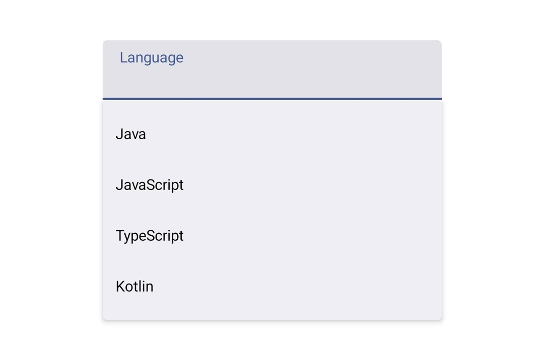
import {
  DropdownMenuItem,
  ExposedDropdownMenuBox,
  ExposedDropdownMenu,
  Host,
  Text,
  TextField,
  useNativeState,
} from '@expo/ui/jetpack-compose';
import { menuAnchor } from '@expo/ui/jetpack-compose/modifiers';
import { useState } from 'react';

const LANGUAGES = [
  { label: 'Java', value: 'java' },
  { label: 'JavaScript', value: 'js' },
  { label: 'TypeScript', value: 'ts' },
];

export default function BasicExposedDropdownMenuBoxExample() {
  const selectedLabel = useNativeState('Java');
  const [expanded, setExpanded] = useState(false);

  return (
    <Host matchContents>
      <ExposedDropdownMenuBox expanded={expanded} onExpandedChange={setExpanded}>
        <TextField value={selectedLabel} readOnly modifiers={[menuAnchor()]} />
        <ExposedDropdownMenu expanded={expanded} onDismissRequest={() => setExpanded(false)}>
          {LANGUAGES.map(lang => (
            <DropdownMenuItem
              key={lang.value}
              onClick={() => {
                selectedLabel.value = lang.label;
                setExpanded(false);
              }}>
              <DropdownMenuItem.Text>
                <Text>{lang.label}</Text>
              </DropdownMenuItem.Text>
            </DropdownMenuItem>
          ))}
        </ExposedDropdownMenu>
      </ExposedDropdownMenuBox>
    </Host>
  );
}
API
import { ExposedDropdownMenuBox } from '@expo/ui/jetpack-compose';
Components
Type: React.Element<ExposedDropdownMenuProps>
A Material 3 ExposedDropdownMenu that displays menu items in a dropdown.
Must be used inside an ExposedDropdownMenuBox.
Props for the ExposedDropdownMenu component.
Type: React.Element<ExposedDropdownMenuBoxProps>
A Material 3 ExposedDropdownMenuBox.
Use the menuAnchor() modifier on the anchor content (e.g. a TextField or Text).
Use ExposedDropdownMenu to wrap DropdownMenuItem children.
Example
<ExposedDropdownMenuBox expanded={expanded} onExpandedChange={setExpanded}>
  <TextField modifiers={[menuAnchor()]} defaultValue={value} readOnly />
  <ExposedDropdownMenu expanded={expanded} onDismissRequest={() => setExpanded(false)}>
    <DropdownMenuItem onClick={() => { setSelected('a'); setExpanded(false); }}>
      <DropdownMenuItem.Text><Text>Option A</Text></DropdownMenuItem.Text>
    </DropdownMenuItem>
  </ExposedDropdownMenu>
</ExposedDropdownMenuBox>
ReactNodeChildren — should contain an anchor element with the menuAnchor() modifier
and an ExposedDropdownMenu with DropdownMenuItem children.