This documentation is available as Markdown for AI agents and LLMs. See the full Markdown index or append .md to any documentation URL.
Surface
A Jetpack Compose Surface component for styled content containers.
Expo UI Surface matches the official Jetpack Compose Surface API and provides a container that applies Material Design surface styling including color, elevation, and content color.
Installation
- npx expo install @expo/uiIf you are installing this in an existing React Native app, make sure to install expo in your project.
Usage
Basic surface
import { Host, Surface, Text } from '@expo/ui/jetpack-compose';
import { paddingAll } from '@expo/ui/jetpack-compose/modifiers';

export default function BasicSurfaceExample() {
  return (
    <Host matchContents>
      <Surface modifiers={[paddingAll(16)]}>
        <Text>Content on a surface</Text>
      </Surface>
    </Host>
  );
}
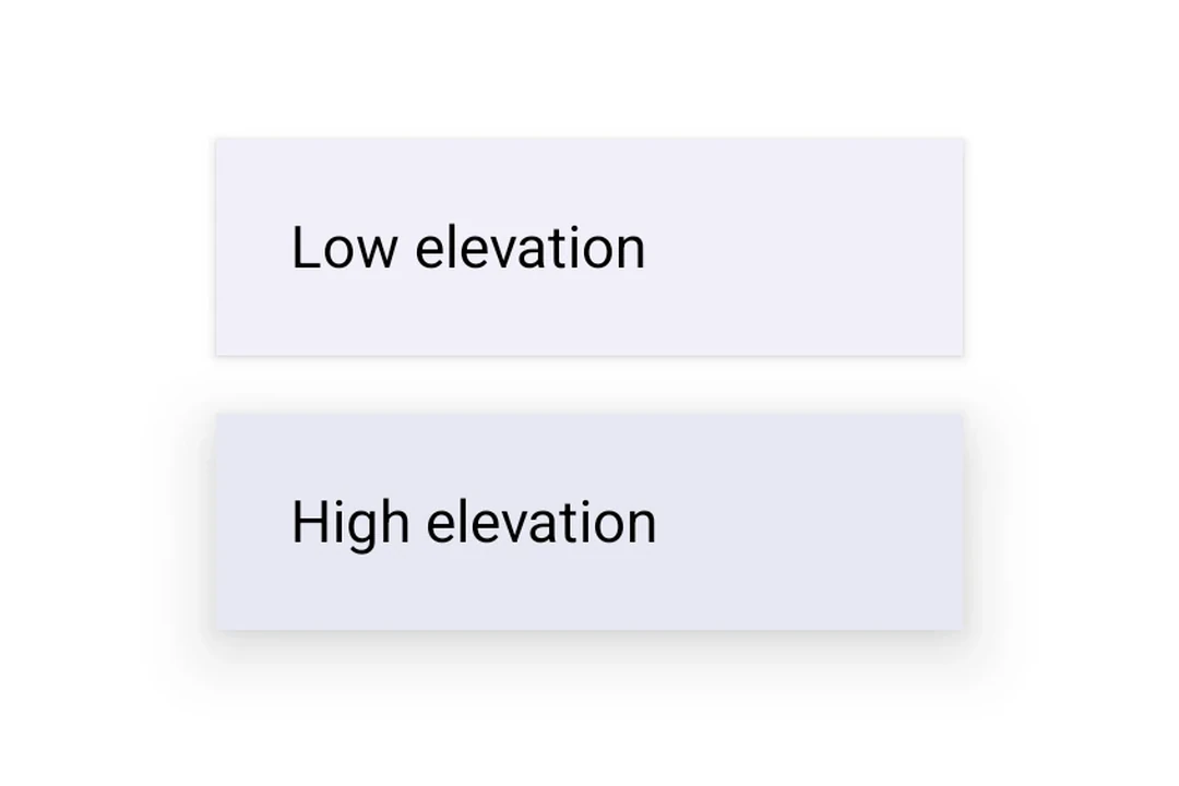
Surface with elevation
Use tonalElevation and shadowElevation to control the visual depth of the surface.
import { Host, Surface, Column, Text } from '@expo/ui/jetpack-compose';
import { paddingAll } from '@expo/ui/jetpack-compose/modifiers';

export default function SurfaceElevationExample() {
  return (
    <Host matchContents>
      <Column modifiers={[paddingAll(16)]}>
        <Surface tonalElevation={1} shadowElevation={2} modifiers={[paddingAll(16)]}>
          <Text>Low elevation</Text>
        </Surface>
        <Surface tonalElevation={4} shadowElevation={8} modifiers={[paddingAll(16)]}>
          <Text>High elevation</Text>
        </Surface>
      </Column>
    </Host>
  );
}
Surface with custom colors
Use the color and contentColor props to override the default Material theme colors.
import { Host, Surface, Text } from '@expo/ui/jetpack-compose';
import { paddingAll } from '@expo/ui/jetpack-compose/modifiers';

export default function SurfaceCustomColorsExample() {
  return (
    <Host matchContents>
      <Surface
        color="#1E3A5F"
        contentColor="#FFFFFF"
        tonalElevation={2}
        modifiers={[paddingAll(16)]}>
        <Text color="#FFFFFF">Custom colored surface</Text>
      </Surface>
    </Host>
  );
}
Surface with shape and border
Use the shape prop to clip content and border to draw a stroke around the surface.
import { Host, Surface, Shape, Text } from '@expo/ui/jetpack-compose';
import { paddingAll } from '@expo/ui/jetpack-compose/modifiers';

export default function SurfaceShapeBorderExample() {
  return (
    <Host matchContents>
      <Surface
        shape={Shape.RoundedCorner({
          cornerRadii: { topStart: 16, topEnd: 16, bottomStart: 16, bottomEnd: 16 },
        })}
        border={{ width: 2, color: '#6200EE' }}
        modifiers={[paddingAll(16)]}>
        <Text>Rounded surface with border</Text>
      </Surface>
    </Host>
  );
}
API
import { Surface } from '@expo/ui/jetpack-compose';
Component
Type: React.Element<SurfaceProps>
A Material Design surface container. Surface is responsible for:
- Clipping content to the shape
- Applying background color based on tonal elevation
- Providing content color to its children
booleanWhether the surface is in a checked (toggled on) state. When provided together with
onCheckedChange, the surface becomes a toggleable surface.
ColorValueThe background color of the surface.
Defaults to MaterialTheme.colorScheme.surface.
ColorValueThe color of the content inside the surface.
Defaults to contentColorFor(color).
boolean • Default: trueWhether the surface is enabled and responds to user interaction.
(checked: boolean) => voidCalled when the checked state of a toggleable surface changes.
Providing this callback together with checked enables the toggleable variant.
() => voidCalled when the surface is clicked. Providing this callback makes the surface clickable.
When combined with selected, the surface becomes a selectable variant.
booleanWhether the surface is in a selected state. When provided together with onClick,
the surface becomes a selectable surface that visually reflects its selection state.
number • Default: 0The shadow elevation of the surface. Value in dp.
Types
Border stroke configuration.
| Property | Type | Description |
|---|---|---|
| color(optional) | ColorValue | Border color. Default: MaterialTheme.colorScheme.outline |
| width(optional) | number | Border width in dp. Default: 1 |