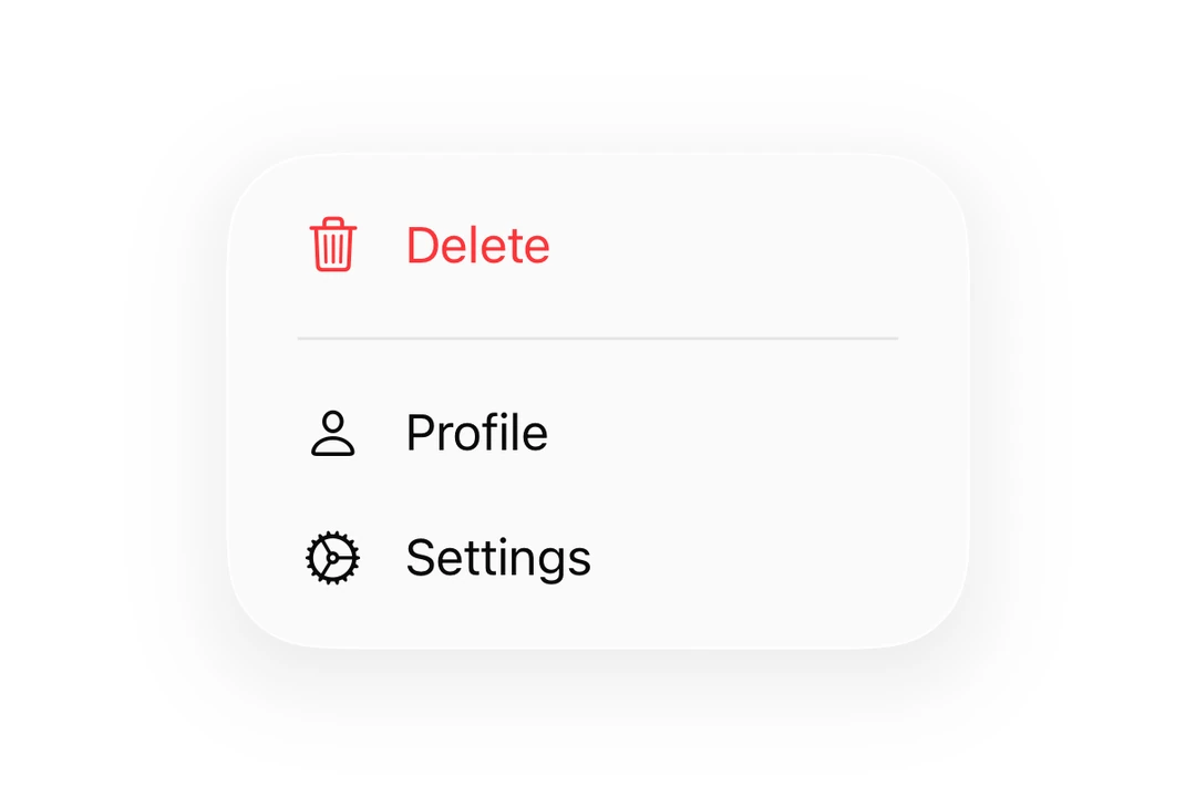
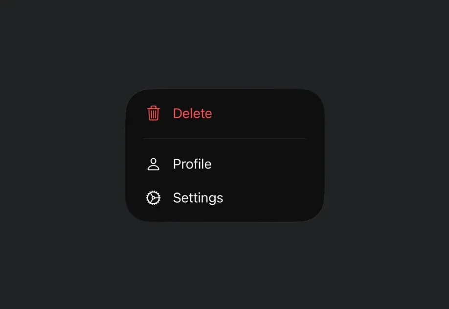
Expo UI Menu matches the official SwiftUI Menu API and supports styling via the buttonStyle modifier. Menu opens on a single tap. For long-press interactions, use ContextMenu instead.
To create a menu with the iOS Liquid Glass appearance, use buttonStyle('glass') or buttonStyle('glassProminent') on the Menu component.
Important: Do not apply the glassEffect() modifier to the Menu's label view to achieve a glass look. This causes a visual artifact where a rectangular halo briefly appears behind the trigger when the menu is dismissed. Always use buttonStyle instead, which correctly integrates with the Menu's dismiss animation.
Use a ControlGroup inside a menu to render a horizontal row of icon buttons, similar to the quick actions row in Apple Music or Safari menus.
MenuWithControlGroupExample.tsx
import{Host,Menu,ControlGroup,Button,Section,Divider,}from'@expo/ui/swift-ui';exportdefaultfunctionMenuWithControlGroupExample(){return(<Hoststyle={{ flex:1}}><Menulabel="Song Options"systemImage="ellipsis.circle"><ControlGroup><ButtonsystemImage="plus"label="Add"onPress={()=>console.log('Add')}/><ButtonsystemImage="star"label="Favorite"onPress={()=>console.log('Favorite')}/><ButtonsystemImage="square.and.arrow.up"label="Share"onPress={()=>console.log('Share')}/></ControlGroup><Section><ButtonsystemImage="text.badge.plus"label="Add to a playlist"onPress={()=>console.log('Add to playlist')}/><ButtonsystemImage="antenna.radiowaves.left.and.right"label="Create station"onPress={()=>console.log('Create station')}/></Section><Divider/><ButtonsystemImage="hand.thumbsdown"label="Suggest less"onPress={()=>console.log('Suggest less')}/></Menu></Host>);}
Disabled items
Use the disabled(true) modifier on a menu Button to render it greyed-out and non-interactive. The button still appears in the menu but won't fire onPress.
DisabledMenuItemExample.tsx
import{Host,Menu,Button}from'@expo/ui/swift-ui';import{ disabled }from'@expo/ui/swift-ui/modifiers';exportdefaultfunctionDisabledMenuItemExample(){return(<Hoststyle={{ flex:1}}><Menulabel="Options"><Buttonlabel="Available"onPress={()=>console.log('Available')}/><Buttonlabel="Locked"systemImage="lock"modifiers={[disabled(true)]}onPress={()=>console.log('This never fires')}/></Menu></Host>);}
Selectable items (checkmarks)
A SwiftUI Toggle placed inside a Menu automatically renders as a row with its SF Symbol (when systemImage is set) and a checkmark before that symbol when isOn is true. Use this pattern instead of inventing a custom checkmark item.
Use the labelStyle('iconOnly') modifier to display only the icon without the label text. The label prop should still be provided for accessibility purposes.
The label for the menu trigger. Can be a string for simple text labels,
or a ReactNode for custom label content.
onPrimaryAction
iOS
tvOS
Optional • Type: () => void
A callback that is invoked when the user taps the menu label.
When provided, a single tap triggers this action, while a long-press shows the menu.
When not provided, a single tap shows the menu.
systemImage
iOS
tvOS
Optional • Type: string
An SF Symbol name to display alongside the label.
Only used when label is a string.