Label
A SwiftUI Label component for displaying text with an icon.
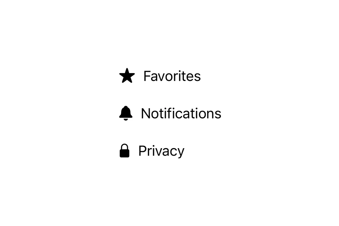
Expo UI Label matches the official SwiftUI Label API and displays a title alongside an icon.
Installation
- npx expo install @expo/uiIf you are installing this in an existing React Native app, make sure to install expo in your project.
Usage
Basic label with SF Symbol
import { Host, Label } from '@expo/ui/swift-ui';

export default function BasicLabelExample() {
  return (
    <Host matchContents>
      <Label title="Favorites" systemImage="star.fill" />
    </Host>
  );
}
With custom icon
Use the icon prop to provide a custom React node as the icon instead of an SF Symbol.
import { Host, Label, Image } from '@expo/ui/swift-ui';

export default function LabelCustomIconExample() {
  return (
    <Host matchContents>
      <Label title="Custom Icon" icon={<Image systemName="sparkles" size={20} color="purple" />} />
    </Host>
  );
}
Icon only
Use the labelStyle modifier with iconOnly to display only the icon. Always provide a title for accessibility even though it won't be visible.
import { Host, Label } from '@expo/ui/swift-ui';
import { labelStyle } from '@expo/ui/swift-ui/modifiers';

export default function LabelIconOnlyExample() {
  return (
    <Host matchContents>
      <Label title="Settings" systemImage="gear" modifiers={[labelStyle('iconOnly')]} />
    </Host>
  );
}
API
import { Label } from '@expo/ui/swift-ui';
Component
Type: React.Element<LabelProps>
Renders a native label view, which could be used in a list or section.
React.ReactNodeCustom title view. Accepts any React node (for example, a VStack with title and subtitle).
When provided, this takes precedence over title.
Deprecated: Use
foregroundStylemodifier instead.
ColorValueThe color of the label icon.
React.ReactNodeCustom icon view to be displayed in the label.
When provided, this takes precedence over systemImage.