This documentation is available as Markdown for AI agents and LLMs. See the full Markdown index or append .md to any documentation URL.
SwiftUI
SwiftUI components for building native iOS interfaces with @expo/ui.
The SwiftUI components in @expo/ui/swift-ui allow you to build fully native iOS interfaces using SwiftUI from React Native.
Installation
If you are installing this in an existing React Native app, make sure to install expo in your project.
Usage
Expo UI has several SwiftUI components available. You can use them in your app by importing them from @expo/ui/swift-ui. However, to cross the boundary from React Native (UIKit) to SwiftUI, you need to use the Host component. The Host is the container for SwiftUI views. You can think of it like <svg> in the DOM or <Canvas> in react-native-skia. Under the hood, it uses UIHostingController to render SwiftUI views in UIKit.
import { Host, Button } from '@expo/ui/swift-ui';

export function SaveButton() {
  return (
    <Host style={{ flex: 1 }}>
      <Button label="Save changes" />
    </Host>
  );
}
Create custom SwiftUI components and modifiers that integrate with Expo UI.

Learn how to build real SwiftUI views in your React Native app with the new Expo UI.
Available components
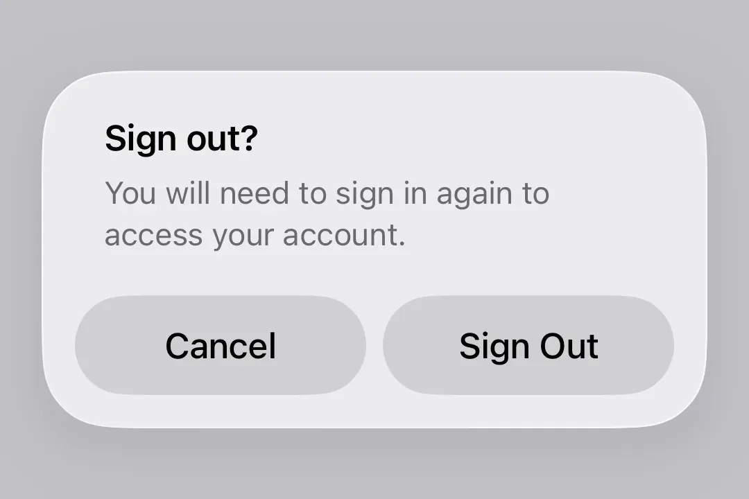
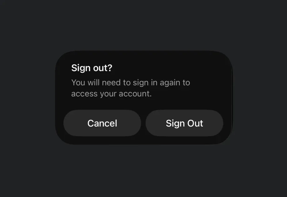
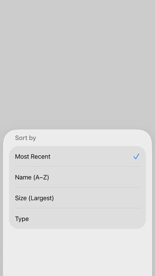
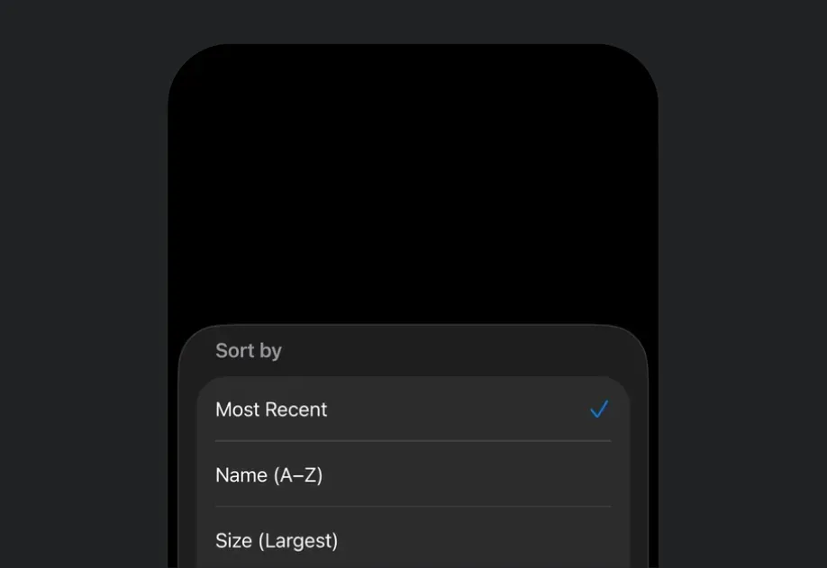
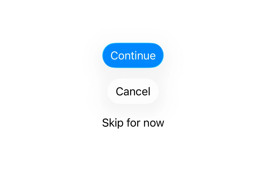
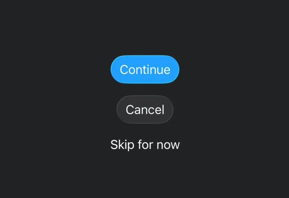
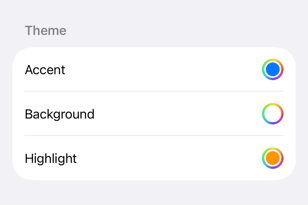
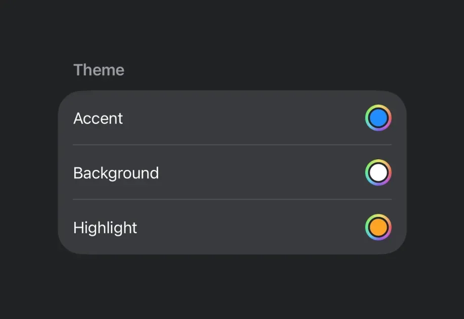
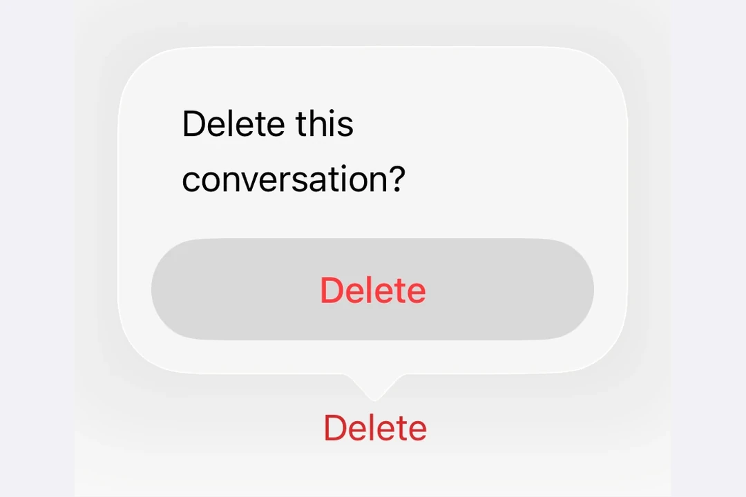

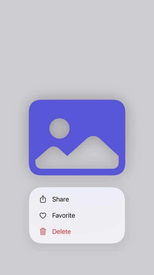
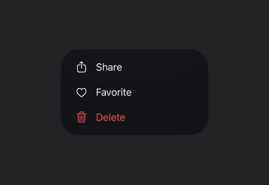
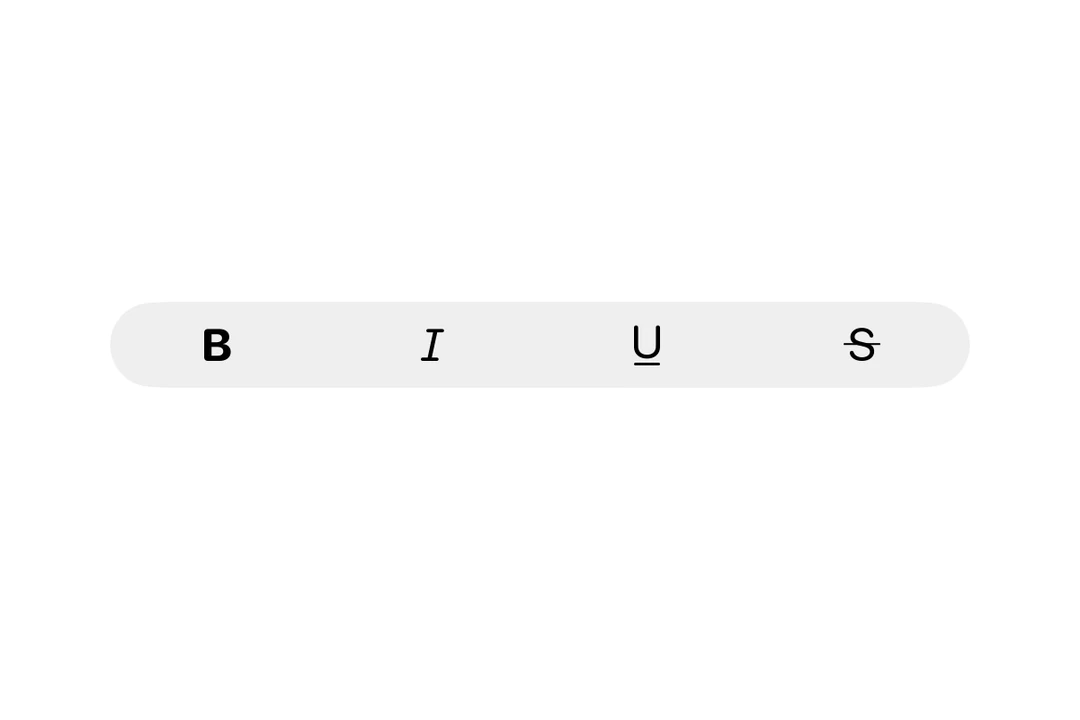

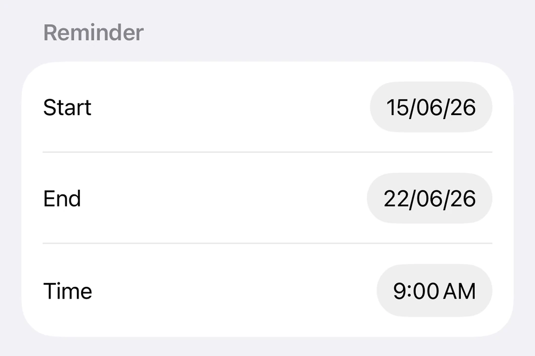
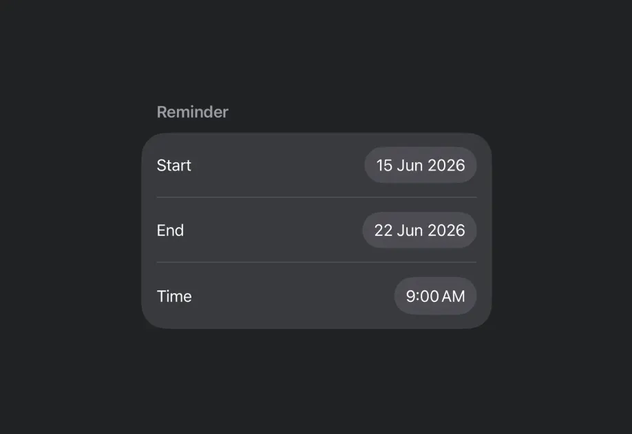
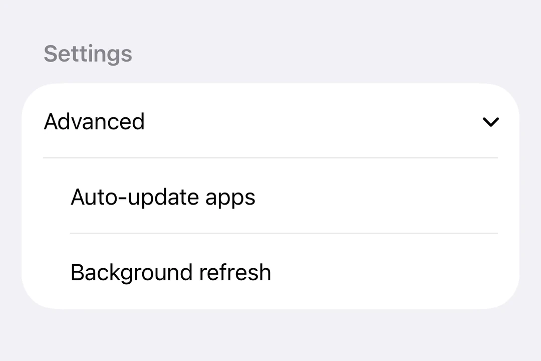
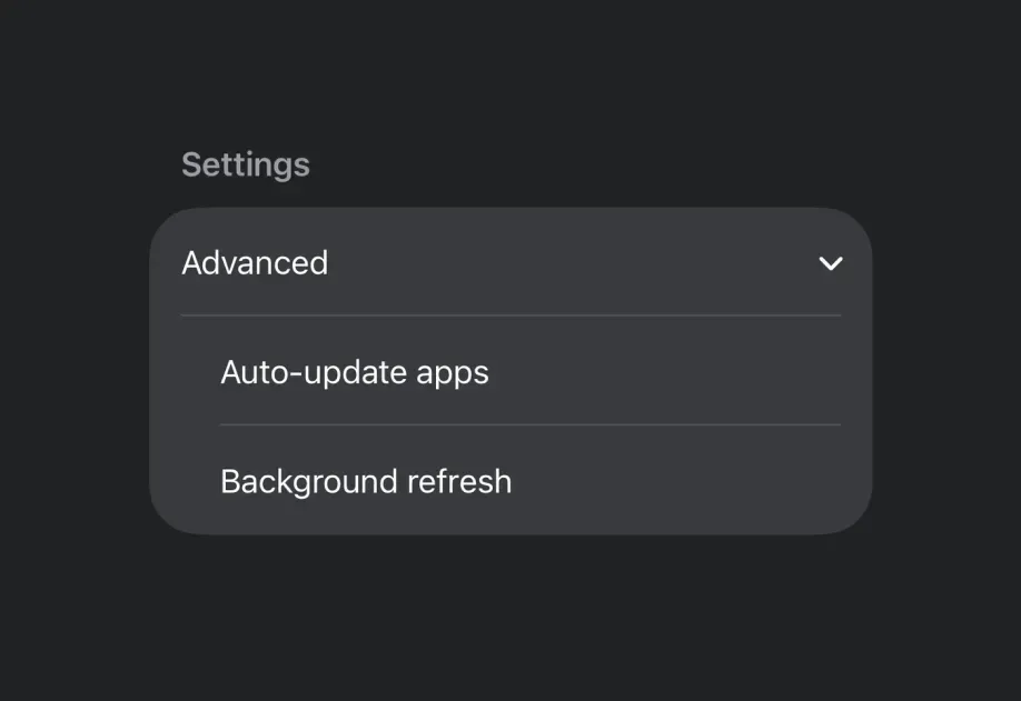
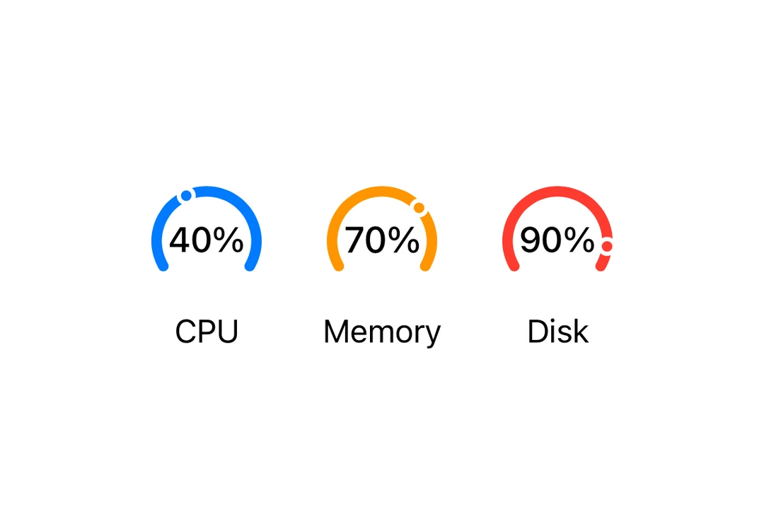
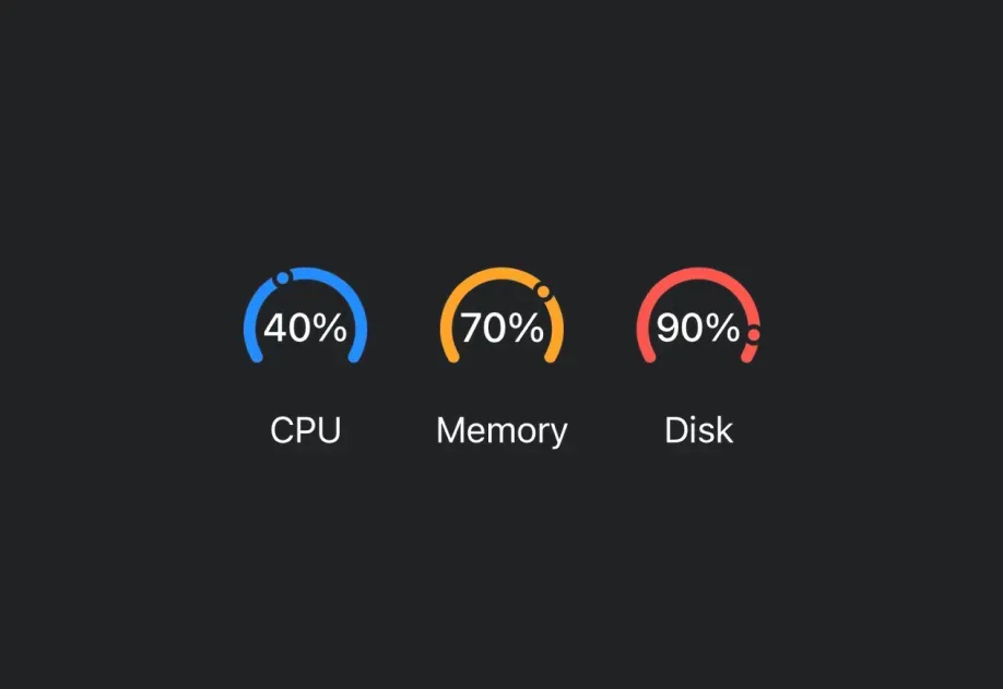




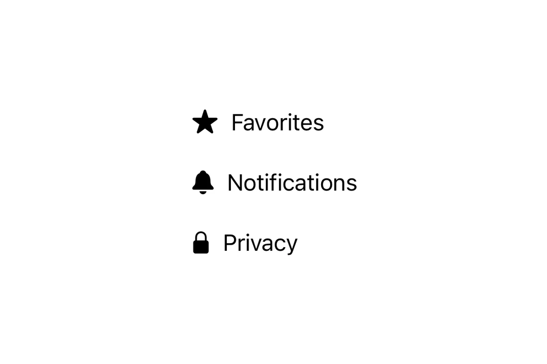
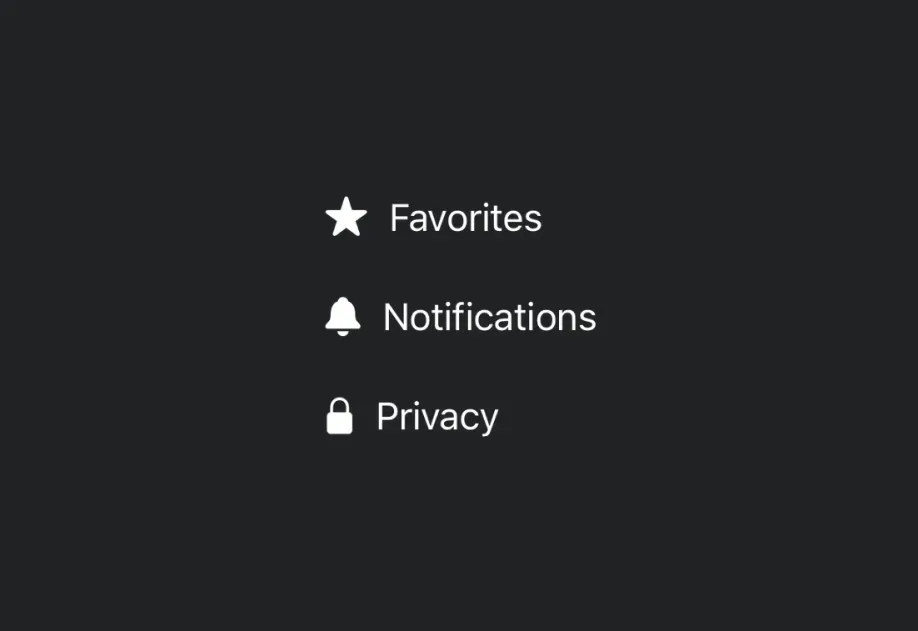


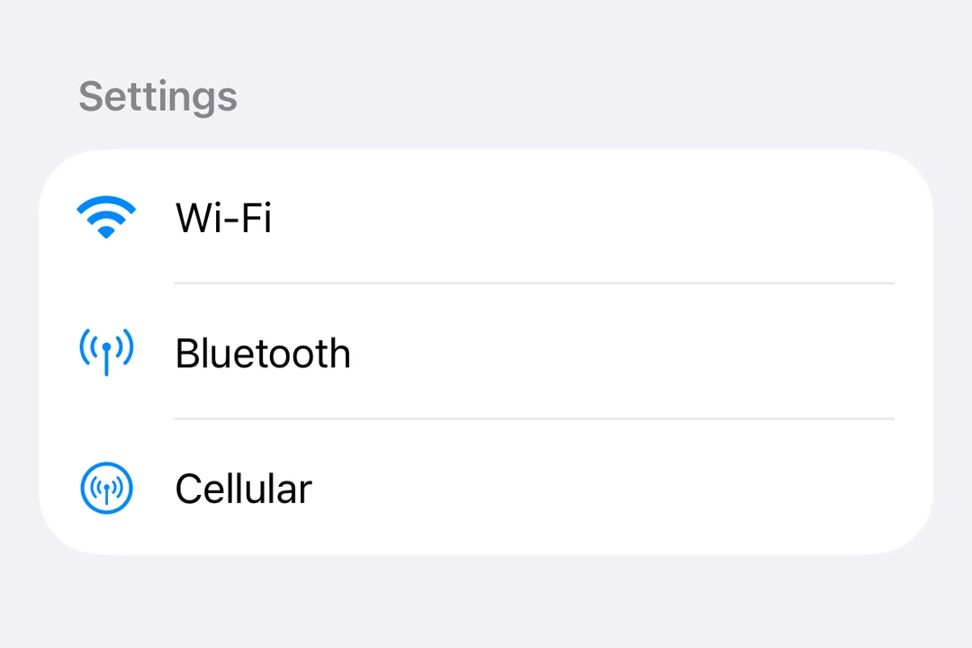
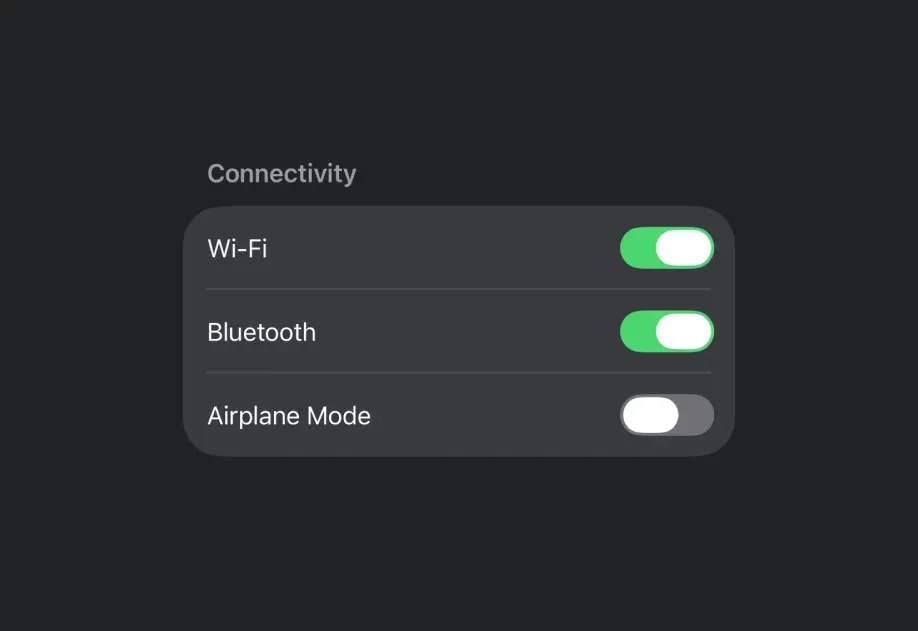
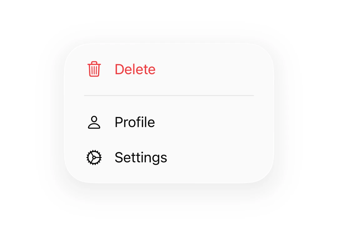
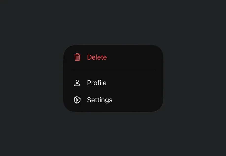



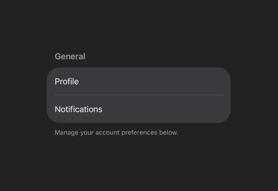
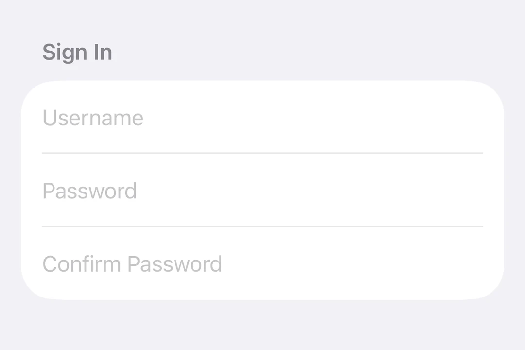
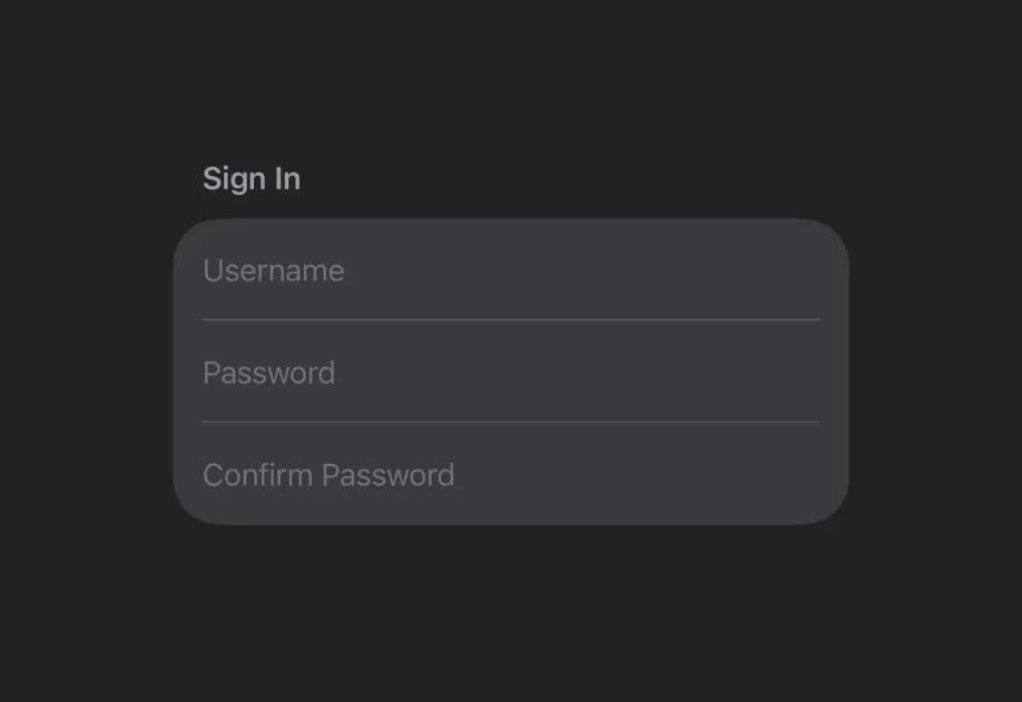



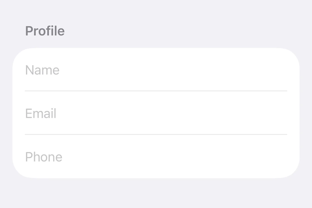
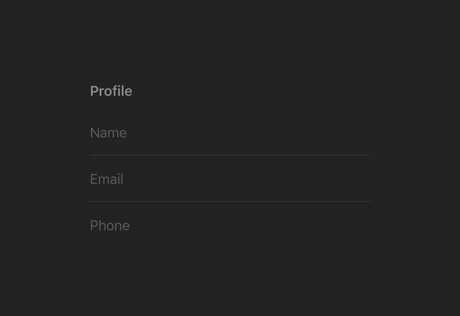
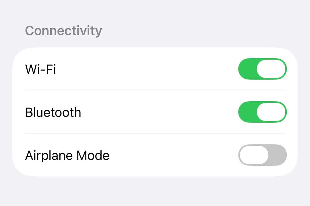
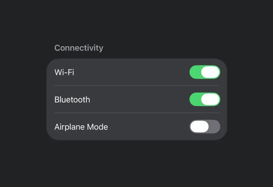




Examples
Modifiers
SwiftUI modifiers customize the appearance and behavior of SwiftUI components. Expo UI also provides modifiers for SwiftUI components. You can import modifiers from @expo/ui/swift-ui/modifiers and pass them as an array to the modifiers prop. In the following example, the expo-mesh-gradient and the glassEffect modifier are combined to create Liquid Glass text.
The
glassEffectmodifier requires Xcode 26+ and iOS 26+.
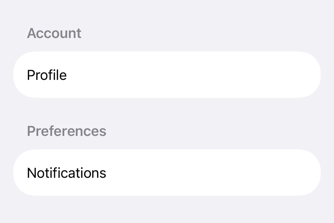
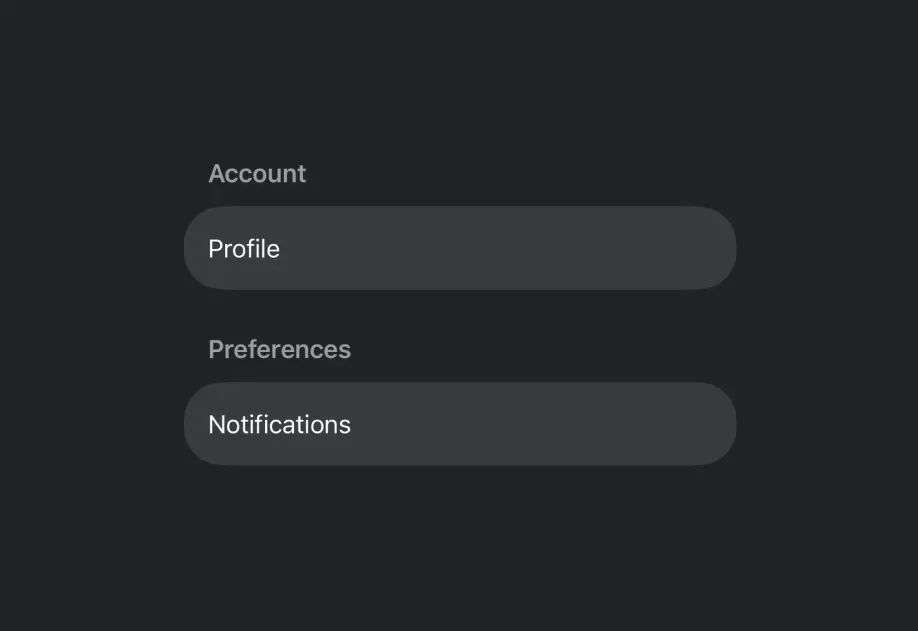
iOS Settings app
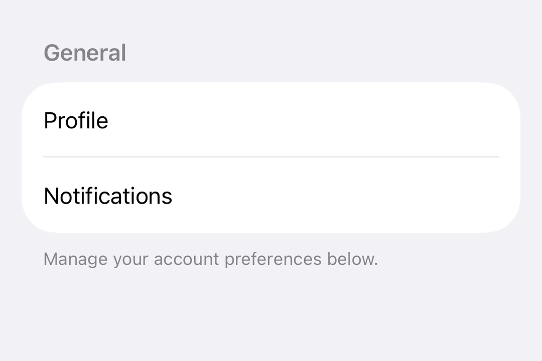
Combining the Expo UI components and modifiers, you can build a UI like the iOS Settings app.
Secondary text styling
Use foregroundStyle to apply a hierarchical style, which makes text appear lighter and more subtle.
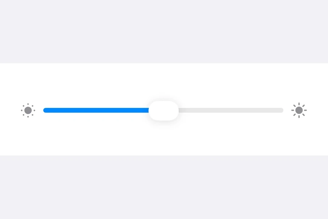
Slider with icons
A common pattern for brightness or volume controls is to flank a Slider with icons.
Multi-line list items
Use VStack with alignment="leading" for list items with a title and subtitle.