This documentation is available as Markdown for AI agents and LLMs. See the full Markdown index or append .md to any documentation URL.
Alert
A SwiftUI Alert component for presenting native iOS alert dialogs.
Expo UI Alert matches the official SwiftUI alert API and presents a native iOS alert dialog with a title, actions, and an optional message.
Alert is the centered modal counterpart to ConfirmationDialog, which renders as an action sheet from the bottom of the screen. Both share the same trigger/actions/message slot model so callers can swap between them by changing the component name.
Installation
- npx expo install @expo/uiIf you are installing this in an existing React Native app, make sure to install expo in your project.
Usage
Basic alert
Use Alert.Trigger to define the visible element and Alert.Actions to provide the dialog buttons.
import { useState } from 'react';
import { Host, Alert, Button } from '@expo/ui/swift-ui';

export default function BasicAlertExample() {
  const [isPresented, setIsPresented] = useState(false);

  return (
    <Host matchContents>
      <Alert title="Saved" isPresented={isPresented} onIsPresentedChange={setIsPresented}>
        <Alert.Trigger>
          <Button label="Show alert" onPress={() => setIsPresented(true)} />
        </Alert.Trigger>
        <Alert.Actions>
          <Button label="OK" onPress={() => setIsPresented(false)} />
        </Alert.Actions>
      </Alert>
    </Host>
  );
}
Cancel and confirm
Combine role="cancel" with a confirm button to build a standard yes/no alert.
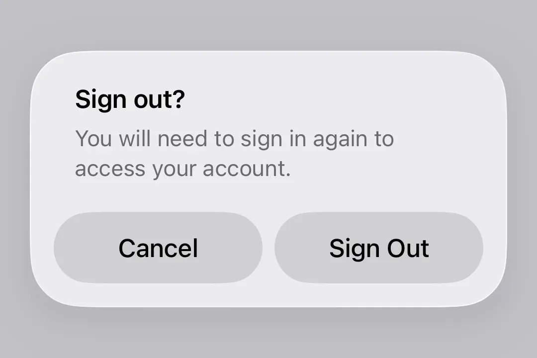
import { useState } from 'react';
import { Host, Alert, Button, Text } from '@expo/ui/swift-ui';

export default function CancelConfirmAlertExample() {
  const [isPresented, setIsPresented] = useState(false);

  return (
    <Host matchContents>
      <Alert title="Sign out?" isPresented={isPresented} onIsPresentedChange={setIsPresented}>
        <Alert.Trigger>
          <Button label="Sign out" onPress={() => setIsPresented(true)} />
        </Alert.Trigger>
        <Alert.Actions>
          <Button label="Sign Out" onPress={() => console.log('Signed out')} />
          <Button label="Cancel" role="cancel" />
        </Alert.Actions>
        <Alert.Message>
          <Text>You will need to sign in again to access your account.</Text>
        </Alert.Message>
      </Alert>
    </Host>
  );
}
Destructive action
Use role="destructive" on a Button inside Alert.Actions to style it as a destructive action.
import { useState } from 'react';
import { Host, Alert, Button, Text } from '@expo/ui/swift-ui';

export default function DestructiveAlertExample() {
  const [isPresented, setIsPresented] = useState(false);

  return (
    <Host matchContents>
      <Alert title="Delete account?" isPresented={isPresented} onIsPresentedChange={setIsPresented}>
        <Alert.Trigger>
          <Button label="Delete account" role="destructive" onPress={() => setIsPresented(true)} />
        </Alert.Trigger>
        <Alert.Actions>
          <Button
            label="Delete"
            role="destructive"
            onPress={() => {
              console.log('Deleted');
              setIsPresented(false);
            }}
          />
          <Button label="Cancel" role="cancel" />
        </Alert.Actions>
        <Alert.Message>
          <Text>This permanently deletes your account and all data. This cannot be undone.</Text>
        </Alert.Message>
      </Alert>
    </Host>
  );
}
API
import { Alert } from '@expo/ui/swift-ui';
Component
Type: React.Element<AlertProps>
Alert presents a SwiftUI alert with a title, optional message, and action buttons.
See: Official SwiftUI documentation.