This documentation is available as Markdown for AI agents and LLMs. See the full Markdown index or append .md to any documentation URL.
FieldGroup
A scrollable container of grouped settings-style rows.
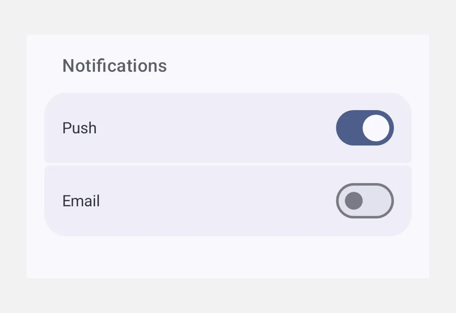
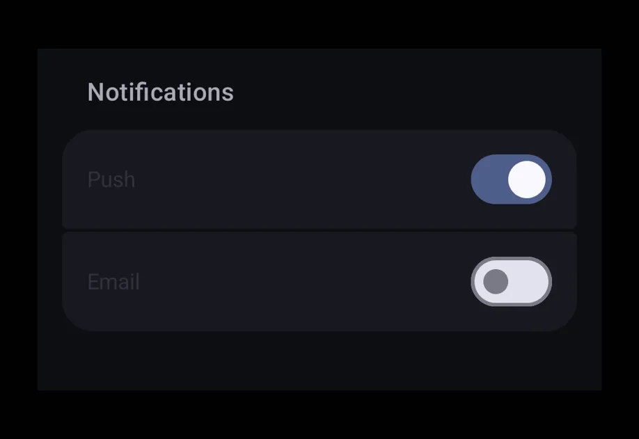
A scrollable container for grouped settings-style rows, mirroring the look of an iOS Settings screen. Compose FieldGroup.Section (for explicit groups), FieldGroup.SectionHeader, and FieldGroup.SectionFooter slots inside.
Installation
If you are installing this in an existing React Native app, make sure to install expo in your project.
Usage
Sectioned form
Custom section header and footer
Use FieldGroup.SectionHeader and FieldGroup.SectionFooter to render fully styled header/footer slots in place of the default title text.
API
import { FieldGroup } from '@expo/ui';
Components
Type: React.Element<FieldGroupProps>
A scrollable container for grouped settings-style rows, mirroring the look
of an iOS Settings screen. Render one or more
FieldGroup.Section components inside. Direct
non-section children are automatically grouped into an implicit section,
matching SwiftUI Form behavior.
Props for the FieldGroup component, a scrollable container
of grouped settings-style rows.
ReactNodeA collection of FieldGroup.Section components that
make up the group. Non-section children are rendered inline between
sections, matching SwiftUI Form behavior.
booleanWhether the component is disabled. Disabled components do not respond to user interaction.
ModifierConfig[]Platform-specific modifier escape hatch. Pass an array of modifier configs
from @expo/ui/swift-ui/modifiers or @expo/ui/jetpack-compose/modifiers.
A modifier supplied here replaces any modifier of the same type that the
component derives from style or other props.
() => voidCalled when the component is removed from screen.
Pick<ViewStyle, 'padding' | 'paddingHorizontal' | 'paddingVertical' | 'paddingTop' | 'paddingBottom' | 'paddingLeft' | 'paddingRight' | 'backgroundColor' | 'borderRadius' | 'borderWidth' | 'borderColor' | 'opacity' | 'width' | 'height'>Platform-agnostic style properties. These are translated to SwiftUI modifiers on iOS and Jetpack Compose modifiers on Android.
Type: React.Element<FC<FieldSectionProps>>
Props for the FieldGroup.Section component, a
grouped list of rows within a FieldGroup.
ReactNodeThe rows of the section, optionally interleaved with a single
<FieldGroup.SectionHeader> and/or <FieldGroup.SectionFooter> child
to customize the header / footer slots.
booleanWhether the component is disabled. Disabled components do not respond to user interaction.
ModifierConfig[]Platform-specific modifier escape hatch. Pass an array of modifier configs
from @expo/ui/swift-ui/modifiers or @expo/ui/jetpack-compose/modifiers.
A modifier supplied here replaces any modifier of the same type that the
component derives from style or other props.
() => voidCalled when the component is removed from screen.
Pick<ViewStyle, 'padding' | 'paddingHorizontal' | 'paddingVertical' | 'paddingTop' | 'paddingBottom' | 'paddingLeft' | 'paddingRight' | 'backgroundColor' | 'borderRadius' | 'borderWidth' | 'borderColor' | 'opacity' | 'width' | 'height'>Platform-agnostic style properties. These are translated to SwiftUI modifiers on iOS and Jetpack Compose modifiers on Android.
stringIdentifier used to locate the component in end-to-end tests.
stringA plain-text section title, rendered as the default styled header above
the group. Ignored when a <FieldGroup.SectionHeader> child is
provided.
Methods
Computes the position of a row given its index within a section of
total rows.
FieldItemPositionTypes
Literal type: string
Position of a row within a FieldGroup.Section, used
to compute grouped-list corner radii.
Acceptable values are: 'leading' | 'middle' | 'trailing' | 'only'