Configure status bar, splash screen and app icon
Edit page
In this tutorial, learn the basics of how to configure a status bar, app icon, and splash screen.
For the complete documentation index, see llms.txt. Use this file to discover all available pages.
In this chapter, we'll address some app details before deploying our app to an app store, such as theming the status bar, customizing the app icon, and splash screen.

Configure the status bar, customize your app icon, and set up the splash screen before deploying to the app store.
1
Configure the status bar
expo-status-bar library comes pre-installed in every project created using create-expo-app. This library provides a StatusBar component to configure the app's status bar style.
Inside app/_layout.tsx:
- Import
StatusBarfromexpo-status-bar. - Group the
StatusBarand existingStackcomponents with React's Fragment component.
import { Stack } from 'expo-router';
import { StatusBar } from 'expo-status-bar';

export default function RootLayout() {
  return (
    <>
      <Stack>
        <Stack.Screen name="(tabs)" options={{ headerShown: false }} />
      </Stack>
      <StatusBar style="light" />
    </>
  );
}
Let's take a look at our app now on Android, and iOS:
2
App icon
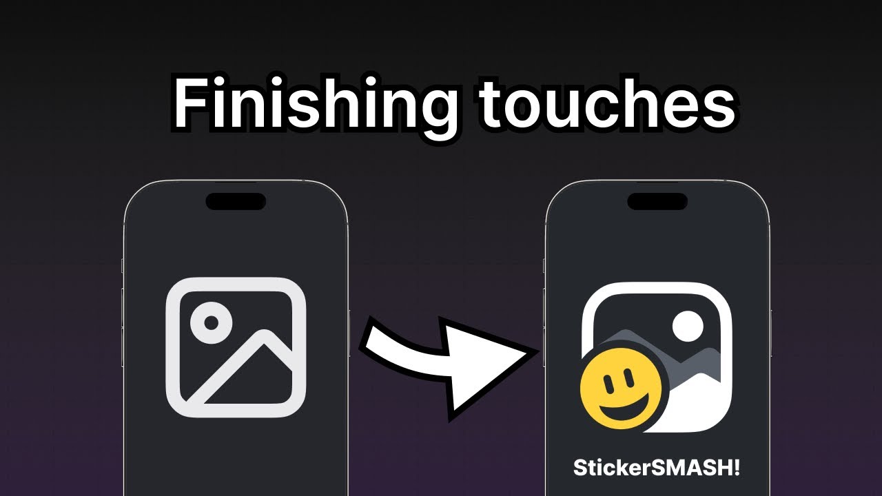
Inside the project, there's an icon.png file inside the assets/images directory. This is our app icon. It's a 1024px by 1024px image and looks as shown below:
Like the splash screen image, the "icon" property in the app.json file configures the app icon's path. By default, a new Expo project defines the correct path to "./assets/images/icon.png". We don't have to change anything.
Eventually, when you'll build your app for the app stores, Expo Application Services (EAS) will take this image and create optimized icon for every device.
You can see the icon in various places in Expo Go. Here is an example of the app icon displayed in the developer menu of Expo Go:
3
Splash screen
A splash screen is visible before the app's content is loaded. It uses a smaller image, such as an app's icon, which is centered. It hides once the app's content is ready to be displayed.
The expo-splash-screen plugin already comes pre-installed in every project created using create-expo-app. This library provides a config plugin to configure the splash screen.
In app.json, the expo-splash-screen plugin is already configured to use the app's icon as the splash screen image (provided in the downloadable assets) with the following snippet so we don't have to change anything:
{
  "plugins": [
    %%placeholder-start%%... %%placeholder-end%%
    [
      "expo-splash-screen",
      {
        "image": "./assets/images/splash-icon.png"
        %%placeholder-start%%... %%placeholder-end%%
      }
    ]
  ]
}
However, to test the splash screen, we cannot use Expo Go or a development build. To test it, we need to create a preview or a production build of our app. We recommend going through the following resources to learn more about the splash screen configuration and how to test it:
- Create a splash screen icon guide to learn how splash screen icon is configured.
- To learn how to create a preview build, see Internal distribution guide in EAS Tutorial, or to create production builds see guides for Android and iOS.
Summary
Chapter 9: Configure status bar, splash screen and app icon
Well done! We built an app that runs on Android, iOS, and the web from the same codebase.
The next section of the tutorial will guide you toward resources to learn more about concepts we've covered here and others we have mentioned briefly.