This documentation is available as Markdown for AI agents and LLMs. See the full Markdown index or append .md to any documentation URL.
Create a modal
Edit page
In this tutorial, learn how to create a React Native modal to select an image.
React Native provides a <Modal> component that presents content above the rest of your app. In general, modals are used to draw a user's attention toward critical information or guide them to take action. For example, in the third chapter, after pressing the button, we used alert() to display some placeholder text. That's how a modal component displays an overlay.
In this chapter, we'll create a modal that shows an emoji picker list.
Build a modal component using React Native's Modal API to display an emoji picker and handle user interactions.
1
Declare a state variable to show buttons
Before implementing the modal, we are going to add three new buttons. These buttons are visible after the user picks an image from the media library or uses the placeholder image. One of these buttons will trigger the emoji picker modal.
In app/(tabs)/index.tsx:
- Declare a boolean state variable,
showAppOptions, to show or hide the buttons that open the modal, alongside a few other options. When the app screen loads, we'll set it tofalseso the options are not shown before picking an image. When the user picks an image or uses the placeholder image, we'll set it totrue. - Update the
pickImageAsync()function to set the value ofshowAppOptionstotrueafter the user picks an image. - Update the button with no theme by adding an
onPressprop with the following value.
import { View, StyleSheet } from 'react-native';
import * as ImagePicker from 'expo-image-picker';
import { useState } from 'react';

import Button from '@/components/Button';
import ImageViewer from '@/components/ImageViewer';

const PlaceholderImage = require('@/assets/images/background-image.png');

export default function Index() {
  const [selectedImage, setSelectedImage] = useState<string | undefined>(undefined);
  const [showAppOptions, setShowAppOptions] = useState<boolean>(false);

  const pickImageAsync = async () => {
    let result = await ImagePicker.launchImageLibraryAsync({
      mediaTypes: ['images'],
      allowsEditing: true,
      quality: 1,
    });

    if (!result.canceled) {
      setSelectedImage(result.assets[0].uri);
      setShowAppOptions(true);
    } else {
      alert('You did not select any image.');
    }
  };

  return (
    <View style={styles.container}>
      <View style={styles.imageContainer}>
        <ImageViewer imgSource={PlaceholderImage} selectedImage={selectedImage} />
      </View>
      {showAppOptions ? (
        <View />
      ) : (
        <View style={styles.footerContainer}>
          <Button theme="primary" label="Choose a photo" onPress={pickImageAsync} />
          <Button label="Use this photo" onPress={() => setShowAppOptions(true)} />
        </View>
      )}
    </View>
  );
}

const styles = StyleSheet.create({
  container: {
    flex: 1,
    backgroundColor: '#25292e',
    alignItems: 'center',
  },
  imageContainer: {
    flex: 1,
  },
  footerContainer: {
    flex: 1 / 3,
    alignItems: 'center',
  },
});
In the above snippet, we're rendering the Button component based on the value of showAppOptions and moving the buttons in the ternary operator block. When the value of showAppOptions is true, render an empty <View> component. We'll address this state in the next step.
Now, we can remove the alert on the Button component and update the onPress prop when rendering the second button in the components/Button.tsx:
<Pressable style={styles.button} onPress={onPress}>
2
Add buttons
Let's break down the layout of the option buttons we'll implement in this chapter. The design looks like this:
It contains a parent <View> with three buttons aligned in a row. The button in the middle with the plus icon (+) will open the modal and is styled differently than the other two buttons.
Inside the components directory, create a new CircleButton.tsx file with the following code:
import { View, Pressable, StyleSheet } from 'react-native';
import MaterialIcons from '@expo/vector-icons/MaterialIcons';

type Props = {
  onPress: () => void;
};

export default function CircleButton({ onPress }: Props) {
  return (
    <View style={styles.circleButtonContainer}>
      <Pressable style={styles.circleButton} onPress={onPress}>
        <MaterialIcons name="add" size={38} color="#25292e" />
      </Pressable>
    </View>
  );
}

const styles = StyleSheet.create({
  circleButtonContainer: {
    width: 84,
    height: 84,
    marginHorizontal: 60,
    borderWidth: 4,
    borderColor: '#ffd33d',
    borderRadius: 42,
    padding: 3,
  },
  circleButton: {
    flex: 1,
    justifyContent: 'center',
    alignItems: 'center',
    borderRadius: 42,
    backgroundColor: '#fff',
  },
});
To render the plus icon, this button uses the <MaterialIcons> icon set from the @expo/vector-icons library.
The other two buttons also use <MaterialIcons> to display vertically aligned text labels and icons. Create a file named IconButton.tsx inside the components directory. This component accepts three props:
icon: the name corresponding to theMaterialIconslibrary icon.label: the text label displayed on the button.onPress: this function invokes when the user presses the button.
import { Pressable, StyleSheet, Text } from 'react-native';
import MaterialIcons from '@expo/vector-icons/MaterialIcons';

type Props = {
  icon: keyof typeof MaterialIcons.glyphMap;
  label: string;
  onPress: () => void;
};

export default function IconButton({ icon, label, onPress }: Props) {
  return (
    <Pressable style={styles.iconButton} onPress={onPress}>
      <MaterialIcons name={icon} size={24} color="#fff" />
      <Text style={styles.iconButtonLabel}>{label}</Text>
    </Pressable>
  );
}

const styles = StyleSheet.create({
  iconButton: {
    justifyContent: 'center',
    alignItems: 'center',
  },
  iconButtonLabel: {
    color: '#fff',
    marginTop: 12,
  },
});
Inside app/(tabs)/index.tsx:
- Import the
CircleButtonandIconButtoncomponents to display them. - Add three placeholder functions for these buttons. The
onReset()function invokes when the user presses the reset button, causing the image picker button to appear again. We'll add the functionality for the other two functions later.
import { View, StyleSheet } from 'react-native';
import * as ImagePicker from 'expo-image-picker';
import { useState } from 'react';

import Button from '@/components/Button';
import ImageViewer from '@/components/ImageViewer';
import IconButton from '@/components/IconButton';
import CircleButton from '@/components/CircleButton';

const PlaceholderImage = require('@/assets/images/background-image.png');

export default function Index() {
  const [selectedImage, setSelectedImage] = useState<string | undefined>(undefined);
  const [showAppOptions, setShowAppOptions] = useState<boolean>(false);

  const pickImageAsync = async () => {
    let result = await ImagePicker.launchImageLibraryAsync({
      mediaTypes: ['images'],
      allowsEditing: true,
      quality: 1,
    });

    if (!result.canceled) {
      setSelectedImage(result.assets[0].uri);
      setShowAppOptions(true);
    } else {
      alert('You did not select any image.');
    }
  };

  const onReset = () => {
    setShowAppOptions(false);
  };

  const onAddSticker = () => {
    // we will implement this later
  };

  const onSaveImageAsync = async () => {
    // we will implement this later
  };

  return (
    <View style={styles.container}>
      <View style={styles.imageContainer}>
        <ImageViewer imgSource={PlaceholderImage} selectedImage={selectedImage} />
      </View>
      {showAppOptions ? (
        <View style={styles.optionsContainer}>
          <View style={styles.optionsRow}>
            <IconButton icon="refresh" label="Reset" onPress={onReset} />
            <CircleButton onPress={onAddSticker} />
            <IconButton icon="save-alt" label="Save" onPress={onSaveImageAsync} />
          </View>
        </View>
      ) : (
        <View style={styles.footerContainer}>
          <Button theme="primary" label="Choose a photo" onPress={pickImageAsync} />
          <Button label="Use this photo" onPress={() => setShowAppOptions(true)} />
        </View>
      )}
    </View>
  );
}

const styles = StyleSheet.create({
  container: {
    flex: 1,
    backgroundColor: '#25292e',
    alignItems: 'center',
  },
  imageContainer: {
    flex: 1,
  },
  footerContainer: {
    flex: 1 / 3,
    alignItems: 'center',
  },
  optionsContainer: {
    position: 'absolute',
    bottom: 80,
  },
  optionsRow: {
    alignItems: 'center',
    flexDirection: 'row',
  },
});
Let's take a look at our app on Android, iOS and the web:
3
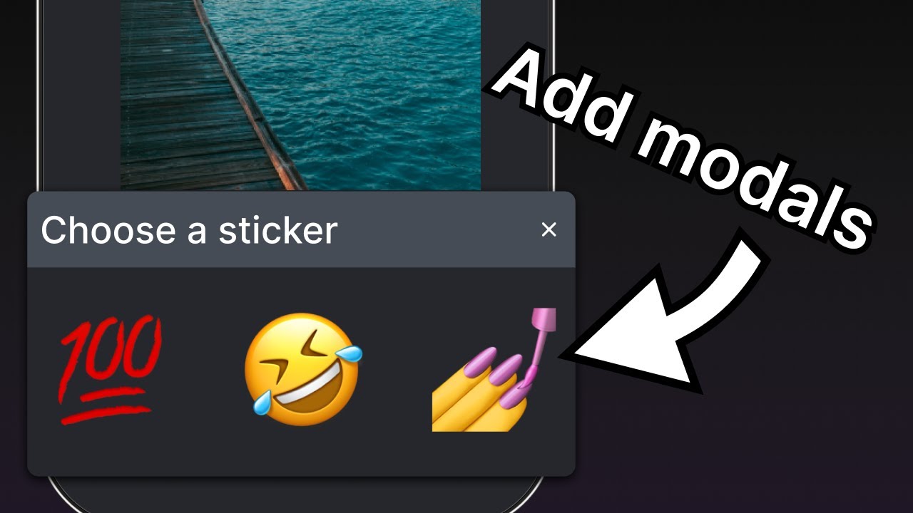
Create an emoji picker modal
The modal allows the user to choose an emoji from a list of available emoji. Create an EmojiPicker.tsx file inside the components directory. This component accepts three props:
isVisible: a boolean to determine the state of the modal's visibility.onClose: a function to close the modal.children: used later to display a list of emoji.
import { Modal, View, Text, Pressable, StyleSheet } from 'react-native';
import { PropsWithChildren } from 'react';
import MaterialIcons from '@expo/vector-icons/MaterialIcons';

type Props = PropsWithChildren<{
  isVisible: boolean;
  onClose: () => void;
}>;

export default function EmojiPicker({ isVisible, children, onClose }: Props) {
  return (
    <View>
      <Modal animationType="slide" transparent={true} visible={isVisible}>
        <View style={styles.modalContent}>
          <View style={styles.titleContainer}>
            <Text style={styles.title}>Choose a sticker</Text>
            <Pressable onPress={onClose}>
              <MaterialIcons name="close" color="#fff" size={22} />
            </Pressable>
          </View>
          {children}
        </View>
      </Modal>
    </View>
  );
}

const styles = StyleSheet.create({
  modalContent: {
    height: '25%',
    width: '100%',
    backgroundColor: '#25292e',
    borderTopRightRadius: 18,
    borderTopLeftRadius: 18,
    position: 'absolute',
    bottom: 0,
  },
  titleContainer: {
    height: '16%',
    backgroundColor: '#464C55',
    borderTopRightRadius: 10,
    borderTopLeftRadius: 10,
    paddingHorizontal: 20,
    flexDirection: 'row',
    alignItems: 'center',
    justifyContent: 'space-between',
  },
  title: {
    color: '#fff',
    fontSize: 16,
  },
});
Let's learn what the above code does:
- The
<Modal>component displays a title and a close button. - Its
visibleprop takes the value ofisVisibleand controls whether the modal is open or closed. - Its
transparentprop is a boolean value, which determines whether the modal fills the entire view. - Its
animationTypeprop determines how it enters and leaves the screen. In this case, it is sliding from the bottom of the screen. - Lastly, the
<EmojiPicker>invokes theonCloseprop when the user presses the close<Pressable>.
Now, let's modify the app/(tabs)/index.tsx:
- Import the
<EmojiPicker>component. - Create an
isModalVisiblestate variable with theuseStatehook. Its default value isfalse, which hides the modal until the user presses the button to open it. - Replace the comment in the
onAddSticker()function to update theisModalVisiblevariable totruewhen the user presses the button. This will open the emoji picker. - Create the
onModalClose()function to update theisModalVisiblestate variable. - Place the
<EmojiPicker>component at the bottom of theIndexcomponent.
import { View, StyleSheet } from 'react-native';
import * as ImagePicker from 'expo-image-picker';
import { useState } from 'react';

import Button from '@/components/Button';
import ImageViewer from '@/components/ImageViewer';
import IconButton from '@/components/IconButton';
import CircleButton from '@/components/CircleButton';
import EmojiPicker from '@/components/EmojiPicker';

const PlaceholderImage = require('@/assets/images/background-image.png');

export default function Index() {
  const [selectedImage, setSelectedImage] = useState<string | undefined>(undefined);
  const [showAppOptions, setShowAppOptions] = useState<boolean>(false);
  const [isModalVisible, setIsModalVisible] = useState<boolean>(false);

  const pickImageAsync = async () => {
    let result = await ImagePicker.launchImageLibraryAsync({
      mediaTypes: ['images'],
      allowsEditing: true,
      quality: 1,
    });

    if (!result.canceled) {
      setSelectedImage(result.assets[0].uri);
      setShowAppOptions(true);
    } else {
      alert('You did not select any image.');
    }
  };

  const onReset = () => {
    setShowAppOptions(false);
  };

  const onAddSticker = () => {
    setIsModalVisible(true);
  };

  const onModalClose = () => {
    setIsModalVisible(false);
  };

  const onSaveImageAsync = async () => {
    // we will implement this later
  };

  return (
    <View style={styles.container}>
      <View style={styles.imageContainer}>
        <ImageViewer imgSource={PlaceholderImage} selectedImage={selectedImage} />
      </View>
      {showAppOptions ? (
        <View style={styles.optionsContainer}>
          <View style={styles.optionsRow}>
            <IconButton icon="refresh" label="Reset" onPress={onReset} />
            <CircleButton onPress={onAddSticker} />
            <IconButton icon="save-alt" label="Save" onPress={onSaveImageAsync} />
          </View>
        </View>
      ) : (
        <View style={styles.footerContainer}>
          <Button theme="primary" label="Choose a photo" onPress={pickImageAsync} />
          <Button label="Use this photo" onPress={() => setShowAppOptions(true)} />
        </View>
      )}
      <EmojiPicker isVisible={isModalVisible} onClose={onModalClose}>
        {/* Emoji list component will go here */}
      </EmojiPicker>
    </View>
  );
}

const styles = StyleSheet.create({
  container: {
    flex: 1,
    backgroundColor: '#25292e',
    alignItems: 'center',
  },
  imageContainer: {
    flex: 1,
  },
  footerContainer: {
    flex: 1 / 3,
    alignItems: 'center',
  },
  optionsContainer: {
    position: 'absolute',
    bottom: 80,
  },
  optionsRow: {
    alignItems: 'center',
    flexDirection: 'row',
  },
});
Here is the result after this step:
4
Display a list of emoji
Let's add a horizontal list of emoji in the modal's content. We'll use the <FlatList> component from React Native for it.
Create a EmojiList.tsx file inside the components directory and add the following code:
import { useState } from 'react';
import { ImageSourcePropType, StyleSheet, FlatList, Platform, Pressable } from 'react-native';
import { Image } from 'expo-image';

type Props = {
  onSelect: (image: ImageSourcePropType) => void;
  onCloseModal: () => void;
};

export default function EmojiList({ onSelect, onCloseModal }: Props) {
  const [emoji] = useState<ImageSourcePropType[]>([
    require("../assets/images/emoji1.png"),
    require("../assets/images/emoji2.png"),
    require("../assets/images/emoji3.png"),
    require("../assets/images/emoji4.png"),
    require("../assets/images/emoji5.png"),
    require("../assets/images/emoji6.png"),
  ]);

  return (
    <FlatList
      horizontal
      showsHorizontalScrollIndicator={Platform.OS === 'web'}
      data={emoji}
      contentContainerStyle={styles.listContainer}
      renderItem={({ item, index }) => (
        <Pressable
          onPress={() => {
            onSelect(item);
            onCloseModal();
          }}>
          <Image source={item} key={index} style={styles.image} />
        </Pressable>
      )}
    />
  );
}

const styles = StyleSheet.create({
  listContainer: {
    borderTopRightRadius: 10,
    borderTopLeftRadius: 10,
    paddingHorizontal: 20,
    flexDirection: 'row',
    alignItems: 'center',
    justifyContent: 'space-between',
  },
  image: {
    width: 100,
    height: 100,
    marginRight: 20,
  },
});
Let's learn what the above code does:
- The
<FlatList>component above renders all the emoji images using theImagecomponent, wrapped by a<Pressable>. Later, we will improve it so that the user can tap an emoji on the screen to make it appear as a sticker on the image. - It also takes an array of items provided by the
emojiarray variable as the value of thedataprop. TherenderItemprop takes the item from thedataand returns the item in the list. Finally, we addedImageand the<Pressable>components to display this item. - The
horizontalprop renders the list horizontally instead of vertically. TheshowsHorizontalScrollIndicatoruses React Native'sPlatformmodule to check the value and display the horizontal scroll bar on web.
Now, update the app/(tabs)/index.tsx to import the <EmojiList> component and replace the comments inside the <EmojiPicker> component with the following code snippet:
import { ImageSourcePropType, View, StyleSheet } from 'react-native';
import * as ImagePicker from 'expo-image-picker';
import { useState } from 'react';

import Button from '@/components/Button';
import ImageViewer from '@/components/ImageViewer';
import IconButton from '@/components/IconButton';
import CircleButton from '@/components/CircleButton';
import EmojiPicker from '@/components/EmojiPicker';
import EmojiList from '@/components/EmojiList';

const PlaceholderImage = require('@/assets/images/background-image.png');

export default function Index() {
  const [selectedImage, setSelectedImage] = useState<string | undefined>(undefined);
  const [showAppOptions, setShowAppOptions] = useState<boolean>(false);
  const [isModalVisible, setIsModalVisible] = useState<boolean>(false);
  const [pickedEmoji, setPickedEmoji] = useState<ImageSourcePropType | undefined>(undefined);

  const pickImageAsync = async () => {
    let result = await ImagePicker.launchImageLibraryAsync({
      mediaTypes: ['images'],
      allowsEditing: true,
      quality: 1,
    });

    if (!result.canceled) {
      setSelectedImage(result.assets[0].uri);
      setShowAppOptions(true);
    } else {
      alert('You did not select any image.');
    }
  };

  const onReset = () => {
    setShowAppOptions(false);
  };

  const onAddSticker = () => {
    setIsModalVisible(true);
  };

  const onModalClose = () => {
    setIsModalVisible(false);
  };

  const onSaveImageAsync = async () => {
    // we will implement this later
  };

  return (
    <View style={styles.container}>
      <View style={styles.imageContainer}>
        <ImageViewer imgSource={PlaceholderImage} selectedImage={selectedImage} />
      </View>
      {showAppOptions ? (
        <View style={styles.optionsContainer}>
          <View style={styles.optionsRow}>
            <IconButton icon="refresh" label="Reset" onPress={onReset} />
            <CircleButton onPress={onAddSticker} />
            <IconButton icon="save-alt" label="Save" onPress={onSaveImageAsync} />
          </View>
        </View>
      ) : (
        <View style={styles.footerContainer}>
          <Button theme="primary" label="Choose a photo" onPress={pickImageAsync} />
          <Button label="Use this photo" onPress={() => setShowAppOptions(true)} />
        </View>
      )}
      <EmojiPicker isVisible={isModalVisible} onClose={onModalClose}>
        <EmojiList onSelect={setPickedEmoji} onCloseModal={onModalClose} />
      </EmojiPicker>
    </View>
  );
}

const styles = StyleSheet.create({
  container: {
    flex: 1,
    backgroundColor: '#25292e',
    alignItems: 'center',
  },
  imageContainer: {
    flex: 1,
  },
  footerContainer: {
    flex: 1 / 3,
    alignItems: 'center',
  },
  optionsContainer: {
    position: 'absolute',
    bottom: 80,
  },
  optionsRow: {
    alignItems: 'center',
    flexDirection: 'row',
  },
});
In the EmojiList component, the onSelect prop selects the emoji and after selecting it, the onCloseModal closes the modal.
Let's take a look at our app on Android, iOS and the web:
5
Display the selected emoji
Now, we'll put the emoji sticker on the image. Create a new file in the components directory and call it EmojiSticker.tsx. Then, add the following code:
import { ImageSourcePropType, View } from 'react-native';
import { Image } from 'expo-image';

type Props = {
  imageSize: number;
  stickerSource: ImageSourcePropType;
};

export default function EmojiSticker({ imageSize, stickerSource }: Props) {
  return (
    <View style={{ top: -350 }}>
      <Image source={stickerSource} style={{ width: imageSize, height: imageSize }} />
    </View>
  );
}
This component receives two props:
imageSize: a value defined inside theIndexcomponent. We will use this value in the next chapter to scale the image's size when tapped.stickerSource: the source of the selected emoji image.
Import this component in the app/(tabs)/index.tsx file and update the Index component to display the emoji sticker on the image. We'll check if the pickedEmoji state is not undefined:
import { ImageSourcePropType, View, StyleSheet } from 'react-native';
import * as ImagePicker from 'expo-image-picker';
import { useState } from 'react';

import Button from '@/components/Button';
import ImageViewer from '@/components/ImageViewer';
import IconButton from '@/components/IconButton';
import CircleButton from '@/components/CircleButton';
import EmojiPicker from '@/components/EmojiPicker';
import EmojiList from '@/components/EmojiList';
import EmojiSticker from '@/components/EmojiSticker';

const PlaceholderImage = require('@/assets/images/background-image.png');

export default function Index() {
  const [selectedImage, setSelectedImage] = useState<string | undefined>(undefined);
  const [showAppOptions, setShowAppOptions] = useState<boolean>(false);
  const [isModalVisible, setIsModalVisible] = useState<boolean>(false);
  const [pickedEmoji, setPickedEmoji] = useState<ImageSourcePropType | undefined>(undefined);


  const pickImageAsync = async () => {
    let result = await ImagePicker.launchImageLibraryAsync({
      mediaTypes: ['images'],
      allowsEditing: true,
      quality: 1,
    });

    if (!result.canceled) {
      setSelectedImage(result.assets[0].uri);
      setShowAppOptions(true);
    } else {
      alert('You did not select any image.');
    }
  };

  const onReset = () => {
    setShowAppOptions(false);
  };

  const onAddSticker = () => {
    setIsModalVisible(true);
  };

  const onModalClose = () => {
    setIsModalVisible(false);
  };

  const onSaveImageAsync = async () => {
    // we will implement this later
  };

  return (
    <View style={styles.container}>
      <View style={styles.imageContainer}>
        <ImageViewer imgSource={PlaceholderImage} selectedImage={selectedImage} />
        {pickedEmoji && <EmojiSticker imageSize={40} stickerSource={pickedEmoji} />}
      </View>
      {showAppOptions ? (
        <View style={styles.optionsContainer}>
          <View style={styles.optionsRow}>
            <IconButton icon="refresh" label="Reset" onPress={onReset} />
            <CircleButton onPress={onAddSticker} />
            <IconButton icon="save-alt" label="Save" onPress={onSaveImageAsync} />
          </View>
        </View>
      ) : (
        <View style={styles.footerContainer}>
          <Button theme="primary" label="Choose a photo" onPress={pickImageAsync} />
          <Button label="Use this photo" onPress={() => setShowAppOptions(true)} />
        </View>
      )}
      <EmojiPicker isVisible={isModalVisible} onClose={onModalClose}>
        <EmojiList onSelect={setPickedEmoji} onCloseModal={onModalClose} />
      </EmojiPicker>
    </View>
  );
}

const styles = StyleSheet.create({
  container: {
    flex: 1,
    backgroundColor: '#25292e',
    alignItems: 'center',
  },
  imageContainer: {
    flex: 1,
  },
  footerContainer: {
    flex: 1 / 3,
    alignItems: 'center',
  },
  optionsContainer: {
    position: 'absolute',
    bottom: 80,
  },
  optionsRow: {
    alignItems: 'center',
    flexDirection: 'row',
  },
});
Let's take a look at our app on Android, iOS and the web:
Summary
Chapter 5: Create a modal
We've successfully created the emoji picker modal and implemented the logic to select an emoji and display it over the image.
In the next chapter, let's add user interactions with gestures to drag the emoji and scale the size by tapping it.