Use an image picker
Edit page
In this tutorial, learn how to use Expo Image Picker.
React Native provides built-in components as standard building blocks, such as <View>, <Text>, and <Pressable>. We are building a feature to select an image from the device's media gallery. This isn't possible with the core components and we'll need a library to add this feature in our app.
We'll use expo-image-picker, a library from Expo SDK.
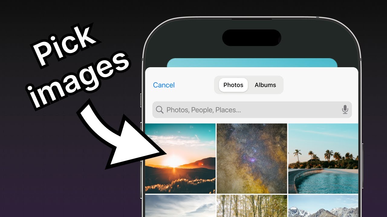
expo-image-pickerprovides access to the system's UI to select images and videos from the phone's library.
Learn how to use expo-image-picker to select images from the device's media library.
1
Install expo-image-picker
To install the expo-image-picker library, stop the development server by pressing Ctrl + c in the terminal, then run the following command:
- npx expo install expo-image-pickerThe npx expo install command will install the library and add it to the project's dependencies in package.json.
Tip: Any time we install a new library in the project, stop the development server by pressing Ctrl + c in the terminal and then run the installation command. After the installation completes, start the development server again by runningnpx expo start.
2
Pick an image from the device's media library
expo-image-picker provides launchImageLibraryAsync() method to display the system UI by choosing an image or a video from the device's media library. We'll use the primary themed button created in the previous chapter to select an image from the device's media library and create a function to launch the device's image library to implement this functionality.
In app/(tabs)/index.tsx, import expo-image-picker library and create a pickImageAsync() function inside the Index component:
// ...rest of the import statements remain unchanged
import * as ImagePicker from 'expo-image-picker';

export default function Index() {
  const pickImageAsync = async () => {
    let result = await ImagePicker.launchImageLibraryAsync({
      mediaTypes: ['images'],
      allowsEditing: true,
      quality: 1,
    });

    if (!result.canceled) {
      console.log(result);
    } else {
      alert('You did not select any image.');
    }
  };

  // ...rest of the code remains same
}
Let's learn what the above code does:
- The
launchImageLibraryAsync()receives an object to specify different options. This object is theImagePickerOptionsobject, which we are passing when invoking the method. - When
allowsEditingis set totrue, the user can crop the image during the selection process on Android and iOS.
3
Update the button component
On pressing the primary button, we'll call the pickImageAsync() function on the Button component. Update the onPress prop of the Button component in components/Button.tsx:
import { StyleSheet, View, Pressable, Text } from 'react-native';
import FontAwesome from '@expo/vector-icons/FontAwesome';

type Props = {
  label: string;
  theme?: 'primary';
  onPress?: () => void;
};

export default function Button({ label, theme, onPress }: Props) {
  if (theme === 'primary') {
    return (
      <View
        style={[
          styles.buttonContainer,
          { borderWidth: 4, borderColor: '#ffd33d', borderRadius: 18 },
        ]}>
        <Pressable style={[styles.button, { backgroundColor: '#fff' }]} onPress={onPress}>
          <FontAwesome name="picture-o" size={18} color="#25292e" style={styles.buttonIcon} />
          <Text style={[styles.buttonLabel, { color: '#25292e' }]}>{label}</Text>
        </Pressable>
      </View>
    );
  }

  return (
    <View style={styles.buttonContainer}>
      <Pressable style={styles.button} onPress={() => alert('You pressed a button.')}>
        <Text style={styles.buttonLabel}>{label}</Text>
      </Pressable>
    </View>
  );
}

const styles = StyleSheet.create({
  buttonContainer: {
    width: 320,
    height: 68,
    marginHorizontal: 20,
    alignItems: 'center',
    justifyContent: 'center',
    padding: 3,
  },
  button: {
    borderRadius: 10,
    width: '100%',
    height: '100%',
    alignItems: 'center',
    justifyContent: 'center',
    flexDirection: 'row',
  },
  buttonIcon: {
    paddingRight: 8,
  },
  buttonLabel: {
    color: '#fff',
    fontSize: 16,
  },
});
In app/(tabs)/index.tsx, add the pickImageAsync() function to the onPress prop on the first <Button>.
import { View, StyleSheet } from 'react-native';
import * as ImagePicker from 'expo-image-picker';

import Button from '@/components/Button';
import ImageViewer from '@/components/ImageViewer';

const PlaceholderImage = require('@/assets/images/background-image.png');

export default function Index() {
  const pickImageAsync = async () => {
    let result = await ImagePicker.launchImageLibraryAsync({
      mediaTypes: ['images'],
      allowsEditing: true,
      quality: 1,
    });

    if (!result.canceled) {
      console.log(result);
    } else {
      alert('You did not select any image.');
    }
  };

  return (
    <View style={styles.container}>
      <View style={styles.imageContainer}>
        <ImageViewer imgSource={PlaceholderImage} />
      </View>
      <View style={styles.footerContainer}>
        <Button theme="primary" label="Choose a photo" onPress={pickImageAsync} />
        <Button label="Use this photo" />
      </View>
    </View>
  );
}

const styles = StyleSheet.create({
  container: {
    flex: 1,
    backgroundColor: '#25292e',
    alignItems: 'center',
  },
  imageContainer: {
    flex: 1,
  },
  footerContainer: {
    flex: 1 / 3,
    alignItems: 'center',
  },
});
The pickImageAsync() function invokes ImagePicker.launchImageLibraryAsync() and then handles the result. The launchImageLibraryAsync() method returns an object containing information about the selected image.
Here is an example of the result object and the properties it contains:
{
  "assets": [
    {
      "assetId": null,
      "base64": null,
      "duration": null,
      "exif": null,
      "fileName": "ea574eaa-f332-44a7-85b7-99704c22b402.jpeg",
      "fileSize": 4513577,
      "height": 4570,
      "mimeType": "image/jpeg",
      "rotation": null,
      "type": "image",
      "uri": "file:///data/user/0/host.exp.exponent/cache/ExperienceData/%2540anonymous%252FStickerSmash-13f21121-fc9d-4ec6-bf89-bf7d6165eb69/ImagePicker/ea574eaa-f332-44a7-85b7-99704c22b402.jpeg",
      "width": 2854
    }
  ],
  "canceled": false
}
{
  "assets": [
    {
      "assetId": "99D53A1F-FEEF-40E1-8BB3-7DD55A43C8B7/L0/001",
      "base64": null,
      "duration": null,
      "exif": null,
      "fileName": "IMG_0004.JPG",
      "fileSize": 2548364,
      "height": 1669,
      "mimeType": "image/jpeg",
      "type": "image",
      "uri": "file:///data/user/0/host.exp.exponent/cache/ExperienceData/%2540anonymous%252FStickerSmash-13f21121-fc9d-4ec6-bf89-bf7d6165eb69/ImagePicker/ea574eaa-f332-44a7-85b7-99704c22b402.jpeg",
      "width": 1668
    }
  ],
  "canceled": false
}
{
  "assets": [
    {
      "fileName": "some-image.png",
      "height": 720,
      "mimeType": "image/png",
      "uri": "data:image/png;base64,iVBORw0KGgoAAAANSUhEUgAABQAA"
    }
  ],
  "canceled": false
}
4
Use the selected image
The result object provides the assets array, which contains the uri of the selected image. Let's take this value from the image picker and use it to show the selected image in the app.
Modify the app/(tabs)/index.tsx file:
- Declare a state variable called
selectedImageusing theuseStatehook from React. We'll use this state variable to hold the URI of the selected image. - Update the
pickImageAsync()function to save the image URI in theselectedImagestate variable. - Pass the
selectedImageas a prop to theImageViewercomponent.
import { View, StyleSheet } from 'react-native';
import * as ImagePicker from 'expo-image-picker';
import { useState } from 'react';

import Button from '@/components/Button';
import ImageViewer from '@/components/ImageViewer';

const PlaceholderImage = require('@/assets/images/background-image.png');

export default function Index() {
  const [selectedImage, setSelectedImage] = useState<string | undefined>(undefined);

  const pickImageAsync = async () => {
    let result = await ImagePicker.launchImageLibraryAsync({
      mediaTypes: ['images'],
      allowsEditing: true,
      quality: 1,
    });

    if (!result.canceled) {
      setSelectedImage(result.assets[0].uri);
    } else {
      alert('You did not select any image.');
    }
  };

  return (
    <View style={styles.container}>
      <View style={styles.imageContainer}>
        <ImageViewer imgSource={PlaceholderImage} selectedImage={selectedImage} />
      </View>
      <View style={styles.footerContainer}>
        <Button theme="primary" label="Choose a photo" onPress={pickImageAsync} />
        <Button label="Use this photo" />
      </View>
    </View>
  );
}

const styles = StyleSheet.create({
  container: {
    flex: 1,
    backgroundColor: '#25292e',
    alignItems: 'center',
  },
  imageContainer: {
    flex: 1,
  },
  footerContainer: {
    flex: 1 / 3,
    alignItems: 'center',
  },
});
Pass the selectedImage prop to the ImageViewer component to display the selected image instead of a placeholder image.
- Modify the components/ImageViewer.tsx file to accept the
selectedImageprop. - The source of the image is getting long, so let's also move it to a separate variable called
imageSource. - Pass
imageSourceas the value of thesourceprop on theImagecomponent.
import { ImageSourcePropType, StyleSheet } from 'react-native';
import { Image } from 'expo-image';

type Props = {
  imgSource: ImageSourcePropType;
  selectedImage?: string;
};

export default function ImageViewer({ imgSource, selectedImage }: Props) {
  const imageSource = selectedImage ? { uri: selectedImage } : imgSource;

  return <Image source={imageSource} style={styles.image} />;
}

const styles = StyleSheet.create({
  image: {
    width: 320,
    height: 440,
    borderRadius: 18,
  },
});
In the above snippet, the Image component uses a conditional operator to load the image's source. The picked image is a uri string, not a local asset like the placeholder image.
Let's take a look at our app now:
The images used for the example app in this tutorial were picked from Unsplash.
Summary
Chapter 4: Use an image picker
We've successfully added the functionality to pick an image from the device's media library.
In the next chapter, we'll learn how to create an emoji picker modal component.