Build a screen
Edit page
In this tutorial, learn how to use components such as React Native's Pressable and Expo Image to build a screen.
In this chapter, we'll create the first screen of the StickerSmash app.
The screen above displays an image and two buttons. The app user can select an image using one of the two buttons. The first button allows the user to select an image from their device. The second button allows the user to continue with a default image provided by the app.
Once the user selects an image, they can add a sticker to it. So, let's start creating this screen.
Build the StickerSmash app's first screen using Pressable, Expo Image, and other core components to create an image picker layout.
1
Break down the screen
Before we build this screen by writing code, let's break it down into some essential elements.
There are two essential elements:
- There is a large image displayed at the center of the screen
- There are two buttons in the bottom half of the screen
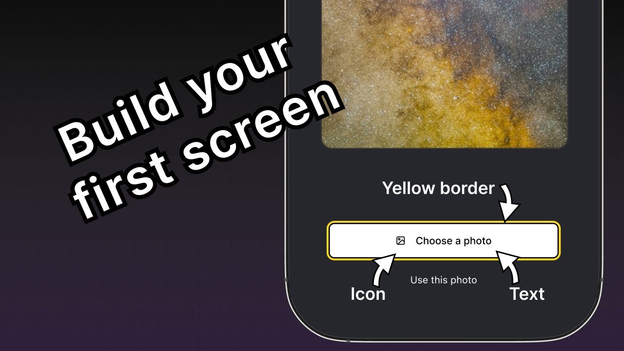
The first button contains multiple components. The parent element provides a yellow border, and contains an icon and text components inside a row.
Now that we've broken down the UI into smaller chunks, we're ready to start coding.
2
Display the image
We'll use expo-image library to display the image in the app. It provides a cross-platform <Image> component to load and render an image. It is already included in the default project template we're using.
The Image component takes the source of an image as its value. The source can be either a static asset or a URL. For example, the source required from assets/images directory is static. It can also come from Network as a uri property.
To use the Image component in app/(tabs)/index.tsx file:
- Import
Imagefrom theexpo-imagelibrary. - Create a
PlaceholderImagevariable to use assets/images/background-image.png file as thesourceprop on theImagecomponent.
import { View, StyleSheet } from 'react-native';
import { Image } from 'expo-image';

const PlaceholderImage = require('@/assets/images/background-image.png');

export default function Index() {
  return (
    <View style={styles.container}>
      <View style={styles.imageContainer}>
        <Image source={PlaceholderImage} style={styles.image} />
      </View>
    </View>
  );
}

const styles = StyleSheet.create({
  container: {
    flex: 1,
    backgroundColor: '#25292e',
    alignItems: 'center',
  },
  imageContainer: {
    flex: 1,
  },
  image: {
    width: 320,
    height: 440,
    borderRadius: 18,
  },
});
3
Divide components into files
Let's divide the code into multiple files as we add more components to this screen. Throughout this tutorial, we'll use the components directory to create custom components.
- Create a top-level components directory, and inside it, create the ImageViewer.tsx file.
- Move the code to display the image in this file along with the
imagestyles.
import { ImageSourcePropType, StyleSheet } from 'react-native';
import { Image } from 'expo-image';

type Props = {
  imgSource: ImageSourcePropType;
};

export default function ImageViewer({ imgSource }: Props) {
  return <Image source={imgSource} style={styles.image} />;
}

const styles = StyleSheet.create({
  image: {
    width: 320,
    height: 440,
    borderRadius: 18,
  },
});
Since ImageViewer is a custom component, we are placing it in a separate directory instead of the app directory. Every file inside app directory is either a layout file or a route file. For more information, see Non-navigation components live outside of app directory.
Import ImageViewer and use it in the app/(tabs)/index.tsx:
import { StyleSheet, View } from 'react-native';

import ImageViewer from '@/components/ImageViewer';

const PlaceholderImage = require('@/assets/images/background-image.png');

export default function Index() {
  return (
    <View style={styles.container}>
      <View style={styles.imageContainer}>
        <ImageViewer imgSource={PlaceholderImage} />
      </View>
    </View>
  );
}

const styles = StyleSheet.create({
  container: {
    flex: 1,
    backgroundColor: '#25292e',
    alignItems: 'center',
  },
  imageContainer: {
    flex: 1,
  },
});
What is the @ in import statement?
The @ symbol is a custom path alias for importing custom components and other modules instead of relative paths. Expo CLI automatically configures it in tsconfig.json.
4
Create buttons using Pressable
React Native includes a few different components for handling touch events, but <Pressable> is recommended for its flexibility. It can detect single taps, long presses, trigger separate events when the button is pushed in and released, and more.
In the design, there are two buttons we need to create. Each has a different style and label. Let's start by creating a reusable component for these buttons. Create a Button.tsx file inside the components directory with the following code:
import { StyleSheet, View, Pressable, Text } from 'react-native';

type Props = {
  label: string;
};

export default function Button({ label }: Props) {
  return (
    <View style={styles.buttonContainer}>
      <Pressable style={styles.button} onPress={() => alert('You pressed a button.')}>
        <Text style={styles.buttonLabel}>{label}</Text>
      </Pressable>
    </View>
  );
}

const styles = StyleSheet.create({
  buttonContainer: {
    width: 320,
    height: 68,
    marginHorizontal: 20,
    alignItems: 'center',
    justifyContent: 'center',
    padding: 3,
  },
  button: {
    borderRadius: 10,
    width: '100%',
    height: '100%',
    alignItems: 'center',
    justifyContent: 'center',
    flexDirection: 'row',
  },
  buttonLabel: {
    color: '#fff',
    fontSize: 16,
  },
});
The app displays an alert when the user taps any of the buttons on the screen. It happens because <Pressable> calls alert() on its onPress prop. Let's import this component into app/(tabs)/index.tsx file and add styles for the <View> that encapsulates these buttons:
import { View, StyleSheet } from 'react-native';

import Button from '@/components/Button';
import ImageViewer from '@/components/ImageViewer';

const PlaceholderImage = require("@/assets/images/background-image.png");

export default function Index() {
  return (
    <View style={styles.container}>
      <View style={styles.imageContainer}>
        <ImageViewer imgSource={PlaceholderImage} />
      </View>
      <View style={styles.footerContainer}>
        <Button label="Choose a photo" />
        <Button label="Use this photo" />
      </View>
    </View>
  );
}

const styles = StyleSheet.create({
  container: {
    flex: 1,
    backgroundColor: '#25292e',
    alignItems: 'center',
  },
  imageContainer: {
    flex: 1,
    paddingTop: 28,
  },
  footerContainer: {
    flex: 1 / 3,
    alignItems: 'center',
  },
});
Let's take a look at our app on Android, iOS and the web:
The second button with the label "Use this photo" resembles the actual button from the design. However, the first button needs more styling to match the design.
5
Enhance the reusable button component
The "Choose a photo" button requires different styling than the "Use this photo" button, so we will add a new button theme prop that will allow us to apply a primary theme. This button also has an icon before the label. We will use an icon from the @expo/vector-icons library.
To load and display the icon on the button, let's use FontAwesome from the library. Modify components/Button.tsx to add the following code snippet:
import { StyleSheet, View, Pressable, Text } from 'react-native';
import FontAwesome from '@expo/vector-icons/FontAwesome';

type Props = {
  label: string;
  theme?: 'primary';
};

export default function Button({ label, theme }: Props) {
  if (theme === 'primary') {
  return (
      <View
        style={[
          styles.buttonContainer,
          { borderWidth: 4, borderColor: '#ffd33d', borderRadius: 18 },
        ]}>
        <Pressable
          style={[styles.button, { backgroundColor: '#fff' }]}
          onPress={() => alert('You pressed a button.')}>
          <FontAwesome name="picture-o" size={18} color="#25292e" style={styles.buttonIcon} />
          <Text style={[styles.buttonLabel, { color: '#25292e' }]}>{label}</Text>
        </Pressable>
      </View>
    );
  }

  return (
    <View style={styles.buttonContainer}>
      <Pressable style={styles.button} onPress={() => alert('You pressed a button.')}>
        <Text style={styles.buttonLabel}>{label}</Text>
      </Pressable>
    </View>
  );
}

const styles = StyleSheet.create({
  buttonContainer: {
    width: 320,
    height: 68,
    marginHorizontal: 20,
    alignItems: 'center',
    justifyContent: 'center',
    padding: 3,
  },
  button: {
    borderRadius: 10,
    width: '100%',
    height: '100%',
    alignItems: 'center',
    justifyContent: 'center',
    flexDirection: 'row',
  },
  buttonIcon: {
    paddingRight: 8,
  },
  buttonLabel: {
    color: '#fff',
    fontSize: 16,
  },
});
Let's learn what the above code does:
- The primary theme button uses inline styles, which overrides the styles defined in
StyleSheet.create()with an object directly passed in thestyleprop. - The
<Pressable>component in the primary theme uses abackgroundColorproperty with a value#fffto set the button's background to white. If we add this property to thestyles.button, the background color value will be set for both the primary theme and the unstyled one. - Inline styles use JavaScript and override the default styles for a specific value.
Now, modify the app/(tabs)/index.tsx file to use the theme="primary" prop on the first button.
import { View, StyleSheet } from 'react-native';

import Button from '@/components/Button';
import ImageViewer from '@/components/ImageViewer';

const PlaceholderImage = require('@/assets/images/background-image.png');

export default function Index() {
  return (
    <View style={styles.container}>
      <View style={styles.imageContainer}>
        <ImageViewer imgSource={PlaceholderImage} />
      </View>
      <View style={styles.footerContainer}>
        <Button theme="primary" label="Choose a photo" />
        <Button label="Use this photo" />
      </View>
    </View>
  );
}

const styles = StyleSheet.create({
  container: {
    flex: 1,
    backgroundColor: '#25292e',
    alignItems: 'center',
  },
  imageContainer: {
    flex: 1,
  },
  footerContainer: {
    flex: 1 / 3,
    alignItems: 'center',
  },
});
Let's take a look at our app on Android, iOS and the web:
Summary
Chapter 3: Build a screen
We've successfully implemented the initial design to start building our app's first screen.
In the next chapter, we'll add the functionality to pick an image from the device's media library.