This documentation is available as Markdown for AI agents and LLMs. See the full Markdown index or append .md to any documentation URL.
Add navigation
Edit page
In this chapter, learn how to add navigation to the Expo app.
In this chapter, we'll learn Expo Router's fundamentals to create stack navigation and a bottom tab bar with two tabs.
Set up file-based routing with Expo Router, create stack navigation between screens, and build a bottom tab bar.
Expo Router basics
Expo Router is a file-based routing framework for React Native and web apps. It manages navigation between screens and uses the same components across multiple platforms. To get started, we need to know about the following conventions:
- app directory: A special directory containing only routes and their layouts. Any files added to this directory become a screen inside our native app and a page on the web.
- Root layout: The app/_layout.tsx file. It defines shared UI elements such as headers and tab bars so they are consistent between different routes.
- File name conventions: Index file names, such as index.tsx, match their parent directory and do not add a path segment. For example, the index.tsx file in the app directory matches
/route. - A route file exports a React component as its default value. It can use either
.js,.jsx,.ts, or.tsxextension. - Android, iOS, and web share a unified navigation structure.
The above list is enough for us to get started. For a complete list of features, see Introduction to Expo Router.
1
Add a new screen to the stack
Let's create a new file named about.tsx inside the app directory. It displays the screen name when the user navigates to the /about route.
import { Text, View, StyleSheet } from 'react-native';

export default function AboutScreen() {
  return (
    <View style={styles.container}>
      <Text style={styles.text}>About screen</Text>
    </View>
  );
}

const styles = StyleSheet.create({
  container: {
    flex: 1,
    backgroundColor: '#25292e',
    justifyContent: 'center',
    alignItems: 'center',
  },
  text: {
    color: '#fff',
  },
});
Inside app/_layout.tsx:
- Add a
<Stack.Screen />component and anoptionsprop to update the title of the/aboutroute. - Update the
/indexroute's title toHomeby addingoptionsprop.
import { Stack } from 'expo-router';

export default function RootLayout() {
  return (
    <Stack>
      <Stack.Screen name="index" options={{ title: 'Home' }} />
      <Stack.Screen name="about" options={{ title: 'About' }} />
    </Stack>
  );
}
What is a Stack?
A stack navigator is the foundation for navigating between different screens in an app. On Android, a stacked route animates on top of the current screen. On iOS, a stacked route animates from the right. Expo Router provides a Stack component to create a navigation stack to add new routes.
2
Navigate between screens
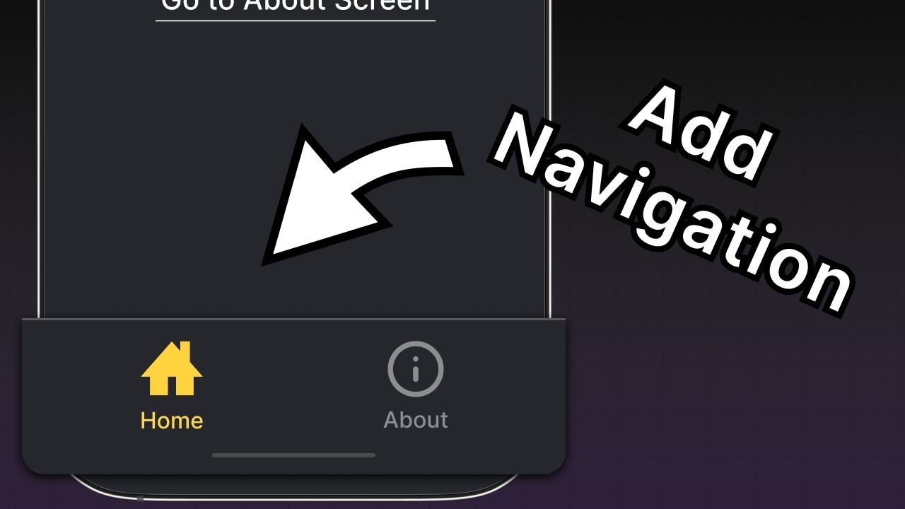
We'll use Expo Router's Link component to navigate from the /index route to the /about route. It is a React component that renders a <Text> with a given href prop.
- Import the
Linkcomponent fromexpo-routerinside index.tsx. - Add a
Linkcomponent after<Text>component and passhrefprop with the/aboutroute. - Add a style of
fontSize,textDecorationLine, andcolortoLinkcomponent. It takes the same props as the<Text>component.
import { Text, View, StyleSheet } from 'react-native';
import { Link } from 'expo-router';

export default function Index() {
  return (
    <View style={styles.container}>
      <Text style={styles.text}>Home screen</Text>
      <Link href="/about" style={styles.button}>
        Go to About screen
      </Link>
    </View>
  );
}

const styles = StyleSheet.create({
  container: {
    flex: 1,
    backgroundColor: '#25292e',
    alignItems: 'center',
    justifyContent: 'center',
  },
  text: {
    color: '#fff',
  },
  button: {
    fontSize: 20,
    textDecorationLine: 'underline',
    color: '#fff',
  },
});
Let's take a look at the changes in our app. Click on Link to navigate to the /about route:
3
Add a not-found route
When a route doesn't exist, we can use a +not-found route to display a fallback screen. This is useful when we want to display a custom screen when navigating to an invalid route on mobile instead of crashing the app or display a 404 error on web. Expo Router uses a special +not-found.tsx file to handle this case.
- Create a new file named +not-found.tsx inside the app directory to add the
NotFoundScreencomponent. - Add
optionsprop from theStack.Screento display a custom screen title for this route. - Add a
Linkcomponent to navigate to the/route, which is our fallback route.
import { View, StyleSheet } from 'react-native';
import { Link, Stack } from 'expo-router';

export default function NotFoundScreen() {
  return (
    <>
      <Stack.Screen options={{ title: 'Oops! Not Found' }} />
      <View style={styles.container}>
        <Link href="/" style={styles.button}>
          Go back to Home screen!
        </Link>
      </View>
    </>
  );
}

const styles = StyleSheet.create({
  container: {
    flex: 1,
    backgroundColor: '#25292e',
    justifyContent: 'center',
    alignItems: 'center',
  },

  button: {
    fontSize: 20,
    textDecorationLine: 'underline',
    color: '#fff',
  },
});
To test this, navigate to http:localhost:8081/123 URL in the web browser since it is easy to change the URL path there. The app should display the NotFoundScreen component:
4
Add a bottom tab navigator
At this point, the file structure of our app directory looks like the following:
app_layout.tsxRoot layoutindex.tsxmatches route '/'about.tsxmatches route '/about'+not-found.tsxmatches route any 404 routeWe'll add a bottom tab navigator to our app and reuse the existing Home and About screens to create a tab layout (a common navigation pattern in many social media apps like X or BlueSky). We'll also use the stack navigator in the Root layout so the +not-found route displays over any other nested navigators.
- Inside the app directory, add a (tabs) subdirectory. This special directory is used to group routes together and display them in a bottom tab bar.
- Create a (tabs)/_layout.tsx file inside the directory. It will be used to define the tab layout, which is separate from Root layout.
- Move the existing index.tsx and about.tsx files inside the (tabs) directory. The structure of app directory will look like this:
app_layout.tsxRoot layout+not-found.tsxmatches route any 404 route(tabs)_layout.tsxTab layoutindex.tsxmatches route '/'about.tsxmatches route '/about'Update the Root layout file to add a (tabs) route:
import { Stack } from 'expo-router';

export default function RootLayout() {
  return (
    <Stack>
      <Stack.Screen name="(tabs)" options={{ headerShown: false }} />
    </Stack>
  );
}
Inside (tabs)/_layout.tsx, add a Tabs component to define the bottom tab layout:
import { Tabs } from 'expo-router';

export default function TabLayout() {
  return (
    <Tabs>
      <Tabs.Screen name="index" options={{ title: 'Home' }} />
      <Tabs.Screen name="about" options={{ title: 'About' }} />
    </Tabs>
  );
}
Let's take a look at our app now to see the new bottom tabs:
5
Update bottom tab navigator appearance
Right now, the bottom tab navigator looks the same on all platforms but doesn't match the style of our app. For example, the tab bar or header doesn't display a custom icon, and the bottom tab background color doesn't match the app's background color.
Modify the (tabs)/_layout.tsx file to add tab bar icons:
- Import
Ioniconsicons set from@expo/vector-icons— a library that includes popular icon sets. - Add the
tabBarIconto both theindexandaboutroutes. This function takesfocusedandcoloras params and renders the icon component. From the icon set, we can provide custom icon names. - Add
screenOptions.tabBarActiveTintColorto theTabscomponent and set its value to#ffd33d. This will change the color of the tab bar icon and label when active.
import { Tabs } from 'expo-router';
import Ionicons from '@expo/vector-icons/Ionicons';

export default function TabLayout() {
  return (
    <Tabs
      screenOptions={{
        tabBarActiveTintColor: '#ffd33d',
      }}
    >
      <Tabs.Screen
        name="index"
        options={{
          title: 'Home',
          tabBarIcon: ({ color, focused }) => (
            <Ionicons name={focused ? 'home-sharp' : 'home-outline'} color={color} size={24} />
          ),
        }}
      />
      <Tabs.Screen
        name="about"
        options={{
          title: 'About',
          tabBarIcon: ({ color, focused }) => (
            <Ionicons name={focused ? 'information-circle' : 'information-circle-outline'} color={color} size={24}/>
          ),
        }}
      />
    </Tabs>
  );
}
Let's also change the background color of the tab bar and header using screenOptions prop:
<Tabs
  screenOptions={{
    tabBarActiveTintColor: '#ffd33d',
    headerStyle: {
      backgroundColor: '#25292e',
    },
    headerShadowVisible: false,
    headerTintColor: '#fff',
    tabBarStyle: {
      backgroundColor: '#25292e',
    },
  }}
>
In the above code:
- The header's background is set to
#25292eusing theheaderStyleproperty. We have also disabled the header's shadow usingheaderShadowVisible. headerTintColorapplies#fffto the header labeltabBarStyle.backgroundColorapplies#25292eto the tab bar
Our app now has a custom bottom tabs navigator:
Summary
Chapter 2: Add navigation
We've successfully added a stack and a tab navigator to our app.
In the next chapter, we'll learn how to build the app's first screen.