This documentation is available as Markdown for AI agents and LLMs. See the full Markdown index or append .md to any documentation URL.
Toolbar
A SwiftUI Toolbar component that places items in the toolbar of the view it wraps.
Expo UI Toolbar matches the official SwiftUI toolbar(content:) API and adds a toolbar to the view it wraps.
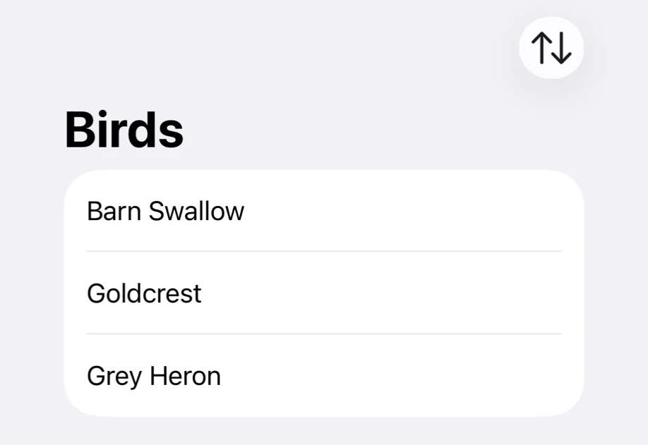
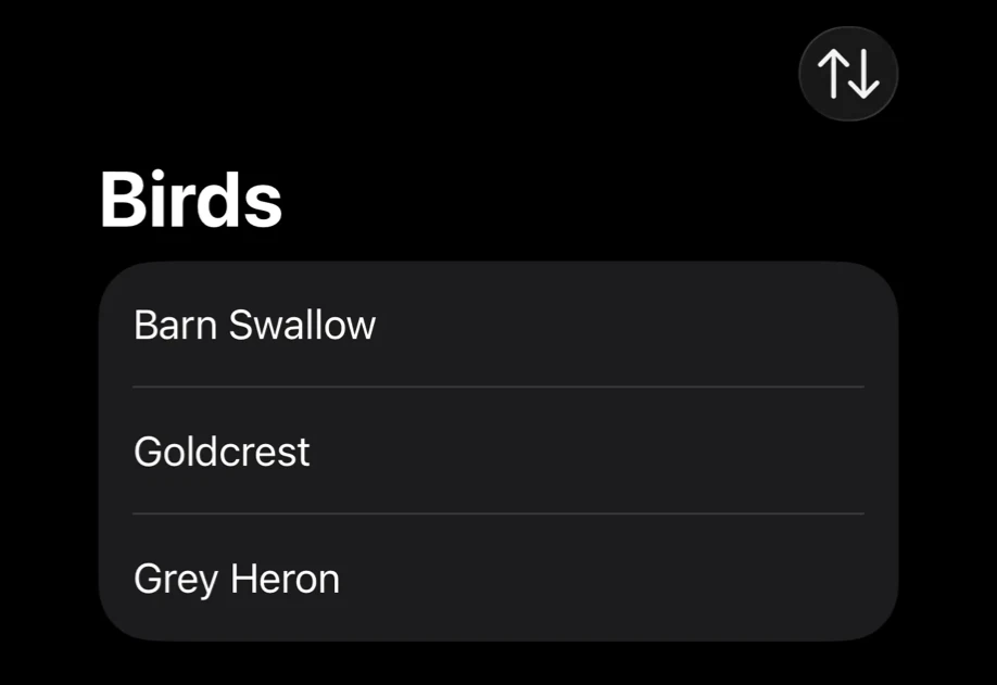
Put the toolbar items in Toolbar.Content. Everything else inside Toolbar is the view the toolbar belongs to. Inside a NavigationStack, the items go into the navigation bar.
Installation
If you are installing this in an existing React Native app, make sure to install expo in your project.
Usage
Buttons in the navigation bar
Set the title with the navigationTitle modifier on Toolbar.
Toolbar item placement
Wrap an item in a ToolbarItem and set its placement. An item without a ToolbarItem uses the automatic placement.
A ToolbarItem has to be inside Toolbar.Content. If the current platform or OS version does not offer a placement, the item uses automatic.
Close button in a sheet
A sheet has no navigation bar of its own, so give its content a NavigationStack. On iOS 26 and later, a Button with role="close" and no label or children shows as a close (X) icon. On earlier versions, set a label and systemImage="xmark" instead.
API
import { Toolbar, ToolbarItem } from '@expo/ui/swift-ui';
Components
Type: React.Element<ToolbarProps>
Adds a toolbar to the view it wraps, matching SwiftUI's toolbar(content:).
Example
<NavigationStack>
  <Toolbar>
    <Text>Bird description</Text>
    <Toolbar.Content>
      <Button role="close" onPress={() => setIsPresented(false)} />
    </Toolbar.Content>
  </Toolbar>
</NavigationStack>
ReactNodeThe view the toolbar belongs to, together with the Toolbar.Content that fills it.
Type: React.Element<ToolbarItemProps>
A single item in a toolbar, matching SwiftUI's ToolbarItem. Place it inside Toolbar.Content
to control where the item appears.
Example
<Toolbar>
  <Text>Bird description</Text>
  <Toolbar.Content>
    <ToolbarItem placement="topBarTrailing">
      <Button systemImage="square.and.arrow.up" onPress={share} />
    </ToolbarItem>
  </Toolbar.Content>
</Toolbar>
ToolbarItemPlacement • Default: 'automatic'The semantic placement of the item within the toolbar.
ToolbarItemVisibilityPriority • Default: 'automatic'How readily the item gives up its place. Items overflow lowest priority first. low and
high apply on iOS and macOS.
Types
Literal type: string
Where an item sits in the toolbar. A placement the current platform or OS version does not
offer falls back to automatic.
See: Official SwiftUI documentation.
Acceptable values are: 'automatic' | 'principal' | 'navigation' | 'primaryAction' | 'secondaryAction' | 'status' | 'confirmationAction' | 'cancellationAction' | 'destructiveAction' | 'keyboard' | 'topBarLeading' | 'topBarTrailing' | 'topBarPinnedTrailing' | 'largeTitle' | 'bottomBar'
Literal type: string
How readily a toolbar item gives up its place when the toolbar runs out of room.
See: Official SwiftUI documentation.
Acceptable values are: 'automatic' | 'low' | 'high'