This documentation is available as Markdown for AI agents and LLMs. See the full Markdown index or append .md to any documentation URL.
NavigationSplitView
A SwiftUI NavigationSplitView component that presents two or three columns side by side.
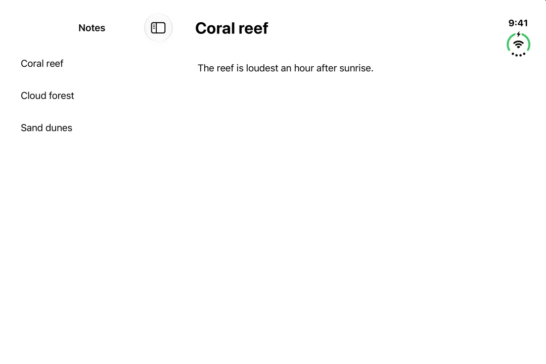
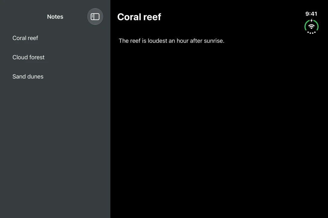
Expo UI NavigationSplitView matches the official SwiftUI NavigationSplitView API and shows two or three columns side by side. The columns collapse into one when there is not enough room.
Installation
If you are installing this in an existing React Native app, make sure to install expo in your project.
Usage
Two columns
Provide NavigationSplitView.Sidebar and NavigationSplitView.Detail. Set the title of each column with the navigationTitle modifier.
On iPhone, only the sidebar shows. On iOS 17 and later, set preferredCompactColumn to 'detail' to open the detail on tap. Pass the value from onPreferredCompactColumnChange back in so the back button works.
Three columns
Add NavigationSplitView.Content between the sidebar and the detail. Set the width of a column with the navigationSplitViewColumnWidth modifier. Set how the columns share the space with the navigationSplitViewStyle modifier.
The split view picks the visible columns by default. Set columnVisibility to 'all' to show every column, or 'detailOnly' to show only the detail. When there is not enough room, it shows fewer columns. Pass the value from onColumnVisibilityChange back in. Otherwise, dragging the divider has no effect.
API
import { NavigationSplitView } from '@expo/ui/swift-ui';
Component
Type: React.Element<NavigationSplitViewProps>
NavigationSplitView uses the native NavigationSplitView view.
It presents a collection, a selection and a detail in one hierarchy: side by side when there is room, and stacked when there is not.
Example
<Host style={{ flex: 1 }}>
  <NavigationSplitView>
    <NavigationSplitView.Sidebar>
      <List>{items}</List>
    </NavigationSplitView.Sidebar>
    <NavigationSplitView.Detail>
      <ItemDetail item={selectedItem} />
    </NavigationSplitView.Detail>
  </NavigationSplitView>
</Host>
ReactNodeThe columns of the split view. Provide NavigationSplitView.Sidebar and
NavigationSplitView.Detail, and add NavigationSplitView.Content for a
three-column layout.
NavigationSplitViewVisibility • Default: 'automatic'The columns to show. Setting it makes the value controlled: pass the value from
onColumnVisibilityChange back in, otherwise dragging the divider has no effect.
Leave it unset to let the split view manage its own columns.
(visibility: NavigationSplitViewVisibility) => voidCalled when the visible columns change, including when the user drags the sidebar.
(column: NavigationSplitViewColumn) => voidCalled when the collapsed column changes.
NavigationSplitViewColumn • Default: 'sidebar'The column to show when the split view collapses to a single column, for example
in a narrow window. Setting it makes the value controlled in the same way as
columnVisibility.
Types
Literal type: string
The column shown when the split view collapses into a single column.
Acceptable values are: 'sidebar' | 'content' | 'detail'