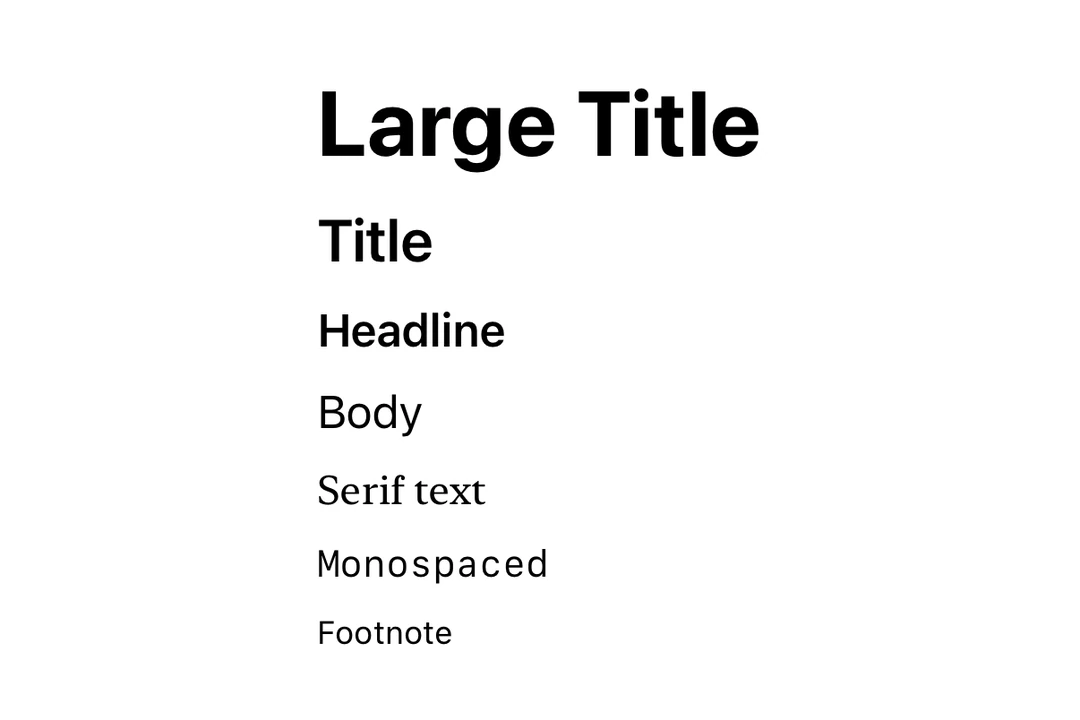
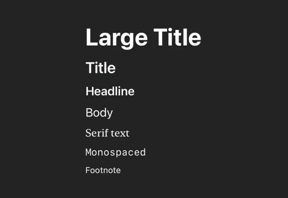
import{Host,Text}from'@expo/ui/swift-ui';import{ font, foregroundStyle }from'@expo/ui/swift-ui/modifiers';exportdefaultfunctionStyledTextExample(){return(<Hoststyle={{ flex:1}}><Textmodifiers={[font({ size:24, weight:'bold'}),foregroundStyle('blue'),]}>
Large Bold Blue Text
</Text></Host>);}
Nested text (per-segment styling)
Nest Text components to style individual segments differently. This is useful for inline formatting, such as bold or colored words within a sentence.
Note: Nested text uses SwiftUI's Text concatenation, so only modifiers that return Text (such as bold, italic, font, foregroundColor, and foregroundStyle with color) will apply to nested segments.
Use the font modifier with a family parameter to use custom fonts. You can load custom fonts using expo-font library.
CustomFontExample.tsx
import{Host,Text,VStack}from'@expo/ui/swift-ui';import{ font }from'@expo/ui/swift-ui/modifiers';exportdefaultfunctionCustomFontExample(){return(<HostmatchContentsstyle={{ alignSelf:'center'}}><VStackspacing={4}><Textmodifiers={[font({ family:'Inter-Bold', size:18})]}>
Inter Bold
</Text><Textmodifiers={[font({ family:'Inter-Regular', size:18})]}>
Inter Regular
</Text></VStack></Host>);}
Text with line limit
Use the lineLimit modifier to truncate text after a certain number of lines.
LineLimitExample.tsx
import{Host,Text}from'@expo/ui/swift-ui';import{ lineLimit }from'@expo/ui/swift-ui/modifiers';exportdefaultfunctionLineLimitExample(){const longText ='This is a very long text that will be truncated after two lines. '.repeat(5);return(<Hoststyle={{ flex:1}}><Textmodifiers={[lineLimit(2)]}>{longText}</Text></Host>);}
Markdown
Use the markdownEnabled property to enable Markdown formatting for the text content.
MarkdownTextExample.tsx
import{Host,Text,VStack}from'@expo/ui/swift-ui';exportdefaultfunctionMarkdownTextExample(){return(<Hoststyle={{ flex:1}}><VStackspacing={4}><TextmarkdownEnabled>Regular text.</Text><TextmarkdownEnabled>
This is **bold text**, *italic text* and ***text in both
bold and italic***.
</Text><TextmarkdownEnabled>~~Strikethrough text~~</Text><TextmarkdownEnabled>`This is monospaced text`</Text><TextmarkdownEnabled>
Visit the [Expo
Docs](https://docs.expo.dev/versions/latest/sdk/ui/) to
learn more about Expo UI
</Text></VStack></Host>);}
Auto-updating date
Use the date and dateStyle props to display a date that automatically updates as time passes. This is especially useful in widgets and Live Activities.
Note:timerInterval, countsDown, and pauseTime require iOS 16.0+ / tvOS 16.0+. On older versions, the timer interval will not render.
Timer width
In a Live Activity, a timer fills the available width. To make it as wide as its text, put a hidden placeholder in an Overlay and show the timer in Overlay.Content. Apply fixedSize to the Overlay, not to the timer. fixedSize on the timer can hide it.
Set the placeholder to the longest value the timer can show, with every digit as 0. Use 0:00 for less than 10 minutes, 00:00 for less than an hour, and 0:00:00 for less than 10 hours. monospacedDigit gives every digit the same width.