This documentation is available as Markdown for AI agents and LLMs. See the full Markdown index or append .md to any documentation URL.
ArrangementView
A SwiftUI ArrangementView component that arranges a primary and a secondary view with an adaptive layout.
Expo UI ArrangementView matches the official SwiftUI ArrangementView API and arranges a primary and a secondary view. The layout adapts to the available size and to hardware features, such as a foldable display.
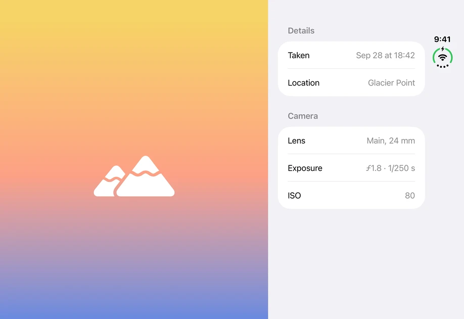
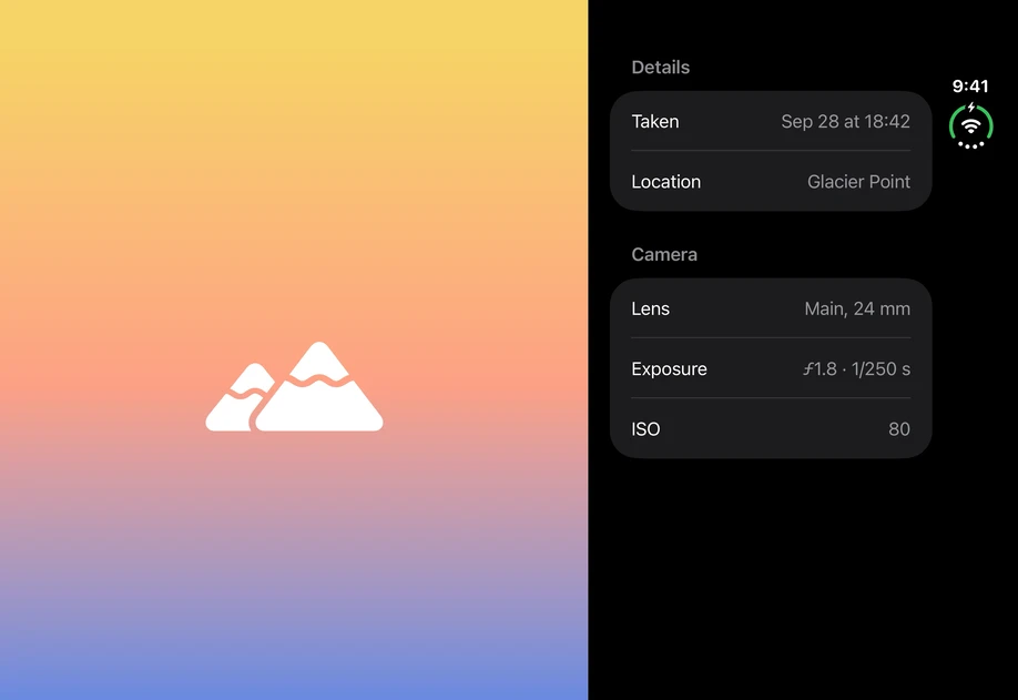
ArrangementView requires iOS 27.1 or later. On earlier versions, the children render without a container.
Installation
If you are installing this in an existing React Native app, make sure to install expo in your project.
Usage
Put the views in ArrangementView.Primary and ArrangementView.Secondary, and choose the layout with the arrangementViewStyle modifier.
Split
The 'split' style places the two views side by side. Limit the size of a view with the splitArrangementLayoutSize modifier. The other view takes the remaining space.
Overlay
The 'overlay' style layers the primary view over the secondary view. Set the edge a view occupies when the arrangement changes to a horizontal or vertical layout with the overlayArrangementEdge modifier.
API
import { ArrangementView } from '@expo/ui/swift-ui';
Component
Type: React.Element<ArrangementViewProps>
ArrangementView uses the native ArrangementView view.
A view that arranges primary and secondary content using an adaptive layout that responds to the environment.
Note: Below iOS 27.1, the children render without a container.
Example
<Host style={{ flex: 1 }}>
  <ArrangementView modifiers={[arrangementViewStyle('split')]}>
    <ArrangementView.Primary>
      <NowPlaying />
    </ArrangementView.Primary>
    <ArrangementView.Secondary>
      <Lyrics />
    </ArrangementView.Secondary>
  </ArrangementView>
</Host>
ReactNodeThe views to arrange. Provide ArrangementView.Primary and ArrangementView.Secondary.