This documentation is available as Markdown for AI agents and LLMs. See the full Markdown index or append .md to any documentation URL.
This is documentation for the next SDK version. For up-to-date documentation, see the latest version (SDK 57).
ScrollView
A scrollable container that supports vertical or horizontal scrolling.
A scrollable container, defaulting to vertical scrolling. Use direction="horizontal" for horizontal lists.
Installation
- npx expo install @expo/uiIf you are installing this in an existing React Native app, make sure to install expo in your project.
Usage
Vertical scrolling
import { useColorScheme } from 'react-native';
import { Host, ScrollView, Column, Text } from '@expo/ui';

export default function VerticalScrollViewExample() {
  const colorScheme = useColorScheme();
  const ink = { color: colorScheme === 'dark' ? '#FFFFFF' : '#000000' };

  return (
    <Host style={{ flex: 1 }}>
      <ScrollView>
        <Column spacing={8}>
          {Array.from({ length: 30 }).map((_, i) => (
            <Text key={i} textStyle={ink}>
              {`Row ${i + 1}`}
            </Text>
          ))}
        </Column>
      </ScrollView>
    </Host>
  );
}
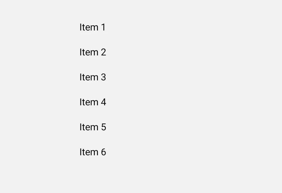
Horizontal scrolling
import { useColorScheme } from 'react-native';
import { Host, ScrollView, Row, Text } from '@expo/ui';

export default function HorizontalScrollViewExample() {
  const colorScheme = useColorScheme();
  const ink = { color: colorScheme === 'dark' ? '#FFFFFF' : '#000000' };

  return (
    <Host matchContents={{ vertical: true }} style={{ width: '100%' }}>
      <ScrollView direction="horizontal">
        <Row spacing={12}>
          {Array.from({ length: 20 }).map((_, i) => (
            <Text key={i} textStyle={ink}>
              {`Item ${i + 1}`}
            </Text>
          ))}
        </Row>
      </ScrollView>
    </Host>
  );
}
API
import { ScrollView } from '@expo/ui';
Component
Type: React.Element<ScrollViewProps>
A scrollable container that supports vertical or horizontal scrolling.
Props for the ScrollView component.
string • Default: 'vertical'Scroll direction.
Acceptable values are: 'vertical' | 'horizontal'
booleanWhether the component is disabled. Disabled components do not respond to user interaction.
ModifierConfig[]Platform-specific modifier escape hatch. Pass an array of modifier configs
from @expo/ui/swift-ui/modifiers or @expo/ui/jetpack-compose/modifiers.
A modifier supplied here replaces any modifier of the same type that the
component derives from style or other props.
() => voidCalled when the component is removed from screen.
Pick<ViewStyle, 'padding' | 'paddingHorizontal' | 'paddingVertical' | 'paddingTop' | 'paddingBottom' | 'paddingLeft' | 'paddingRight' | 'backgroundColor' | 'borderRadius' | 'borderWidth' | 'borderColor' | 'opacity' | 'width' | 'height'>Platform-agnostic style properties. These are translated to SwiftUI modifiers on iOS and Jetpack Compose modifiers on Android.