This documentation is available as Markdown for AI agents and LLMs. See the full Markdown index or append .md to any documentation URL.
モーダルを作成する
ページを編集
このチュートリアルでは、画像を選択するための React Native モーダルを作成する方法を学びます。
React Native は、アプリの他のコンテンツの上にコンテンツを表示する <Modal> コンポーネント を提供します。一般的に、モーダルはユーザーの注意を重要な情報に向けたり、アクションを促したりするために使用されます。たとえば 第 3 章 では、ボタンを押した後に alert() を使ってプレースホルダーのテキストを表示しました。これがモーダルコンポーネントがオーバーレイを表示する仕組みです。
この章では、絵文字ピッカーのリストを表示するモーダルを作成します。
React Native の Modal API を使ってモーダルコンポーネントを構築し、絵文字ピッカーを表示してユーザー操作を処理します。
1
ボタンを表示するための状態変数を宣言する
モーダルを実装する前に、新しいボタンを 3 つ追加します。これらのボタンは、ユーザーがメディアライブラリから画像を選択したり、プレースホルダー画像を使ったりした後に表示されます。ボタンのうちの 1 つが絵文字ピッカーのモーダルを開きます。
app/(tabs)/index.tsx で:
- モーダルを開くボタンや他のオプションの表示・非表示を切り替えるために、ブール値の状態変数
showAppOptionsを宣言します。アプリ画面の読み込み時にはfalseにして、画像を選択する前にはオプションを表示しないようにします。ユーザーが画像を選択したり、プレースホルダー画像を使ったりすると、trueに設定します。 pickImageAsync()関数を更新して、ユーザーが画像を選択した後にshowAppOptionsの値をtrueに設定します。- テーマが設定されていないボタンに、次の値を持つ
onPressプロパティを追加して更新します。
import { View, StyleSheet } from 'react-native';
import * as ImagePicker from 'expo-image-picker';
import { useState } from 'react';

import Button from '@/components/Button';
import ImageViewer from '@/components/ImageViewer';

const PlaceholderImage = require('@/assets/images/background-image.png');

export default function Index() {
  const [selectedImage, setSelectedImage] = useState<string | undefined>(undefined);
  const [showAppOptions, setShowAppOptions] = useState<boolean>(false);

  const pickImageAsync = async () => {
    let result = await ImagePicker.launchImageLibraryAsync({
      mediaTypes: ['images'],
      allowsEditing: true,
      quality: 1,
    });

    if (!result.canceled) {
      setSelectedImage(result.assets[0].uri);
      setShowAppOptions(true);
    } else {
      alert('You did not select any image.');
    }
  };

  return (
    <View style={styles.container}>
      <View style={styles.imageContainer}>
        <ImageViewer imgSource={PlaceholderImage} selectedImage={selectedImage} />
      </View>
      {showAppOptions ? (
        <View />
      ) : (
        <View style={styles.footerContainer}>
          <Button theme="primary" label="Choose a photo" onPress={pickImageAsync} />
          <Button label="Use this photo" onPress={() => setShowAppOptions(true)} />
        </View>
      )}
    </View>
  );
}

const styles = StyleSheet.create({
  container: {
    flex: 1,
    backgroundColor: '#25292e',
    alignItems: 'center',
  },
  imageContainer: {
    flex: 1,
  },
  footerContainer: {
    flex: 1 / 3,
    alignItems: 'center',
  },
});
上記のスニペットでは、showAppOptions の値に応じて Button コンポーネントをレンダリングし、ボタンを三項演算子ブロックの中に移動しています。showAppOptions の値が true の場合は、空の <View> コンポーネントをレンダリングします。この状態については次のステップで対応します。
次に、components/Button.tsx で 2 つ目のボタンをレンダリングする際の Button コンポーネントから alert を削除し、onPress プロパティを更新します。
<Pressable style={styles.button} onPress={onPress}>
2
ボタンを追加する
この章で実装するオプションボタンのレイアウトを分解してみましょう。デザインは次のようになっています。
親の <View> の中に、横一列に並んだ 3 つのボタンが含まれています。中央のプラスアイコン (+) のボタンはモーダルを開くもので、他の 2 つとは異なるスタイルになっています。
components ディレクトリ内に、次のコードで新しい CircleButton.tsx ファイルを作成します。
import { View, Pressable, StyleSheet } from 'react-native';
import MaterialIcons from '@expo/vector-icons/MaterialIcons';

type Props = {
  onPress: () => void;
};

export default function CircleButton({ onPress }: Props) {
  return (
    <View style={styles.circleButtonContainer}>
      <Pressable style={styles.circleButton} onPress={onPress}>
        <MaterialIcons name="add" size={38} color="#25292e" />
      </Pressable>
    </View>
  );
}

const styles = StyleSheet.create({
  circleButtonContainer: {
    width: 84,
    height: 84,
    marginHorizontal: 60,
    borderWidth: 4,
    borderColor: '#ffd33d',
    borderRadius: 42,
    padding: 3,
  },
  circleButton: {
    flex: 1,
    justifyContent: 'center',
    alignItems: 'center',
    borderRadius: 42,
    backgroundColor: '#fff',
  },
});
プラスアイコンを描画するために、このボタンは @expo/vector-icons ライブラリの <MaterialIcons> アイコンセットを使用します。
他の 2 つのボタンも <MaterialIcons> を使い、縦に並んだテキストラベルとアイコンを表示します。components ディレクトリ内に IconButton.tsx という名前のファイルを作成します。このコンポーネントは 3 つのプロパティを受け取ります。
icon:MaterialIconsライブラリのアイコン名に対応します。label: ボタンに表示されるテキストラベルです。onPress: ユーザーがボタンを押したときに実行される関数です。
import { Pressable, StyleSheet, Text } from 'react-native';
import MaterialIcons from '@expo/vector-icons/MaterialIcons';

type Props = {
  icon: keyof typeof MaterialIcons.glyphMap;
  label: string;
  onPress: () => void;
};

export default function IconButton({ icon, label, onPress }: Props) {
  return (
    <Pressable style={styles.iconButton} onPress={onPress}>
      <MaterialIcons name={icon} size={24} color="#fff" />
      <Text style={styles.iconButtonLabel}>{label}</Text>
    </Pressable>
  );
}

const styles = StyleSheet.create({
  iconButton: {
    justifyContent: 'center',
    alignItems: 'center',
  },
  iconButtonLabel: {
    color: '#fff',
    marginTop: 12,
  },
});
app/(tabs)/index.tsx 内で:
CircleButtonとIconButtonコンポーネントをインポートして表示できるようにします。- これらのボタン用に 3 つのプレースホルダー関数を追加します。
onReset()関数はユーザーがリセットボタンを押したときに実行され、画像ピッカーのボタンが再度表示されるようにします。残りの 2 つの関数の機能は後で実装します。
import { View, StyleSheet } from 'react-native';
import * as ImagePicker from 'expo-image-picker';
import { useState } from 'react';

import Button from '@/components/Button';
import ImageViewer from '@/components/ImageViewer';
import IconButton from '@/components/IconButton';
import CircleButton from '@/components/CircleButton';

const PlaceholderImage = require('@/assets/images/background-image.png');

export default function Index() {
  const [selectedImage, setSelectedImage] = useState<string | undefined>(undefined);
  const [showAppOptions, setShowAppOptions] = useState<boolean>(false);

  const pickImageAsync = async () => {
    let result = await ImagePicker.launchImageLibraryAsync({
      mediaTypes: ['images'],
      allowsEditing: true,
      quality: 1,
    });

    if (!result.canceled) {
      setSelectedImage(result.assets[0].uri);
      setShowAppOptions(true);
    } else {
      alert('You did not select any image.');
    }
  };

  const onReset = () => {
    setShowAppOptions(false);
  };

  const onAddSticker = () => {
    // we will implement this later
  };

  const onSaveImageAsync = async () => {
    // we will implement this later
  };

  return (
    <View style={styles.container}>
      <View style={styles.imageContainer}>
        <ImageViewer imgSource={PlaceholderImage} selectedImage={selectedImage} />
      </View>
      {showAppOptions ? (
        <View style={styles.optionsContainer}>
          <View style={styles.optionsRow}>
            <IconButton icon="refresh" label="Reset" onPress={onReset} />
            <CircleButton onPress={onAddSticker} />
            <IconButton icon="save-alt" label="Save" onPress={onSaveImageAsync} />
          </View>
        </View>
      ) : (
        <View style={styles.footerContainer}>
          <Button theme="primary" label="Choose a photo" onPress={pickImageAsync} />
          <Button label="Use this photo" onPress={() => setShowAppOptions(true)} />
        </View>
      )}
    </View>
  );
}

const styles = StyleSheet.create({
  container: {
    flex: 1,
    backgroundColor: '#25292e',
    alignItems: 'center',
  },
  imageContainer: {
    flex: 1,
  },
  footerContainer: {
    flex: 1 / 3,
    alignItems: 'center',
  },
  optionsContainer: {
    position: 'absolute',
    bottom: 80,
  },
  optionsRow: {
    alignItems: 'center',
    flexDirection: 'row',
  },
});
Android、iOS、web でアプリを確認してみましょう。
3
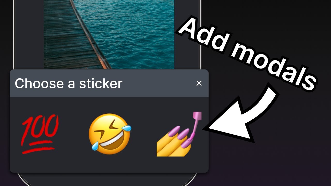
絵文字ピッカーのモーダルを作成する
モーダルでは、利用可能な絵文字のリストからユーザーが絵文字を選択できます。components ディレクトリ内に EmojiPicker.tsx ファイルを作成します。このコンポーネントは 3 つのプロパティを受け取ります。
isVisible: モーダルの表示状態を決定するブール値です。onClose: モーダルを閉じる関数です。children: 後で絵文字のリストを表示するために使用します。
import { Modal, View, Text, Pressable, StyleSheet } from 'react-native';
import { PropsWithChildren } from 'react';
import MaterialIcons from '@expo/vector-icons/MaterialIcons';

type Props = PropsWithChildren<{
  isVisible: boolean;
  onClose: () => void;
}>;

export default function EmojiPicker({ isVisible, children, onClose }: Props) {
  return (
    <View>
      <Modal animationType="slide" transparent={true} visible={isVisible}>
        <View style={styles.modalContent}>
          <View style={styles.titleContainer}>
            <Text style={styles.title}>Choose a sticker</Text>
            <Pressable onPress={onClose}>
              <MaterialIcons name="close" color="#fff" size={22} />
            </Pressable>
          </View>
          {children}
        </View>
      </Modal>
    </View>
  );
}

const styles = StyleSheet.create({
  modalContent: {
    height: '25%',
    width: '100%',
    backgroundColor: '#25292e',
    borderTopRightRadius: 18,
    borderTopLeftRadius: 18,
    position: 'absolute',
    bottom: 0,
  },
  titleContainer: {
    height: '16%',
    backgroundColor: '#464C55',
    borderTopRightRadius: 10,
    borderTopLeftRadius: 10,
    paddingHorizontal: 20,
    flexDirection: 'row',
    alignItems: 'center',
    justifyContent: 'space-between',
  },
  title: {
    color: '#fff',
    fontSize: 16,
  },
});
上記のコードが何をしているのか確認しましょう。
<Modal>コンポーネントはタイトルと閉じるボタンを表示します。visibleプロパティはisVisibleの値を受け取り、モーダルが開いているか閉じているかを制御します。transparentプロパティはブール値で、モーダルがビュー全体を埋めるかどうかを決定します。animationTypeプロパティは、モーダルが画面に表示されるときと消えるときの挙動を決定します。今回は、画面下からスライドして表示されます。- 最後に、
<EmojiPicker>はユーザーが閉じる<Pressable>を押したときにonCloseプロパティを実行します。
それでは、app/(tabs)/index.tsx を変更しましょう。
<EmojiPicker>コンポーネントをインポートします。useStateフックでisModalVisible状態変数を作成します。デフォルト値はfalseで、ユーザーがボタンを押すまでモーダルは非表示のままです。onAddSticker()関数内のコメントを置き換えて、ユーザーがボタンを押したときにisModalVisible変数をtrueに更新します。これで絵文字ピッカーが開きます。isModalVisible状態変数を更新するonModalClose()関数を作成します。Indexコンポーネントの末尾に<EmojiPicker>コンポーネントを配置します。
import { View, StyleSheet } from 'react-native';
import * as ImagePicker from 'expo-image-picker';
import { useState } from 'react';

import Button from '@/components/Button';
import ImageViewer from '@/components/ImageViewer';
import IconButton from '@/components/IconButton';
import CircleButton from '@/components/CircleButton';
import EmojiPicker from '@/components/EmojiPicker';

const PlaceholderImage = require('@/assets/images/background-image.png');

export default function Index() {
  const [selectedImage, setSelectedImage] = useState<string | undefined>(undefined);
  const [showAppOptions, setShowAppOptions] = useState<boolean>(false);
  const [isModalVisible, setIsModalVisible] = useState<boolean>(false);

  const pickImageAsync = async () => {
    let result = await ImagePicker.launchImageLibraryAsync({
      mediaTypes: ['images'],
      allowsEditing: true,
      quality: 1,
    });

    if (!result.canceled) {
      setSelectedImage(result.assets[0].uri);
      setShowAppOptions(true);
    } else {
      alert('You did not select any image.');
    }
  };

  const onReset = () => {
    setShowAppOptions(false);
  };

  const onAddSticker = () => {
    setIsModalVisible(true);
  };

  const onModalClose = () => {
    setIsModalVisible(false);
  };

  const onSaveImageAsync = async () => {
    // we will implement this later
  };

  return (
    <View style={styles.container}>
      <View style={styles.imageContainer}>
        <ImageViewer imgSource={PlaceholderImage} selectedImage={selectedImage} />
      </View>
      {showAppOptions ? (
        <View style={styles.optionsContainer}>
          <View style={styles.optionsRow}>
            <IconButton icon="refresh" label="Reset" onPress={onReset} />
            <CircleButton onPress={onAddSticker} />
            <IconButton icon="save-alt" label="Save" onPress={onSaveImageAsync} />
          </View>
        </View>
      ) : (
        <View style={styles.footerContainer}>
          <Button theme="primary" label="Choose a photo" onPress={pickImageAsync} />
          <Button label="Use this photo" onPress={() => setShowAppOptions(true)} />
        </View>
      )}
      <EmojiPicker isVisible={isModalVisible} onClose={onModalClose}>
        {/* Emoji list component will go here */}
      </EmojiPicker>
    </View>
  );
}

const styles = StyleSheet.create({
  container: {
    flex: 1,
    backgroundColor: '#25292e',
    alignItems: 'center',
  },
  imageContainer: {
    flex: 1,
  },
  footerContainer: {
    flex: 1 / 3,
    alignItems: 'center',
  },
  optionsContainer: {
    position: 'absolute',
    bottom: 80,
  },
  optionsRow: {
    alignItems: 'center',
    flexDirection: 'row',
  },
});
このステップ完了後の結果は次のとおりです。
4
絵文字のリストを表示する
モーダルのコンテンツ内に絵文字の横リストを追加しましょう。これには React Native の <FlatList> コンポーネントを使用します。
components ディレクトリ内に EmojiList.tsx ファイルを作成し、次のコードを追加します。
import { useState } from 'react';
import { ImageSourcePropType, StyleSheet, FlatList, Platform, Pressable } from 'react-native';
import { Image } from 'expo-image';

type Props = {
  onSelect: (image: ImageSourcePropType) => void;
  onCloseModal: () => void;
};

export default function EmojiList({ onSelect, onCloseModal }: Props) {
  const [emoji] = useState<ImageSourcePropType[]>([
    require("../assets/images/emoji1.png"),
    require("../assets/images/emoji2.png"),
    require("../assets/images/emoji3.png"),
    require("../assets/images/emoji4.png"),
    require("../assets/images/emoji5.png"),
    require("../assets/images/emoji6.png"),
  ]);

  return (
    <FlatList
      horizontal
      showsHorizontalScrollIndicator={Platform.OS === 'web'}
      data={emoji}
      contentContainerStyle={styles.listContainer}
      renderItem={({ item, index }) => (
        <Pressable
          onPress={() => {
            onSelect(item);
            onCloseModal();
          }}>
          <Image source={item} key={index} style={styles.image} />
        </Pressable>
      )}
    />
  );
}

const styles = StyleSheet.create({
  listContainer: {
    borderTopRightRadius: 10,
    borderTopLeftRadius: 10,
    paddingHorizontal: 20,
    flexDirection: 'row',
    alignItems: 'center',
    justifyContent: 'space-between',
  },
  image: {
    width: 100,
    height: 100,
    marginRight: 20,
  },
});
上記のコードが何をしているのか確認しましょう。
- 上記の
<FlatList>コンポーネントは、<Pressable>でラップしたImageコンポーネントを使ってすべての絵文字画像をレンダリングします。後ほど、画面上の絵文字をタップすると画像にステッカーとして表示されるよう改良します。 - また、
dataプロパティの値としてemoji配列変数のアイテムの配列を受け取ります。renderItemプロパティはdataから各アイテムを受け取り、リスト内のアイテムとして返します。最後に、このアイテムを表示するためにImageと<Pressable>コンポーネントを追加しました。 horizontalプロパティは、リストを縦ではなく横方向にレンダリングします。showsHorizontalScrollIndicatorは React Native のPlatformモジュールで値を判定し、web では横スクロールバーを表示します。
次に、app/(tabs)/index.tsx を更新して <EmojiList> コンポーネントをインポートし、<EmojiPicker> コンポーネント内のコメントを次のコードスニペットに置き換えます。
import { ImageSourcePropType, View, StyleSheet } from 'react-native';
import * as ImagePicker from 'expo-image-picker';
import { useState } from 'react';

import Button from '@/components/Button';
import ImageViewer from '@/components/ImageViewer';
import IconButton from '@/components/IconButton';
import CircleButton from '@/components/CircleButton';
import EmojiPicker from '@/components/EmojiPicker';
import EmojiList from '@/components/EmojiList';

const PlaceholderImage = require('@/assets/images/background-image.png');

export default function Index() {
  const [selectedImage, setSelectedImage] = useState<string | undefined>(undefined);
  const [showAppOptions, setShowAppOptions] = useState<boolean>(false);
  const [isModalVisible, setIsModalVisible] = useState<boolean>(false);
  const [pickedEmoji, setPickedEmoji] = useState<ImageSourcePropType | undefined>(undefined);

  const pickImageAsync = async () => {
    let result = await ImagePicker.launchImageLibraryAsync({
      mediaTypes: ['images'],
      allowsEditing: true,
      quality: 1,
    });

    if (!result.canceled) {
      setSelectedImage(result.assets[0].uri);
      setShowAppOptions(true);
    } else {
      alert('You did not select any image.');
    }
  };

  const onReset = () => {
    setShowAppOptions(false);
  };

  const onAddSticker = () => {
    setIsModalVisible(true);
  };

  const onModalClose = () => {
    setIsModalVisible(false);
  };

  const onSaveImageAsync = async () => {
    // we will implement this later
  };

  return (
    <View style={styles.container}>
      <View style={styles.imageContainer}>
        <ImageViewer imgSource={PlaceholderImage} selectedImage={selectedImage} />
      </View>
      {showAppOptions ? (
        <View style={styles.optionsContainer}>
          <View style={styles.optionsRow}>
            <IconButton icon="refresh" label="Reset" onPress={onReset} />
            <CircleButton onPress={onAddSticker} />
            <IconButton icon="save-alt" label="Save" onPress={onSaveImageAsync} />
          </View>
        </View>
      ) : (
        <View style={styles.footerContainer}>
          <Button theme="primary" label="Choose a photo" onPress={pickImageAsync} />
          <Button label="Use this photo" onPress={() => setShowAppOptions(true)} />
        </View>
      )}
      <EmojiPicker isVisible={isModalVisible} onClose={onModalClose}>
        <EmojiList onSelect={setPickedEmoji} onCloseModal={onModalClose} />
      </EmojiPicker>
    </View>
  );
}

const styles = StyleSheet.create({
  container: {
    flex: 1,
    backgroundColor: '#25292e',
    alignItems: 'center',
  },
  imageContainer: {
    flex: 1,
  },
  footerContainer: {
    flex: 1 / 3,
    alignItems: 'center',
  },
  optionsContainer: {
    position: 'absolute',
    bottom: 80,
  },
  optionsRow: {
    alignItems: 'center',
    flexDirection: 'row',
  },
});
EmojiList コンポーネントでは、onSelect プロパティで絵文字を選択し、選択後に onCloseModal でモーダルを閉じます。
Android、iOS、web でアプリを確認してみましょう。
5
選択した絵文字を表示する
次に、画像の上に絵文字ステッカーを配置します。components ディレクトリに新しいファイルを作成し、EmojiSticker.tsx という名前にします。そして次のコードを追加します。
import { ImageSourcePropType, View } from 'react-native';
import { Image } from 'expo-image';

type Props = {
  imageSize: number;
  stickerSource: ImageSourcePropType;
};

export default function EmojiSticker({ imageSize, stickerSource }: Props) {
  return (
    <View style={{ top: -350 }}>
      <Image source={stickerSource} style={{ width: imageSize, height: imageSize }} />
    </View>
  );
}
このコンポーネントは 2 つのプロパティを受け取ります。
imageSize:Indexコンポーネント内で定義された値です。次の章で、タップ時に画像サイズを変更するために使用します。stickerSource: 選択された絵文字画像のソースです。
このコンポーネントを app/(tabs)/index.tsx ファイルでインポートし、Index コンポーネントを更新して画像上に絵文字ステッカーを表示します。pickedEmoji 状態が undefined でないかをチェックします。
import { ImageSourcePropType, View, StyleSheet } from 'react-native';
import * as ImagePicker from 'expo-image-picker';
import { useState } from 'react';

import Button from '@/components/Button';
import ImageViewer from '@/components/ImageViewer';
import IconButton from '@/components/IconButton';
import CircleButton from '@/components/CircleButton';
import EmojiPicker from '@/components/EmojiPicker';
import EmojiList from '@/components/EmojiList';
import EmojiSticker from '@/components/EmojiSticker';

const PlaceholderImage = require('@/assets/images/background-image.png');

export default function Index() {
  const [selectedImage, setSelectedImage] = useState<string | undefined>(undefined);
  const [showAppOptions, setShowAppOptions] = useState<boolean>(false);
  const [isModalVisible, setIsModalVisible] = useState<boolean>(false);
  const [pickedEmoji, setPickedEmoji] = useState<ImageSourcePropType | undefined>(undefined);


  const pickImageAsync = async () => {
    let result = await ImagePicker.launchImageLibraryAsync({
      mediaTypes: ['images'],
      allowsEditing: true,
      quality: 1,
    });

    if (!result.canceled) {
      setSelectedImage(result.assets[0].uri);
      setShowAppOptions(true);
    } else {
      alert('You did not select any image.');
    }
  };

  const onReset = () => {
    setShowAppOptions(false);
  };

  const onAddSticker = () => {
    setIsModalVisible(true);
  };

  const onModalClose = () => {
    setIsModalVisible(false);
  };

  const onSaveImageAsync = async () => {
    // we will implement this later
  };

  return (
    <View style={styles.container}>
      <View style={styles.imageContainer}>
        <ImageViewer imgSource={PlaceholderImage} selectedImage={selectedImage} />
        {pickedEmoji && <EmojiSticker imageSize={40} stickerSource={pickedEmoji} />}
      </View>
      {showAppOptions ? (
        <View style={styles.optionsContainer}>
          <View style={styles.optionsRow}>
            <IconButton icon="refresh" label="Reset" onPress={onReset} />
            <CircleButton onPress={onAddSticker} />
            <IconButton icon="save-alt" label="Save" onPress={onSaveImageAsync} />
          </View>
        </View>
      ) : (
        <View style={styles.footerContainer}>
          <Button theme="primary" label="Choose a photo" onPress={pickImageAsync} />
          <Button label="Use this photo" onPress={() => setShowAppOptions(true)} />
        </View>
      )}
      <EmojiPicker isVisible={isModalVisible} onClose={onModalClose}>
        <EmojiList onSelect={setPickedEmoji} onCloseModal={onModalClose} />
      </EmojiPicker>
    </View>
  );
}

const styles = StyleSheet.create({
  container: {
    flex: 1,
    backgroundColor: '#25292e',
    alignItems: 'center',
  },
  imageContainer: {
    flex: 1,
  },
  footerContainer: {
    flex: 1 / 3,
    alignItems: 'center',
  },
  optionsContainer: {
    position: 'absolute',
    bottom: 80,
  },
  optionsRow: {
    alignItems: 'center',
    flexDirection: 'row',
  },
});
Android、iOS、web でアプリを確認してみましょう。
まとめ
第 5 章:モーダルを作成する
絵文字ピッカーのモーダルを作成し、絵文字を選択して画像の上に表示するロジックの実装が完了しました。
次の章では、絵文字をドラッグしたり、タップでサイズを拡大縮小したりする、ジェスチャーを使ったユーザー操作を追加します。