This documentation is available as Markdown for AI agents and LLMs. See the full Markdown index or append .md to any documentation URL.
画面を構築する
ページを編集
このチュートリアルでは、React Native の Pressable や Expo Image などのコンポーネントを使って画面を構築する方法を学びます。
この章では、StickerSmash アプリの最初の画面を作成します。
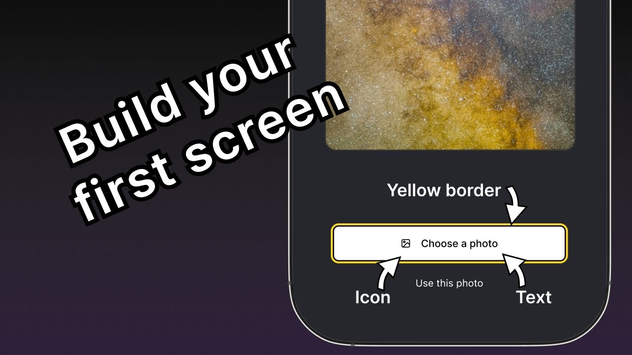
上記の画面には、画像と 2 つのボタンが表示されています。ユーザーはどちらかのボタンを使って画像を選択できます。1 つ目のボタンではデバイスから画像を選択でき、2 つ目のボタンではアプリが用意したデフォルト画像をそのまま使用できます。
ユーザーが画像を選択すると、その画像にステッカーを追加できるようになります。それでは、この画面を作っていきましょう。
Pressable、Expo Image などのコアコンポーネントを使用して、StickerSmash アプリの最初の画面を構築し、画像選択のレイアウトを作成します。
1
2
画像を表示する
アプリ内で画像を表示するために expo-image ライブラリを使用します。このライブラリは、画像を読み込んで描画するためのクロスプラットフォームな <Image> コンポーネントを提供します。使用しているデフォルトのプロジェクトテンプレートにすでに含まれています。
Image コンポーネントは画像のソースを値として受け取ります。ソースには 静的アセット または URL を指定できます。たとえば、assets/images ディレクトリから読み込むソースは静的アセットです。また、uri プロパティを使って ネットワーク から取得することもできます。
app/(tabs)/index.tsx ファイルで Image コンポーネントを使うには:
expo-imageライブラリからImageをインポートします。- assets/images/background-image.png を
Imageコンポーネントのsourceプロパティとして使用するために、PlaceholderImage変数を作成します。
import { View, StyleSheet } from 'react-native';
import { Image } from 'expo-image';

const PlaceholderImage = require('@/assets/images/background-image.png');

export default function Index() {
  return (
    <View style={styles.container}>
      <View style={styles.imageContainer}>
        <Image source={PlaceholderImage} style={styles.image} />
      </View>
    </View>
  );
}

const styles = StyleSheet.create({
  container: {
    flex: 1,
    backgroundColor: '#25292e',
    alignItems: 'center',
  },
  imageContainer: {
    flex: 1,
  },
  image: {
    width: 320,
    height: 440,
    borderRadius: 18,
  },
});
3
コンポーネントをファイルに分割する
この画面にコンポーネントを追加していく中で、コードを複数のファイルに分割しましょう。チュートリアル全体を通して、カスタムコンポーネントの作成には components ディレクトリを使用します。
- トップレベルの components ディレクトリを作成し、その中に ImageViewer.tsx ファイルを作成します。
- 画像を表示するコードと
imageスタイルをこのファイルに移動します。
import { ImageSourcePropType, StyleSheet } from 'react-native';
import { Image } from 'expo-image';

type Props = {
  imgSource: ImageSourcePropType;
};

export default function ImageViewer({ imgSource }: Props) {
  return <Image source={imgSource} style={styles.image} />;
}

const styles = StyleSheet.create({
  image: {
    width: 320,
    height: 440,
    borderRadius: 18,
  },
});
ImageViewer はカスタムコンポーネントであるため、app ディレクトリではなく別のディレクトリに配置しています。app ディレクトリ内のファイルはすべて、レイアウトファイルかルートファイルのいずれかです。詳細については ナビゲーション以外のコンポーネントは app ディレクトリの外に置く を参照してください。
ImageViewer をインポートして、app/(tabs)/index.tsx で使用します。
import { StyleSheet, View } from 'react-native';

import ImageViewer from '@/components/ImageViewer';

const PlaceholderImage = require('@/assets/images/background-image.png');

export default function Index() {
  return (
    <View style={styles.container}>
      <View style={styles.imageContainer}>
        <ImageViewer imgSource={PlaceholderImage} />
      </View>
    </View>
  );
}

const styles = StyleSheet.create({
  container: {
    flex: 1,
    backgroundColor: '#25292e',
    alignItems: 'center',
  },
  imageContainer: {
    flex: 1,
  },
});
import 文の @ とは何ですか?
@ 記号は、相対パスの代わりにカスタムコンポーネントや他のモジュールをインポートするためのカスタム パスエイリアス です。Expo CLI が tsconfig.json で自動的に設定します。
4
Pressable を使ってボタンを作成する
React Native にはタッチイベントを扱うためのコンポーネントがいくつかありますが、柔軟性が高い <Pressable> が推奨されます。シングルタップ、長押し、押下時と解放時で別々のイベントの発火など、さまざまな操作を検出できます。
デザイン上、作成すべきボタンは 2 つあります。それぞれスタイルとラベルが異なります。まずは、これらのボタンの再利用可能なコンポーネントを作成しましょう。components ディレクトリ内に Button.tsx ファイルを作成し、次のコードを記述します。
import { StyleSheet, View, Pressable, Text } from 'react-native';

type Props = {
  label: string;
};

export default function Button({ label }: Props) {
  return (
    <View style={styles.buttonContainer}>
      <Pressable style={styles.button} onPress={() => alert('You pressed a button.')}>
        <Text style={styles.buttonLabel}>{label}</Text>
      </Pressable>
    </View>
  );
}

const styles = StyleSheet.create({
  buttonContainer: {
    width: 320,
    height: 68,
    marginHorizontal: 20,
    alignItems: 'center',
    justifyContent: 'center',
    padding: 3,
  },
  button: {
    borderRadius: 10,
    width: '100%',
    height: '100%',
    alignItems: 'center',
    justifyContent: 'center',
    flexDirection: 'row',
  },
  buttonLabel: {
    color: '#fff',
    fontSize: 16,
  },
});
画面上のいずれかのボタンをタップすると、アプリはアラートを表示します。これは、<Pressable> が onPress プロパティで alert() を呼び出しているためです。このコンポーネントを app/(tabs)/index.tsx ファイルにインポートし、これらのボタンを囲む <View> のスタイルを追加しましょう。
import { View, StyleSheet } from 'react-native';

import Button from '@/components/Button';
import ImageViewer from '@/components/ImageViewer';

const PlaceholderImage = require("@/assets/images/background-image.png");

export default function Index() {
  return (
    <View style={styles.container}>
      <View style={styles.imageContainer}>
        <ImageViewer imgSource={PlaceholderImage} />
      </View>
      <View style={styles.footerContainer}>
        <Button label="Choose a photo" />
        <Button label="Use this photo" />
      </View>
    </View>
  );
}

const styles = StyleSheet.create({
  container: {
    flex: 1,
    backgroundColor: '#25292e',
    alignItems: 'center',
  },
  imageContainer: {
    flex: 1,
    paddingTop: 28,
  },
  footerContainer: {
    flex: 1 / 3,
    alignItems: 'center',
  },
});
Android、iOS、web でアプリを確認してみましょう。
「Use this photo」のラベルが付いた 2 つ目のボタンは、デザイン通りのボタンに近い見た目になっています。一方、1 つ目のボタンはデザインに合わせるために追加のスタイル設定が必要です。
5
再利用可能なボタンコンポーネントを強化する
「Choose a photo」ボタンには「Use this photo」ボタンとは異なるスタイルが必要なので、primary テーマを適用できるよう新しい theme プロパティを追加します。このボタンにはラベルの前にアイコンも表示します。アイコンには @expo/vector-icons ライブラリのものを使用します。
ボタンにアイコンを読み込んで表示するために、ライブラリから FontAwesome を使いましょう。components/Button.tsx を修正して、次のコードスニペットを追加します。
import { StyleSheet, View, Pressable, Text } from 'react-native';
import FontAwesome from '@expo/vector-icons/FontAwesome';

type Props = {
  label: string;
  theme?: 'primary';
};

export default function Button({ label, theme }: Props) {
  if (theme === 'primary') {
  return (
      <View
        style={[
          styles.buttonContainer,
          { borderWidth: 4, borderColor: '#ffd33d', borderRadius: 18 },
        ]}>
        <Pressable
          style={[styles.button, { backgroundColor: '#fff' }]}
          onPress={() => alert('You pressed a button.')}>
          <FontAwesome name="picture-o" size={18} color="#25292e" style={styles.buttonIcon} />
          <Text style={[styles.buttonLabel, { color: '#25292e' }]}>{label}</Text>
        </Pressable>
      </View>
    );
  }

  return (
    <View style={styles.buttonContainer}>
      <Pressable style={styles.button} onPress={() => alert('You pressed a button.')}>
        <Text style={styles.buttonLabel}>{label}</Text>
      </Pressable>
    </View>
  );
}

const styles = StyleSheet.create({
  buttonContainer: {
    width: 320,
    height: 68,
    marginHorizontal: 20,
    alignItems: 'center',
    justifyContent: 'center',
    padding: 3,
  },
  button: {
    borderRadius: 10,
    width: '100%',
    height: '100%',
    alignItems: 'center',
    justifyContent: 'center',
    flexDirection: 'row',
  },
  buttonIcon: {
    paddingRight: 8,
  },
  buttonLabel: {
    color: '#fff',
    fontSize: 16,
  },
});
上記のコードが何をしているのか確認しましょう。
- primary テーマのボタンは インラインスタイル を使用し、
styleプロパティに直接渡したオブジェクトでStyleSheet.create()で定義したスタイルを上書きします。 - primary テーマの
<Pressable>コンポーネントは、backgroundColorプロパティに値#fffを指定して、ボタンの背景を白に設定しています。このプロパティをstyles.buttonに追加すると、primary テーマと未指定のテーマの両方に背景色が適用されてしまいます。 - インラインスタイルは JavaScript を使用し、特定の値についてデフォルトのスタイルを上書きします。
次に、app/(tabs)/index.tsx ファイルを修正して、1 つ目のボタンに theme="primary" プロパティを設定します。
import { View, StyleSheet } from 'react-native';

import Button from '@/components/Button';
import ImageViewer from '@/components/ImageViewer';

const PlaceholderImage = require('@/assets/images/background-image.png');

export default function Index() {
  return (
    <View style={styles.container}>
      <View style={styles.imageContainer}>
        <ImageViewer imgSource={PlaceholderImage} />
      </View>
      <View style={styles.footerContainer}>
        <Button theme="primary" label="Choose a photo" />
        <Button label="Use this photo" />
      </View>
    </View>
  );
}

const styles = StyleSheet.create({
  container: {
    flex: 1,
    backgroundColor: '#25292e',
    alignItems: 'center',
  },
  imageContainer: {
    flex: 1,
  },
  footerContainer: {
    flex: 1 / 3,
    alignItems: 'center',
  },
});
Android、iOS、web でアプリを確認してみましょう。
まとめ
第 3 章:画面を構築する
アプリの最初の画面の構築に向けて、初期デザインの実装が完了しました。
次の章では、デバイスのメディアライブラリから画像を選択する機能を追加します。