This documentation is available as Markdown for AI agents and LLMs. See the full Markdown index or append .md to any documentation URL.
Switch
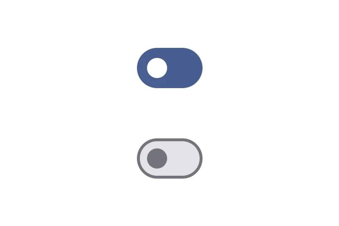
A Jetpack Compose Switch component for toggle controls.
For cross-platform usage, see the universalSwitch— it renders the appropriate native component per platform.
Expo UI Switch matches the official Jetpack Compose Switch API.
Installation
- npx expo install @expo/uiIf you are installing this in an existing React Native app, make sure to install expo in your project.
Usage
Toggle switch
import { useState } from 'react';
import { Host, Switch } from '@expo/ui/jetpack-compose';

export default function ToggleSwitchExample() {
  const [checked, setChecked] = useState(false);

  return (
    <Host matchContents>
      <Switch value={checked} onCheckedChange={setChecked} />
    </Host>
  );
}
Custom colors
import { useState } from 'react';
import { Host, Switch } from '@expo/ui/jetpack-compose';

export default function CustomColorsExample() {
  const [checked, setChecked] = useState(false);

  return (
    <Host matchContents>
      <Switch
        value={checked}
        onCheckedChange={setChecked}
        colors={{
          checkedThumbColor: '#6200EE',
          checkedTrackColor: '#EDE9FE',
          uncheckedThumbColor: '#9CA3AF',
          uncheckedTrackColor: '#F3F4F6',
          uncheckedBorderColor: '#D1D5DB',
        }}
      />
    </Host>
  );
}
Custom thumb content
Use Switch.ThumbContent to render a custom element inside the thumb. Switch.DefaultIconSize gives you the M3 default icon size so your content fits perfectly.
import { useState } from 'react';
import { Host, Switch, Box } from '@expo/ui/jetpack-compose';
import { size, clip, background, Shapes } from '@expo/ui/jetpack-compose/modifiers';

export default function ThumbContentExample() {
  const [checked, setChecked] = useState(false);

  return (
    <Host matchContents>
      <Switch
        value={checked}
        onCheckedChange={setChecked}
        colors={{
          checkedThumbColor: '#7C3AED',
          checkedTrackColor: '#EDE9FE',
          checkedIconColor: '#7C3AED',
          uncheckedThumbColor: '#9CA3AF',
          uncheckedTrackColor: '#F3F4F6',
          uncheckedBorderColor: '#D1D5DB',
          uncheckedIconColor: '#9CA3AF',
        }}>
        <Switch.ThumbContent>
          <Box
            modifiers={[
              size(Switch.DefaultIconSize, Switch.DefaultIconSize),
              clip(Shapes.Circle),
              background(checked ? '#FFFFFF' : '#E5E7EB'),
            ]}
          />
        </Switch.ThumbContent>
      </Switch>
    </Host>
  );
}
API
import { Switch } from '@expo/ui/jetpack-compose';
Components
Type: React.Element<SwitchProps>
A switch component.
(value: boolean) => voidCallback function that is called when the checked state changes.
Type: React.Element<ThumbContentProps>
Custom content to be displayed inside the switch thumb.
Types
Colors for switch core elements.
| Property | Type | Description |
|---|---|---|
| checkedBorderColor(optional) | ColorValue | - |
| checkedIconColor(optional) | ColorValue | - |
| checkedThumbColor(optional) | ColorValue | - |
| checkedTrackColor(optional) | ColorValue | - |
| disabledCheckedBorderColor(optional) | ColorValue | - |
| disabledCheckedIconColor(optional) | ColorValue | - |
| disabledCheckedThumbColor(optional) | ColorValue | - |
| disabledCheckedTrackColor(optional) | ColorValue | - |
| disabledUncheckedBorderColor(optional) | ColorValue | - |
| disabledUncheckedIconColor(optional) | ColorValue | - |
| disabledUncheckedThumbColor(optional) | ColorValue | - |
| disabledUncheckedTrackColor(optional) | ColorValue | - |
| uncheckedBorderColor(optional) | ColorValue | - |
| uncheckedIconColor(optional) | ColorValue | - |
| uncheckedThumbColor(optional) | ColorValue | - |
| uncheckedTrackColor(optional) | ColorValue | - |