This documentation is available as Markdown for AI agents and LLMs. See the full Markdown index or append .md to any documentation URL.
ToggleButton
Jetpack Compose ToggleButton components for displaying native Material3 toggle buttons.
Expo UI provides four toggle button components that match the official Jetpack Compose Toggle Button API: ToggleButton, IconToggleButton, FilledIconToggleButton, and OutlinedIconToggleButton.
Installation
- npx expo install @expo/uiIf you are installing this in an existing React Native app, make sure to install expo in your project.
Usage
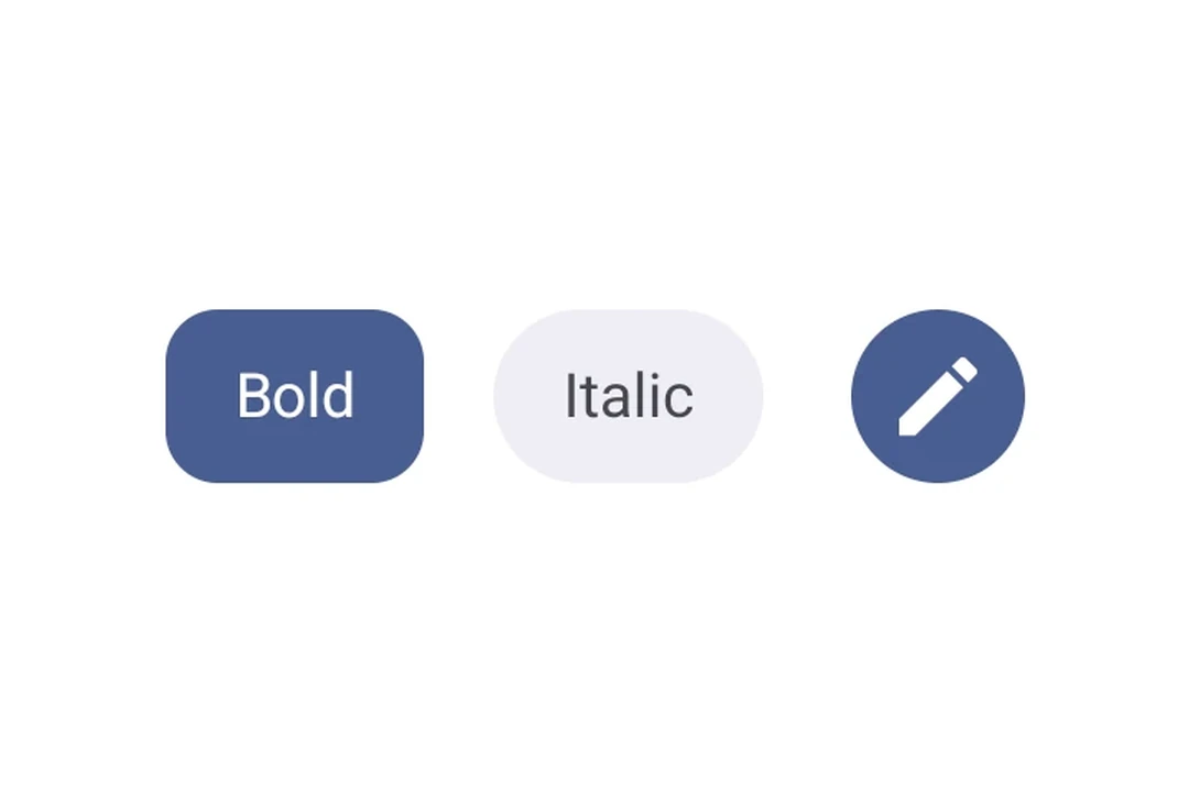
Basic toggle button
A toggle button with text and icon content.
import { useState } from 'react';
import { Host, ToggleButton, Text } from '@expo/ui/jetpack-compose';

export default function BasicToggleButtonExample() {
  const [checked, setChecked] = useState(false);

  return (
    <Host matchContents>
      <ToggleButton checked={checked} onCheckedChange={setChecked}>
        <Text>Favorite</Text>
      </ToggleButton>
    </Host>
  );
}
Icon toggle button variants
Use different icon toggle button components to convey varying levels of emphasis.
import { useState } from 'react';
import {
  Host,
  IconToggleButton,
  FilledIconToggleButton,
  OutlinedIconToggleButton,
  Icon,
  Row,
} from '@expo/ui/jetpack-compose';

const starIcon = require('./assets/star.png');

export default function IconToggleButtonVariantsExample() {
  const [checked1, setChecked1] = useState(false);
  const [checked2, setChecked2] = useState(true);
  const [checked3, setChecked3] = useState(false);

  return (
    <Host matchContents>
      <Row horizontalArrangement={{ spacedBy: 8 }}>
        <IconToggleButton checked={checked1} onCheckedChange={setChecked1}>
          <Icon source={starIcon} size={24} />
        </IconToggleButton>
        <FilledIconToggleButton checked={checked2} onCheckedChange={setChecked2}>
          <Icon source={starIcon} size={24} />
        </FilledIconToggleButton>
        <OutlinedIconToggleButton checked={checked3} onCheckedChange={setChecked3}>
          <Icon source={starIcon} size={24} />
        </OutlinedIconToggleButton>
      </Row>
    </Host>
  );
}
Custom colors
Override checked and unchecked colors using the colors prop.
import { useState } from 'react';
import { Host, ToggleButton, Text } from '@expo/ui/jetpack-compose';

export default function CustomColorsToggleButtonExample() {
  const [checked, setChecked] = useState(true);

  return (
    <Host matchContents>
      <ToggleButton
        checked={checked}
        onCheckedChange={setChecked}
        colors={{
          checkedContainerColor: '#4CAF50',
          checkedContentColor: '#FFFFFF',
          containerColor: '#E0E0E0',
          contentColor: '#333333',
        }}>
        <Text>{checked ? 'ON' : 'OFF'}</Text>
      </ToggleButton>
    </Host>
  );
}
Disabled toggle button
import { Host, ToggleButton, Text } from '@expo/ui/jetpack-compose';

export default function DisabledToggleButtonExample() {
  return (
    <Host matchContents>
      <ToggleButton checked={false} enabled={false}>
        <Text>Disabled</Text>
      </ToggleButton>
    </Host>
  );
}
API
import {
  ToggleButton,
  IconToggleButton,
  FilledIconToggleButton,
  OutlinedIconToggleButton,
} from '@expo/ui/jetpack-compose';
Components
Type: React.Element<ToggleButtonProps>
A filled icon toggle button with a solid background.
Type: React.Element<ToggleButtonProps>
An icon toggle button with no background.
Type: React.Element<ToggleButtonProps>
An outlined icon toggle button with a border and no fill.
Type: React.Element<ToggleButtonProps>
A toggle button component that can be toggled on and off.
boolean • Default: trueWhether the button is enabled for user interaction.
Type: React.Element<number>
Types
Colors for toggle button elements.
| Property | Type | Description |
|---|---|---|
| checkedContainerColor(optional) | ColorValue | - |
| checkedContentColor(optional) | ColorValue | - |
| containerColor(optional) | ColorValue | - |
| contentColor(optional) | ColorValue | - |
| disabledContainerColor(optional) | ColorValue | - |
| disabledContentColor(optional) | ColorValue | - |