This documentation is available as Markdown for AI agents and LLMs. See the full Markdown index or append .md to any documentation URL.
DropdownMenu A Jetpack Compose DropdownMenu component for displaying dropdown menus.
Recommended version:
~58.0.23
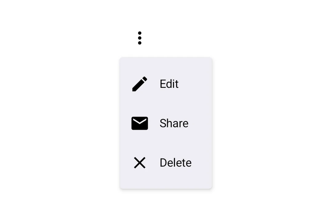
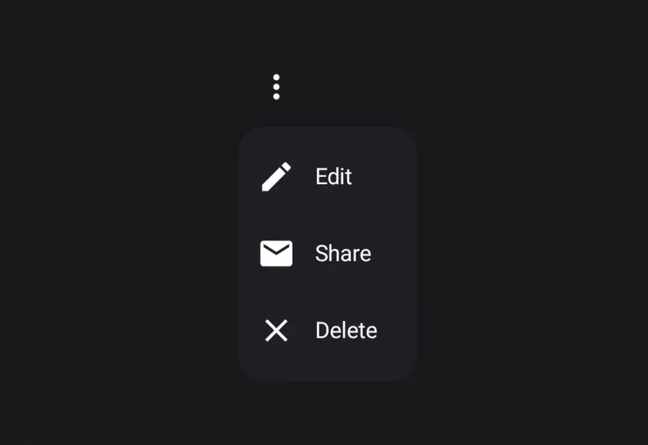
Expo UI DropdownMenu matches the official Jetpack Compose Menu API and displays a dropdown menu when a trigger element is pressed.
Installation
- npx expo install @expo/ui
- yarn expo install @expo/ui
- pnpm expo install @expo/ui
- bun expo install @expo/ui
If you are installing this in an existing React Native app , make sure to install expo in your project.
Usage
BasicDropdownMenuExample.tsx import {
Host ,
DropdownMenu ,
DropdownMenuItem ,
OutlinedButton ,
Text ,
Icon ,
} from '@expo/ui/jetpack-compose' ;
import { useState } from 'react' ;
const homeIcon = require ( './assets/home.xml' ) ;
export default function BasicDropdownMenuExample ( ) {
const [ isExpanded, setIsExpanded] = useState ( false ) ;
return (
< Host matchContents >
< DropdownMenu expanded = { isExpanded} onDismissRequest = { ( ) => setIsExpanded ( false ) } >
< DropdownMenu.Trigger >
< OutlinedButton onClick = { ( ) => setIsExpanded ( true ) } >
< Text > Show menu </ Text >
</ OutlinedButton >
</ DropdownMenu.Trigger >
< DropdownMenu.Items >
< DropdownMenuItem onClick = { ( ) => {
setIsExpanded ( false ) ;
console . log ( 'Home pressed' ) ;
} } >
< DropdownMenuItem.Text >
< Text > Home </ Text >
</ DropdownMenuItem.Text >
< DropdownMenuItem.LeadingIcon >
< Icon source = { homeIcon} size = { 24 } />
</ DropdownMenuItem.LeadingIcon >
</ DropdownMenuItem >
</ DropdownMenu.Items >
</ DropdownMenu >
</ Host > ) ;
}
React Native components as trigger
You can use a React Native view (such as Pressable) as the dropdown's trigger by wrapping it in RNHostView
RNTriggerDropdownMenuExample.tsx import {
Host ,
DropdownMenu ,
DropdownMenuItem ,
Text as ComposeText ,
RNHostView ,
} from '@expo/ui/jetpack-compose' ;
import { useState } from 'react' ;
import { Pressable , Text } from 'react-native' ;
export default function RNTriggerDropdownMenuExample ( ) {
const [ isExpanded, setIsExpanded] = useState ( false ) ;
return (
< Host matchContents >
< DropdownMenu expanded = { isExpanded} onDismissRequest = { ( ) => setIsExpanded ( false ) } >
< DropdownMenu.Trigger >
< RNHostView matchContents >
< Pressable onPress = { ( ) => setIsExpanded ( true ) } style = { {
alignSelf: 'flex-start' ,
paddingHorizontal: 16 ,
paddingVertical: 10 ,
borderRadius: 8 ,
backgroundColor: '#9B59B6' ,
} } >
< Text style = { { color: 'white' , fontWeight: '600' } } >
RN Pressable Trigger
</ Text >
</ Pressable >
</ RNHostView >
</ DropdownMenu.Trigger >
< DropdownMenu.Items >
< DropdownMenuItem onClick = { ( ) => setIsExpanded ( false ) } >
< DropdownMenuItem.Text >
< ComposeText > Item 1 </ ComposeText >
</ DropdownMenuItem.Text >
</ DropdownMenuItem >
< DropdownMenuItem onClick = { ( ) => setIsExpanded ( false ) } >
< DropdownMenuItem.Text >
< ComposeText > Item 2 </ ComposeText >
</ DropdownMenuItem.Text >
</ DropdownMenuItem >
</ DropdownMenu.Items >
</ DropdownMenu >
</ Host > ) ;
}
Long-press trigger
Jetpack Compose has no dedicated long-press menu primitive — you compose one from a combinedClickableDropdownMenu. The menu anchors to the trigger automatically.
LongPressDropdownMenuExample.tsx import {
Host ,
DropdownMenu ,
DropdownMenuItem ,
Text ,
} from '@expo/ui/jetpack-compose' ;
import {
background,
combinedClickable,
} from '@expo/ui/jetpack-compose/modifiers' ;
import { useState } from 'react' ;
export default function LongPressDropdownMenuExample ( ) {
const [ isExpanded, setIsExpanded] = useState ( false ) ;
return (
< Host matchContents >
< DropdownMenu expanded = { isExpanded} onDismissRequest = { ( ) => setIsExpanded ( false ) } >
< DropdownMenu.Trigger >
< Text modifiers = { [
background ( '#e0e0e0' ) ,
combinedClickable ( {
onClick : ( ) => console . log ( 'Short tap' ) ,
onLongClick : ( ) => setIsExpanded ( true ) ,
} ) ,
] } >
Long-press me
</ Text >
</ DropdownMenu.Trigger >
< DropdownMenu.Items >
< DropdownMenuItem onClick = { ( ) => setIsExpanded ( false ) } >
< DropdownMenuItem.Text >
< Text > Copy </ Text >
</ DropdownMenuItem.Text >
</ DropdownMenuItem >
< DropdownMenuItem elementColors = { { textColor: '#B3261E' } } onClick = { ( ) => setIsExpanded ( false ) } >
< DropdownMenuItem.Text >
< Text > Delete </ Text >
</ DropdownMenuItem.Text >
</ DropdownMenuItem >
</ DropdownMenu.Items >
</ DropdownMenu >
</ Host > ) ;
}
Rounded corners
Use cornerRadius to override the default Material3 menu shape with a custom corner radius (in dp).
RoundedDropdownMenuExample.tsx import {
Host ,
DropdownMenu ,
DropdownMenuItem ,
OutlinedButton ,
Text ,
} from '@expo/ui/jetpack-compose' ;
import { useState } from 'react' ;
export default function RoundedDropdownMenuExample ( ) {
const [ isExpanded, setIsExpanded] = useState ( false ) ;
return (
< Host matchContents >
< DropdownMenu expanded = { isExpanded} onDismissRequest = { ( ) => setIsExpanded ( false ) } cornerRadius = { 16 } >
< DropdownMenu.Trigger >
< OutlinedButton onClick = { ( ) => setIsExpanded ( true ) } >
< Text > Show menu </ Text >
</ OutlinedButton >
</ DropdownMenu.Trigger >
< DropdownMenu.Items >
< DropdownMenuItem onClick = { ( ) => setIsExpanded ( false ) } >
< DropdownMenuItem.Text >
< Text > Item 1 </ Text >
</ DropdownMenuItem.Text >
</ DropdownMenuItem >
</ DropdownMenu.Items >
</ DropdownMenu >
</ Host > ) ;
}
Shadow elevation
Use shadowElevation to set the popup shadow elevation in dp. Set it to 0 to remove the shadow, or omit it to use Material 3's default. Modifiers on DropdownMenu apply to the trigger container, so shadow modifiers do not change the popup shadow.
ShadowDropdownMenuExample.tsx import {
Host ,
DropdownMenu ,
DropdownMenuItem ,
OutlinedButton ,
Text ,
} from '@expo/ui/jetpack-compose' ;
import { useState } from 'react' ;
export default function ShadowDropdownMenuExample ( ) {
const [ isExpanded, setIsExpanded] = useState ( false ) ;
return (
< Host matchContents >
< DropdownMenu expanded = { isExpanded} onDismissRequest = { ( ) => setIsExpanded ( false ) } shadowElevation = { 1 } >
< DropdownMenu.Trigger >
< OutlinedButton onClick = { ( ) => setIsExpanded ( true ) } >
< Text > Show menu </ Text >
</ OutlinedButton >
</ DropdownMenu.Trigger >
< DropdownMenu.Items >
< DropdownMenuItem onClick = { ( ) => setIsExpanded ( false ) } >
< DropdownMenuItem.Text >
< Text > Item 1 </ Text >
</ DropdownMenuItem.Text >
</ DropdownMenuItem >
</ DropdownMenu.Items >
</ DropdownMenu >
</ Host > ) ;
}
API
import { DropdownMenu } from '@expo/ui/jetpack-compose' ;
Components Type: React.Element < DropdownMenuProps >
Props of the DropdownMenu component.
The contents of the submenu are used as an anchor for the dropdown menu.
The children will be wrapped in a pressable element, which triggers opening of the dropdown menu.
Optional • Type:
ColorValue The color of the container holding the dropdown menu items.
Optional • Type: number
Corner radius in dp for the dropdown menu container. Defaults to the Material3
MenuDefaults.shape corner radius.
Optional • Type: boolean
Whether the dropdown menu is expanded (visible).
Optional • Type: ModifierConfig[]
Modifiers for the component.
Optional • Type: ( ) => void
Callback fired when the menu requests to be dismissed (e.g. tapping outside).
Must be provided when expanded is true to allow the menu to close.
Optional • Type:
PopupProperties Properties for the popup window of the dropdown menu.
Optional • Type: number
Shadow elevation of the dropdown menu popup in dp. Set to 0 to remove the shadow.
Defaults to Material3's MenuDefaults.ShadowElevation.
Optional • Type:
StyleProp< ViewStyle > Optional styles to apply to the DropdownMenu.
Type: React.Element < DropdownMenuItemProps>
A dropdown menu item component that wraps Compose's DropdownMenuItem.
Should be used inside DropdownMenu.Items or ExposedDropdownMenu.
Type: React.Element < {
children: ReactNode
} >
Container for items displayed in the dropdown menu.
Children should be DropdownMenuItem components or other native views.
Type: React.Element < {
children: ReactNode
} >
Preview content shown during long press (iOS only).
Type: React.Element < {
children: ReactNode
} >
Container for the trigger element that opens the dropdown menu.
Types Properties for the popup window, matching PopupProperties in Compose.