This documentation is available as Markdown for AI agents and LLMs. See the full Markdown index or append .md to any documentation URL.
DateTimePicker
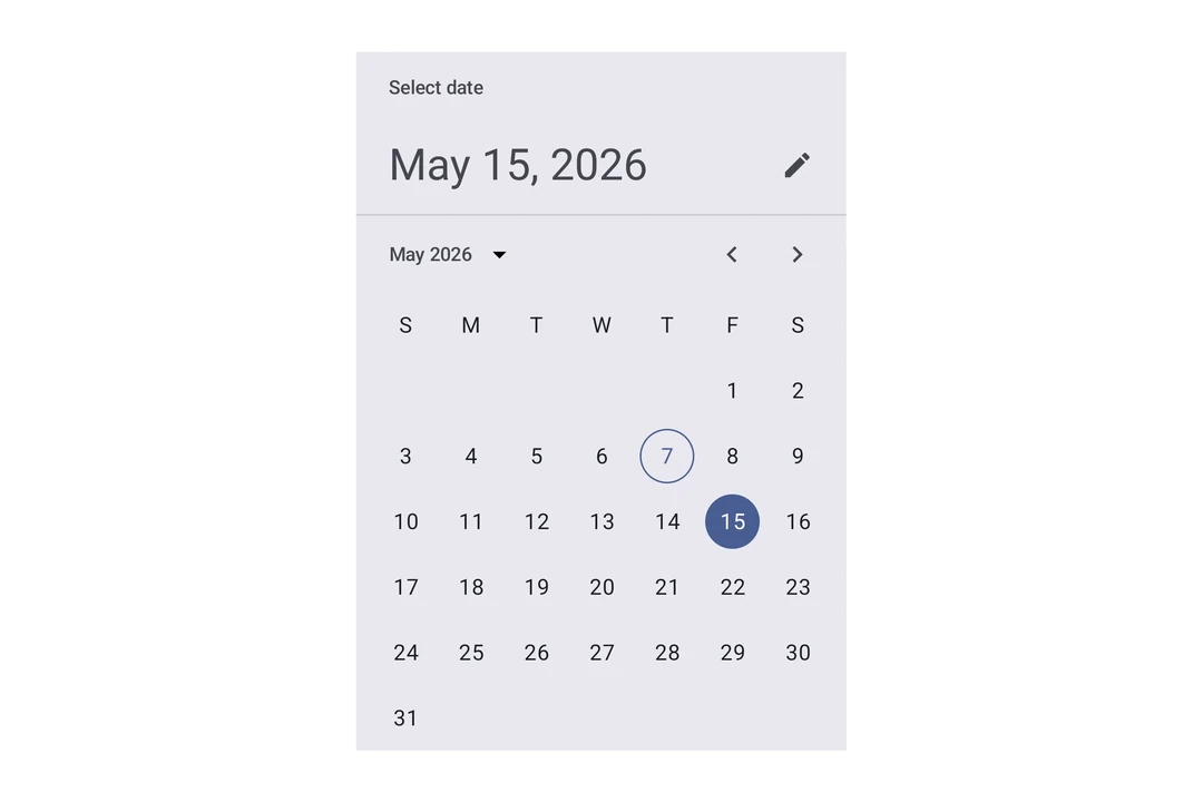
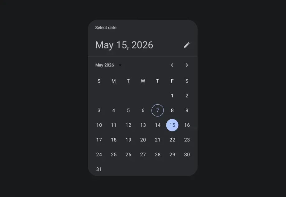
Jetpack Compose components for selecting dates, date ranges, and times.
Expo UI's date and time picker components match the official Jetpack Compose Date Picker, Date Range Picker, and Time Picker APIs.
Note: The date variants render Material's calendar grid and input field, both of which scroll horizontally internally. The parent
Hostmust provide a finite width on the horizontal axis, usematchContents={{ vertical: true }}together withstyle={{ width: '100%' }}(or any finite width). See Match contents in Host reference for details.
Note:
DateRangePickeralso scrolls vertically and fills the finite height provided by its parent. Place itsHostin a bounded layout, such as one usingflex: 1. Do not usematchContentson the vertical axis.
Installation
If you are installing this in an existing React Native app, make sure to install expo in your project.
Usage
Date picker
Time picker
Input variant
Use variant="input" to display the picker as a text input field instead of the default picker UI.
Without title and headline
Set showTitle={false} and showHeadline={false} to hide the "Select date" title and the selected-date headline. Use these props when the picker is in a screen or sheet that already has its own heading. The same props are available on DatePickerDialog, DateRangePicker, and DateRangePickerDialog. The following example also sets showVariantToggle={false} to hide the button that toggles between variants, so only the calendar shows.
Date range picker
The callback's end value is null until the user finishes selecting the range.
Date range picker dialog
API
import {
  DateRangePicker,
  DateRangePickerDialog,
  DateTimePicker,
} from '@expo/ui/jetpack-compose';
Components
Type: React.Element<DatePickerDialogProps>
ColorValueDatePickerElementColors & TimePickerElementColorsunionThe initially selected date. When omitted, the dialog opens on the current month with no selection and the confirm button stays disabled until a date is picked.
Acceptable values are: string | null
(date: Date) => voidboolean • Default: trueWhether the picker shows its headline, which displays the current selection. When false,
the picker passes null to Material 3's headline slot.
boolean • Default: trueWhether the picker shows its title, such as "Select date". When false, the picker passes
null to Material 3's title slot.
AndroidVariantType: React.Element<DateRangePickerProps>
Renders an inline Material 3 date range picker.
DatePickerElementColorsFine-grained color overrides for individual picker elements.
unionThe initially selected end date, as an ISO 8601 string. It must be on or after initialStartDate.
Acceptable values are: string | null
unionThe initially selected start date, as an ISO 8601 string.
Acceptable values are: string | null
(range: DateRangeSelection) => voidCalled once when the component mounts with the initial range, and again whenever the selected date range changes.
The end date is null while the user is selecting a range.
Constrains which dates can be selected. start is the earliest selectable date and end is
the latest.
boolean • Default: trueWhether the picker shows its headline, which displays the current selection. When false,
the picker passes null to Material 3's headline slot.
boolean • Default: trueWhether the picker shows its title, such as "Select date". When false, the picker passes
null to Material 3's title slot.
boolean • Default: trueShow a button to toggle between variants on Android.
AndroidVariant • Default: 'picker'The variant of the picker, which determines its appearance and behavior.
Type: React.Element<DateRangePickerDialogProps>
Renders a modal Material 3 date range picker.
ColorValueThe tint color to use on the picker elements and dialog buttons.
stringThe label for the button that confirms the selected range. Defaults to the system "Ok" string.
stringThe label for the button that dismisses the dialog. Defaults to the system "Cancel" string.
(range: DateRangeSelection) => voidCallback function that is called when the user confirms a complete date range.
() => voidCallback function that is called when the dialog is dismissed.
Inherited props
Omit<DateRangePickerProps, 'modifiers'>
Type: React.Element<DateTimePickerProps>
Renders an inline DateTimePicker component.
ColorValueThe tint color to use on the picker elements.
When elementColors is not provided, this color is applied to a subset of
picker elements (selected day, title, headline, today border for date picker;
selector, selected time segment, clock dial for time picker).
DisplayedComponents • Default: 'date'The components that the picker should display.
On Android, you can have a picker that selects just the date or just the time.
dateAndTime is only available on iOS and will result in a date picker on Android.
On iOS, you can have a picker that selects both date and time.
DatePickerElementColors & TimePickerElementColorsFine-grained color overrides for individual picker elements.
When provided, these take precedence over the color prop.
Date picker color keys are used when displayedComponents is 'date' or 'dateAndTime'.
Time picker color keys are used when displayedComponents is 'hourAndMinute'.
Unset values fall back to Material 3 theme defaults.
unionThe initial date to display on the picker.
Acceptable values are: string | null
boolean • Default: trueDetermines what format the clock should be displayed in on Android.
(date: Date) => voidCallback function that is called when a date is selected.
Constrains which dates can be selected. Mirrors the native Compose selectableDates parameter.
start is the earliest selectable date, end is the latest.
boolean • Default: trueWhether the picker shows its headline, which displays the current selection. When false,
the picker passes null to Material 3's headline slot. This prop has no effect when
displayedComponents is 'hourAndMinute'.
boolean • Default: trueWhether the picker shows its title, such as "Select date". When false, the picker passes
null to Material 3's title slot. This prop has no effect when displayedComponents is
'hourAndMinute'.
boolean • Default: trueShow a button to toggle between variants on Android.
AndroidVariant • Default: 'picker'The variant of the picker, which determines its appearance and behavior.
Type: React.Element<TimePickerDialogProps>
ColorValueDatePickerElementColors & TimePickerElementColors(date: Date) => voidTypes
Color overrides for the Material 3 DatePicker component. All properties are optional — unset values use Material 3 theme defaults.
Literal type: string
Acceptable values are: 'date' | 'hourAndMinute' | 'dateAndTime'