This documentation is available as Markdown for AI agents and LLMs. See the full Markdown index or append .md to any documentation URL.
SegmentedButton
Jetpack Compose Segmented Button components for single or multi-choice selection.
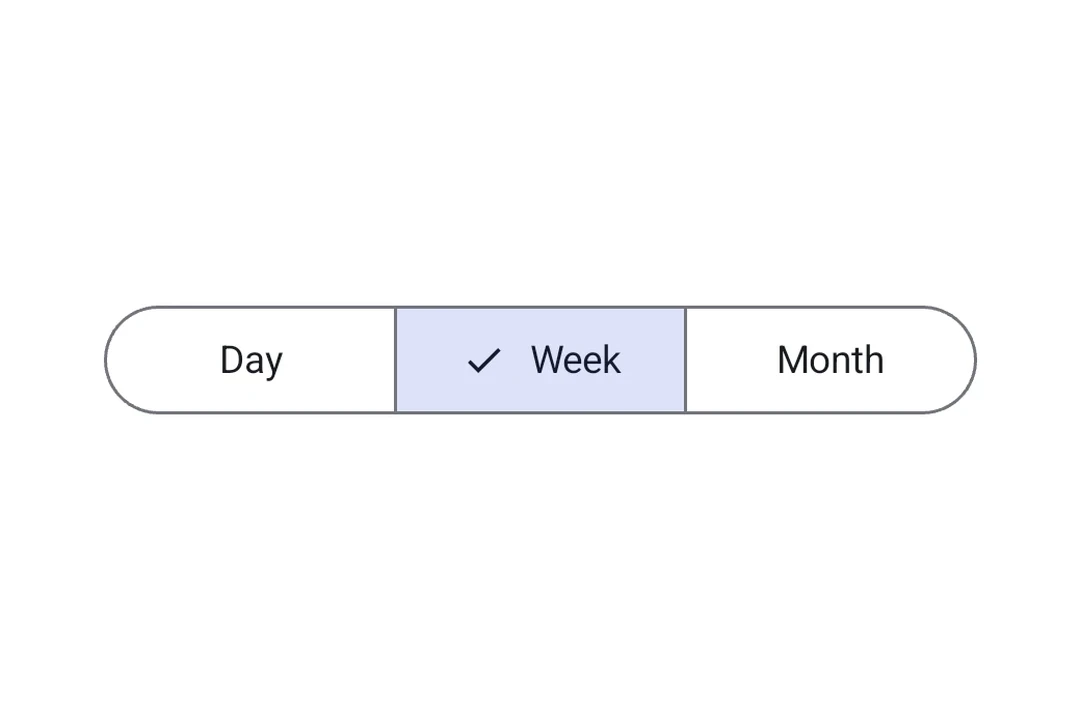
Segmented buttons let app users choose from a small set of options displayed side by side in a row. They map to the official Jetpack Compose Segmented Button API.
There are two container types:
SingleChoiceSegmentedButtonRow: only one button can be selected at a time (like radio buttons).MultiChoiceSegmentedButtonRow: multiple buttons can be toggled independently (like checkboxes).
Installation
- npx expo install @expo/uiIf you are installing this in an existing React Native app, make sure to install expo in your project.
Usage
Single-choice segmented button
Use SingleChoiceSegmentedButtonRow when only one option can be active at a time. Each SegmentedButton takes selected and onClick props.
import { useState } from 'react';
import {
  Host,
  SingleChoiceSegmentedButtonRow,
  SegmentedButton,
  Text,
} from '@expo/ui/jetpack-compose';

export default function SingleChoiceExample() {
  const [selectedIndex, setSelectedIndex] = useState(0);
  const options = ['Day', 'Week', 'Month', 'Year'];

  return (
    <Host matchContents>
      <SingleChoiceSegmentedButtonRow>
        {options.map((label, index) => (
          <SegmentedButton
            key={label}
            selected={index === selectedIndex}
            onClick={() => setSelectedIndex(index)}>
            <SegmentedButton.Label>
              <Text>{label}</Text>
            </SegmentedButton.Label>
          </SegmentedButton>
        ))}
      </SingleChoiceSegmentedButtonRow>
    </Host>
  );
}
Multi-choice segmented button
Use MultiChoiceSegmentedButtonRow when multiple options can be toggled independently. Each SegmentedButton takes checked and onCheckedChange props.
import { useState } from 'react';
import {
  Host,
  MultiChoiceSegmentedButtonRow,
  SegmentedButton,
  Text,
} from '@expo/ui/jetpack-compose';

export default function MultiChoiceExample() {
  const [checkedItems, setCheckedItems] = useState([false, false, false, false]);
  const options = ['Wi-Fi', 'Bluetooth', 'NFC', 'GPS'];

  return (
    <Host matchContents>
      <MultiChoiceSegmentedButtonRow>
        {options.map((label, index) => (
          <SegmentedButton
            key={label}
            checked={checkedItems[index]}
            onCheckedChange={checked => {
              setCheckedItems(prev => {
                const next = [...prev];
                next[index] = checked;
                return next;
              });
            }}>
            <SegmentedButton.Label>
              <Text>{label}</Text>
            </SegmentedButton.Label>
          </SegmentedButton>
        ))}
      </MultiChoiceSegmentedButtonRow>
    </Host>
  );
}
Custom colors
Use the colors prop on SegmentedButton to customize its appearance across active, inactive, and disabled states.
import { useState } from 'react';
import {
  Host,
  SingleChoiceSegmentedButtonRow,
  SegmentedButton,
  Text,
} from '@expo/ui/jetpack-compose';

export default function CustomColorsExample() {
  const [selectedIndex, setSelectedIndex] = useState(0);
  const options = ['$', '$$', '$$$', '$$$$'];

  return (
    <Host matchContents>
      <SingleChoiceSegmentedButtonRow>
        {options.map((label, index) => (
          <SegmentedButton
            key={label}
            selected={index === selectedIndex}
            onClick={() => setSelectedIndex(index)}
            colors={{
              activeContainerColor: '#6200EE',
              activeContentColor: '#FFFFFF',
            }}>
            <SegmentedButton.Label>
              <Text>{label}</Text>
            </SegmentedButton.Label>
          </SegmentedButton>
        ))}
      </SingleChoiceSegmentedButtonRow>
    </Host>
  );
}
API
import {
  SingleChoiceSegmentedButtonRow,
  MultiChoiceSegmentedButtonRow,
  SegmentedButton,
} from '@expo/ui/jetpack-compose';
Components
Type: React.Element<MultiChoiceSegmentedButtonRowProps>
A row container for multi-choice SegmentedButton children.
Maps to Material 3 MultiChoiceSegmentedButtonRow.
Type: React.Element<SegmentedButtonProps>
A Material 3 segmented button. Must be used inside a SingleChoiceSegmentedButtonRow
or MultiChoiceSegmentedButtonRow.
booleanWhether the button is currently checked (used inside MultiChoiceSegmentedButtonRow).
(checked: boolean) => voidCallback that is called when the checked state changes (used inside MultiChoiceSegmentedButtonRow).
() => voidCallback that is called when the button is clicked (used inside SingleChoiceSegmentedButtonRow).
Type: React.Element<SingleChoiceSegmentedButtonRowProps>
A row container for single-choice SegmentedButton children.
Maps to Material 3 SingleChoiceSegmentedButtonRow.
Types
Colors for the segmented button in different states.
| Property | Type | Description |
|---|---|---|
| activeBorderColor(optional) | ColorValue | - |
| activeContainerColor(optional) | ColorValue | - |
| activeContentColor(optional) | ColorValue | - |
| disabledActiveBorderColor(optional) | ColorValue | - |
| disabledActiveContainerColor(optional) | ColorValue | - |
| disabledActiveContentColor(optional) | ColorValue | - |
| disabledInactiveBorderColor(optional) | ColorValue | - |
| disabledInactiveContainerColor(optional) | ColorValue | - |
| disabledInactiveContentColor(optional) | ColorValue | - |
| inactiveBorderColor(optional) | ColorValue | - |
| inactiveContainerColor(optional) | ColorValue | - |
| inactiveContentColor(optional) | ColorValue | - |