This documentation is available as Markdown for AI agents and LLMs. See the full Markdown index or append .md to any documentation URL.
HorizontalPager
A Jetpack Compose HorizontalPager component for swipeable pages.
Expo UI HorizontalPager matches Jetpack Compose's HorizontalPager — a horizontally scrolling pager that snaps to individual pages.
HorizontalPager does not impose its own height — give it one with the height modifier or place it inside a parent with a finite height.
Installation
- npx expo install @expo/uiIf you are installing this in an existing React Native app, make sure to install expo in your project.
Usage
Uncontrolled
The pager owns its scroll position natively. Use initialPage to pick the starting page, and listen for changes with onCurrentPageChange (fires mid-swipe as the snap target flips) or onSettledPageChange (fires only after the swipe settles).
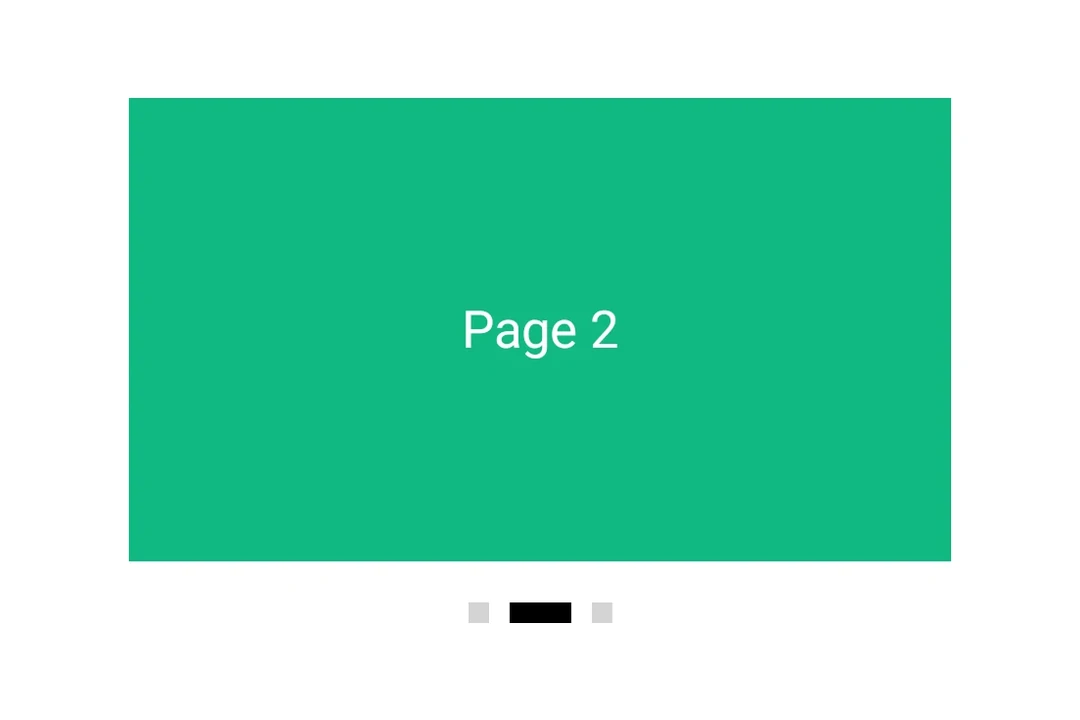
import { Box, Column, Host, HorizontalPager, Text } from '@expo/ui/jetpack-compose';
import { background, fillMaxSize, fillMaxWidth, height } from '@expo/ui/jetpack-compose/modifiers';
import { useState } from 'react';

export default function UncontrolledPagerExample() {
  const [currentPage, setCurrentPage] = useState(1);
  const [settledPage, setSettledPage] = useState(1);

  return (
    <Host matchContents={{ vertical: true }} style={{ width: '100%' }}>
      <Column verticalArrangement={{ spacedBy: 12 }} modifiers={[fillMaxWidth()]}>
        <Text style={{ typography: 'titleLarge' }}>
          currentPage: {currentPage} · settledPage: {settledPage}
        </Text>
        <HorizontalPager
          initialPage={1}
          onCurrentPageChange={setCurrentPage}
          onSettledPageChange={setSettledPage}
          modifiers={[fillMaxWidth(), height(240)]}>
          <Page label="Page 1" color="#6200EE" />
          <Page label="Page 2" color="#03DAC5" />
          <Page label="Page 3" color="#FF5722" />
        </HorizontalPager>
      </Column>
    </Host>
  );
}

function Page({ label, color }: { label: string; color: string }) {
  return (
    <Box modifiers={[fillMaxSize(), background(color)]} contentAlignment="center">
      <Text color="#FFFFFF" style={{ typography: 'headlineLarge' }}>
        {label}
      </Text>
    </Box>
  );
}
Programmatic navigation
Attach a ref and call animateScrollToPage or scrollToPage on it. These mirror Compose's PagerState.animateScrollToPage and PagerState.scrollToPage.
import {
  Box,
  Button,
  Column,
  Host,
  HorizontalPager,
  type HorizontalPagerHandle,
  Row,
  Text,
} from '@expo/ui/jetpack-compose';
import { background, fillMaxSize, fillMaxWidth, height } from '@expo/ui/jetpack-compose/modifiers';
import { useRef, useState } from 'react';

const PAGE_COUNT = 5;

export default function ProgrammaticPagerExample() {
  const pagerRef = useRef<HorizontalPagerHandle>(null);
  const [page, setPage] = useState(0);

  return (
    <Host matchContents={{ vertical: true }} style={{ width: '100%' }}>
      <Column verticalArrangement={{ spacedBy: 12 }} modifiers={[fillMaxWidth()]}>
        <Text style={{ typography: 'titleLarge' }}>
          Page {page + 1} / {PAGE_COUNT}
        </Text>
        <HorizontalPager
          ref={pagerRef}
          onSettledPageChange={setPage}
          modifiers={[fillMaxWidth(), height(200)]}>
          {Array.from({ length: PAGE_COUNT }).map((_, i) => (
            <Page key={i} label={`Page ${i + 1}`} color={COLORS[i]} />
          ))}
        </HorizontalPager>
        <Row horizontalArrangement={{ spacedBy: 8 }}>
          <Button onClick={() => pagerRef.current?.animateScrollToPage(Math.max(0, page - 1))}>
            <Text>Prev</Text>
          </Button>
          <Button
            onClick={() =>
              pagerRef.current?.animateScrollToPage(Math.min(PAGE_COUNT - 1, page + 1))
            }>
            <Text>Next</Text>
          </Button>
          <Button onClick={() => pagerRef.current?.scrollToPage(0)}>
            <Text>Jump to first</Text>
          </Button>
        </Row>
      </Column>
    </Host>
  );
}

const COLORS = ['#6200EE', '#03DAC5', '#FF5722', '#4CAF50', '#2196F3'];

function Page({ label, color }: { label: string; color: string }) {
  return (
    <Box modifiers={[fillMaxSize(), background(color)]} contentAlignment="center">
      <Text color="#FFFFFF" style={{ typography: 'headlineLarge' }}>
        {label}
      </Text>
    </Box>
  );
}
Page spacing and content padding
Use pageSpacing to add a gap between pages (visible during swipe) and contentPadding to inset the pager so neighboring pages peek at rest.
import { Box, Host, HorizontalPager, Text } from '@expo/ui/jetpack-compose';
import { background, fillMaxSize, fillMaxWidth, height } from '@expo/ui/jetpack-compose/modifiers';

export default function PagerLayoutExample() {
  return (
    <Host matchContents={{ vertical: true }} style={{ width: '100%' }}>
      <HorizontalPager
        pageSpacing={12}
        contentPadding={{ start: 32, end: 32 }}
        modifiers={[fillMaxWidth(), height(180)]}>
        <Page label="Page 1" color="#6200EE" />
        <Page label="Page 2" color="#03DAC5" />
        <Page label="Page 3" color="#FF5722" />
      </HorizontalPager>
    </Host>
  );
}

function Page({ label, color }: { label: string; color: string }) {
  return (
    <Box modifiers={[fillMaxSize(), background(color)]} contentAlignment="center">
      <Text color="#FFFFFF" style={{ typography: 'headlineLarge' }}>
        {label}
      </Text>
    </Box>
  );
}
API
import { HorizontalPager } from '@expo/ui/jetpack-compose';
Component
Type: React.Element<HorizontalPagerProps>
A horizontally scrolling pager that snaps to individual pages,
matching Compose's HorizontalPager.
number • Default: 0Number of pages to compose and keep beyond the visible viewport.
union • Default: 0Padding for pager content (dp or per-side object).
Acceptable values are: number | PaddingValuesRecord
number • Default: 0Page to mount on. Mirrors rememberPagerState(initialPage = …). Subsequent
changes have no effect — use the ref methods to navigate after mount.
(page: number) => voidFires when Compose's PagerState.currentPage changes — i.e. when the page
closest to the snap position flips, including mid-swipe as the user
crosses between pages.
(page: number) => voidFires when Compose's PagerState.settledPage changes — i.e. after a
swipe or programmatic scroll has fully settled.
Ref<HorizontalPagerHandle>Imperative handle for programmatic navigation. Mirrors the methods on
Compose's PagerState.
boolean • Default: falseWhether to reverse the layout direction.