This documentation is available as Markdown for AI agents and LLMs. See the full Markdown index or append .md to any documentation URL.
Navigation layouts in Expo Router
Edit page
Learn how to construct different relationships between pages by using directories and layout files.
What are layout files, how to navigate between screens, and block access using redirects.
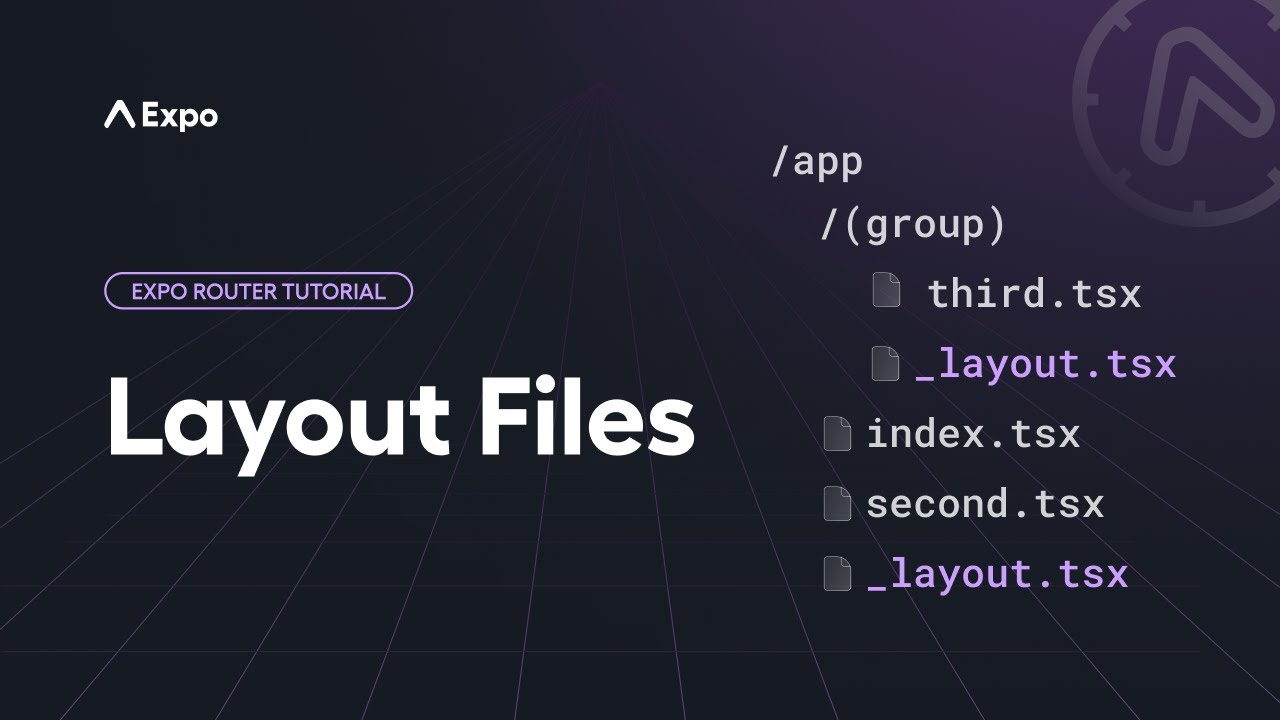
Each directory within the src/app directory (including src/app itself) can define a layout in the form of a _layout.tsx file inside that directory. This file defines how all the pages within that directory are arranged. This is where you would define a stack navigator, tab navigator, drawer navigator, or any other layout that you want to use for the pages in that directory. The layout file exports a default component that is rendered before whatever page you are navigating to within that directory.
Let's look at a few common layout scenarios.
Root layout
Virtually every app will have a _layout.tsx file directly inside the src/app directory. This is the root layout and represents the entry point for your navigation. In addition to describing the top-level navigator for your app, this file is where you would put initialization code that may have previously gone inside an App.jsx file, such as loading fonts, interacting with the splash screen, or adding context providers.
Here's an example root layout:
import { useFonts } from 'expo-font';
import { Stack } from 'expo-router';
import * as SplashScreen from 'expo-splash-screen';
import { useEffect } from 'react';

SplashScreen.preventAutoHideAsync();

export default function RootLayout() {
  const [loaded] = useFonts({
    SpaceMono: require('@/assets/fonts/SpaceMono-Regular.ttf'),
  });

  useEffect(() => {
    if (loaded) {
      SplashScreen.hide();
    }
  }, [loaded]);

  if (!loaded) {
    return null;
  }

  return <Stack />;
}
The above example shows the splash screen initially and then renders a stack navigator once the fonts are loaded, which will cause your app to proceed to the initial route.
Stacks
You can implement a stack navigator in your root layout, as shown above, or in any other layout file inside a directory. Let's suppose you have a file structure with a stack inside of a directory:
srcappproducts_layout.tsxindex.tsx[productId].tsxaccessoriesindex.tsxIf you want everything inside the src/app/products directory to be arranged in a stack relationship, inside the _layout.tsx file, return a Stack component:
import { Stack } from 'expo-router';

export default function StackLayout() {
  return <Stack />;
}
When you navigate to /products, it will first go to the default route, which is products/index.tsx. If you navigate to /products/123, then that page will be pushed onto the stack. By default, the stack will render a back button in the header that will pop the current page off the stack, returning the user to the previous page. Even when a page isn't visible, if it is still pushed onto the stack, it is still being rendered.
The Stack component implements React Navigation's native stack and can use the same screen options. However, you do not have to define the pages specifically inside the navigator. The files inside the directory will be automatically treated as eligible routes in the stack. However, if you want to define screen options, you can add a Stack.Screen component inside the Stack component. The name prop should match the route name, but you do not need to supply a component prop; Expo Router will map this automatically:
import { Stack } from 'expo-router';

export default function StackLayout() {
  return (
    <Stack>
      <Stack.Screen name="[productId]" options={{ headerShown: false }} />
    </Stack>
  );
}
While it is possible to nest navigators, be sure to only do so when it is truly needed. In the above example, if you want to push products/accessories/index.tsx onto the stack, it's not necessary to have an additional _layout.tsx in the accessories directory with a Stack navigator. That would define another stack inside the first one. It is fine to add directories that only affect the URL, otherwise, use the same navigator as the parent directory.
Tabs
Expo Router provides multiple ways to implement tab navigation depending on your needs.
JavaScript tabs
You can implement a JavaScript-based tab navigator in a layout file using the Tabs component. All the routes directly inside that directory will be treated as tabs. Consider the following file structure:
srcapp(tabs)_layout.tsxindex.tsxfeed.tsxprofile.tsxIn the _layout.tsx file, return a Tabs component:
import { Tabs } from 'expo-router';
import MaterialIcons from '@expo/vector-icons/MaterialIcons';

export default function TabLayout() {
  return (
    <Tabs>
      <Tabs.Screen
        name="index"
        options={{
          title: 'Home',
          tabBarIcon: ({ color }) => <MaterialIcons size={28} name="house.fill" color={color} />,
        }}
      />
      <Tabs.Screen name="feed" options={{ title: 'Feed' }} />
      <Tabs.Screen name="profile" options={{ title: 'Profile' }} />
    </Tabs>
  );
}
This will cause the index.tsx, feed.tsx, and profile.tsx files to appear together in the same bottom tabs navigator. This Tabs component uses React Navigation's native bottom tabs and supports the same options.
In the case of Tabs, you will likely want to define the tabs in the navigator, as this influences the order in which tabs appear, the title, and the icon inside the tab. The index route will be the default selected tab.
Native tabs
On Android and iOS, you can use native tabs to render the platform's built-in tab bar. Native tabs provide expected platform behaviors like scroll-to-top on tap, native animations, and a native look and feel.
Like JavaScript tabs, native tabs can be used in a layout file inside a route group directory:
srcapp(tabs)_layout.tsxindex.tsxfeed.tsxprofile.tsximport { NativeTabs } from 'expo-router/unstable-native-tabs'; export default function TabLayout() { return ( <NativeTabs> <NativeTabs.Trigger name="index"> <NativeTabs.Trigger.Label>Home</NativeTabs.Trigger.Label> <NativeTabs.Trigger.Icon src={require('@/assets/images/tabIcons/home.png')} /> </NativeTabs.Trigger> <NativeTabs.Trigger name="feed"> <NativeTabs.Trigger.Label>Feed</NativeTabs.Trigger.Label> <NativeTabs.Trigger.Icon src={require('@/assets/images/tabIcons/feed.png')} /> </NativeTabs.Trigger> <NativeTabs.Trigger name="profile"> <NativeTabs.Trigger.Label>Profile</NativeTabs.Trigger.Label> <NativeTabs.Trigger.Icon src={require('@/assets/images/tabIcons/profile.png')} /> </NativeTabs.Trigger> </NativeTabs> ); }
Platform-specific tabs
Since native tabs are only available on Android and iOS, a common pattern is to use platform-specific file extensions to provide different tab implementations for native and web. The root layout renders a tab component, and Expo's module resolution automatically picks the correct file based on the platform.
srcapp_layout.tsxindex.tsxexplore.tsxcomponentsapp-tabs.native.tsxNative tabs (Android and iOS)app-tabs.tsxCustom tabs (web)The root layout imports and renders the AppTabs component. app-tabs.native.tsx is used on Android and iOS, and app-tabs.tsx on web:
import AppTabs from '@/components/app-tabs';

export default function RootLayout() {
  return <AppTabs />;
}
On Android and iOS, app-tabs.native.tsx uses native tabs:
import { NativeTabs } from 'expo-router/native-tabs';

export default function AppTabs() {
  return (
    <NativeTabs>
      <NativeTabs.Trigger name="index">
        <NativeTabs.Trigger.Label>Home</NativeTabs.Trigger.Label>
        <NativeTabs.Trigger.Icon src={require('@/assets/images/tabIcons/home.png')} />
      </NativeTabs.Trigger>
      <NativeTabs.Trigger name="explore">
        <NativeTabs.Trigger.Label>Explore</NativeTabs.Trigger.Label>
        <NativeTabs.Trigger.Icon src={require('@/assets/images/tabIcons/explore.png')} />
      </NativeTabs.Trigger>
    </NativeTabs>
  );
}
On web, app-tabs.tsx uses custom tabs from expo-router/ui, which are unstyled and flexible components:
import { Tabs, TabList, TabTrigger, TabSlot } from 'expo-router/ui';

export default function AppTabs() {
  return (
    <Tabs>
      <TabSlot />
      <TabList>
        <TabTrigger name="index" href="/">
          Home
        </TabTrigger>
        <TabTrigger name="explore" href="/explore">
          Explore
        </TabTrigger>
      </TabList>
    </Tabs>
  );
}
Slot
In some cases, you may want a layout without a navigator. This is helpful for adding a header or footer around the current route, or for displaying a modal over any route inside a directory. In this case, you can use the Slot component, which serves as a placeholder for the current child route.
Consider the following file structure:
srcappsocial_layout.tsxindex.tsxfeed.tsxprofile.tsxFor example, you may want to wrap any route inside the social directory with a header and footer, but you want navigating between the pages to simply replace the current page rather than pushing new pages onto a stack, which can then later be popped off with a "back" navigation action. In the _layout.tsx file, return a Slot component surrounded by your header and footer:
import { Slot } from 'expo-router';

export default function Layout() {
  return (
    <>
      <Header />
      <Slot />
      <Footer />
    </>
  );
}
Other layouts
These are just a few examples of common layouts to give you an idea of how it works. There's much more you can do with layout:
- Implement a Drawer navigator
- Use native tabs for a platform-native tab bar on Android and iOS
- Replace the default tabs with fully customized tabs
- Use a modal to display a page with transparency, such that the parent navigator is still visible underneath
- Adapt any navigator that is compatible with React Navigation, including top tabs, bottom sheets, and more