Splash screen and app icon
Edit page
Learn how to add a splash screen and app icon to your Expo project.
A splash screen and an app icon are fundamental elements of a mobile app. They play an important role in the user experience and branding of the app. This guide provides steps on how to create and add them to your app.
See a detailed walkthrough on how to create an app icon and splash screen for an Expo project.
Splash screen
A splash screen, also known as a launch screen, is the first screen a user sees when they open your app. It stays visible while the app is loading. You can also control the behavior of when a splash screen disappears by using the native SplashScreen API.
The expo-splash-screen has a built-in config plugin that lets you configure properties such as the splash icon and background color.
Do not use Expo Go or a development build to test your splash screen. Expo Go renders your app icon while the splash screen is visible, which can interfere with testing. Development builds includeexpo-dev-client, which has its own splash screen and may cause conflicts. Instead, use a preview build or a production build.
1
Create a splash screen icon
To create a splash screen icon, you can use this Figma template. It provides a bare minimum design for an icon and splash images for Android and iOS.
Recommended:
- Use a 1024x1024 image.
- Use a .png file.
- Use a transparent background.
2
Export the splash icon as a .png
After creating a splash screen icon, export it as a .png and save it in the assets/images directory. By default, Expo uses splash-icon.png as the file name. If you decide to change the name of your splash screen file, make sure to use that in the next step.
Note: Currently, only .png images are supported to use as a splash screen icon in an Expo project. If you use another image format, making a production build of your app will fail.
3
Configure the splash screen icon
Open the app config file, and under plugins, set the following properties:
{
  "expo": {
    "plugins": [
      [
        "expo-splash-screen",
        {
          "backgroundColor": "#232323",
          "image": "./assets/images/splash-icon.png",
          "dark": {
            "image": "./assets/images/splash-icon-dark.png",
            "backgroundColor": "#000000"
          },
          "imageWidth": 200
        }
      ]
    ]
  }
}
To test your new splash screen, build your app for internal distribution or for production, see guides on Android and iOS.
Learn about the configurable properties of the SplashScreen API.
Configuring expo-splash-screen properties separately for Android and iOS
expo-splash-screen also supports android and ios properties for configuring the splash screen for a specific platform. See the following example:
{
  "expo": {
    "plugins": [
      [
        "expo-splash-screen",
        {
          "ios": {
            "backgroundColor": "#ffffff",
            "image": "./assets/images/splash-icon.png",
            "resizeMode": "cover"
          },
          "android": {
            "backgroundColor": "#0c7cff",
            "image": "./assets/images/splash-android-icon.png",
            "imageWidth": 150
          }
        }
      ]
    ]
  }
}
Not using prebuild?
If your app does not use Expo Prebuild (formerly the managed workflow) to generate the native android and ios directories, then changes in the app config will have no effect. For more information, see how you can customize the configuration manually.
Troubleshooting: New splash screen not appearing on iOS
For SDK 52 and earlier, in iOS development builds, launch screens can sometimes remain cached between builds, making it harder to test new images. Apple recommends clearing the derived data directory before rebuilding, this can be done with Expo CLI by running:
- npx expo run:ios --no-build-cacheSee Apple's guide on testing launch screens for more information.
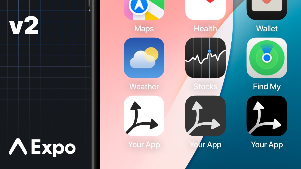
App icon
An app's icon is what your app users see on their device's home screen and app stores. Android and iOS have different and strict requirements.
1
Create an app icon
To create an app icon, you can use this Figma template. It provides a bare minimum design for an icon and splash images for Android and iOS.
2
3
Add the icon in app config
Open the app config and add the local path as the value of icon property to point it to your new app icon:
{
  "icon": "./assets/images/icon.png"
}
Custom configuration tips for Android and iOS
Android
Further customization of the Android icon is possible using the android.adaptiveIcon property, which will override both of the previously mentioned settings.
The Android Adaptive Icon is formed from two separate layers — a foreground image and a background color or image. This allows the OS to mask the icon into different shapes and also supports visual effects. For Android 13 and later, the OS supports a themed app icon that uses a wallpaper and theme to determine the color set by the device's theme.
The design you provide should follow the Android Adaptive Icon Guidelines for launcher icons. You should also:
- Use .png files.
- Use the
android.adaptiveIcon.foregroundImageproperty to specify the path to your foreground image. - Use the
android.adaptiveIcon.monochromeImageproperty to specify the path to your monochrome image. - The default background color is white; to specify a different background color, use the
android.adaptiveIcon.backgroundColorproperty. You can instead specify a background image using theandroid.adaptiveIcon.backgroundImageproperty. Make sure that it has the same dimensions as your foreground image.
You may also want to provide a separate icon for older Android devices that do not support Adaptive Icons. You can do so with the android.icon property. This single icon would be a combination of your foreground and background layers.
See Apple best practices to ensure your icon looks professional, such as testing your icon on different wallpapers and avoiding text beside your product's wordmark. Provide an icon that's at least 512x512 pixels.
iOS

Learn how to use the new Icon Composer to create app icons for an Expo project.
For iOS, your app's icon should follow the Apple Human Interface Guidelines. You can use the Icon Composer app to create your app icon. This will output a .icon directory that you can add to your project's assets directory. You can then provide the path to this directory in your app config. Adding support for dark mode is handled in Icon Composer, so you do not need to provide variants when using this approach.
Note: Providing an Icon Composer .icon directory viaios.iconis supported in SDK 54 and later.
{
  "expo": {
    "ios": {
      "icon": "./assets/app.icon"
    }
  }
}
Alternatively, the previous approach of providing an image is still supported. You should:
- Use a .png file.
- 1024x1024 is a good size. If you have an Expo project created using
npx create-expo-app, EAS Build will generate the other sizes for you. In case of a bare React Native project, generate the icons on your own. The largest size EAS Build generates is 1024x1024. - The icon must be exactly square. For example, a 1023x1024 icon is not valid.
- Make sure the icon fills the whole square, with no rounded corners or other transparent pixels. The operating system will mask your icon when appropriate.
- Use
ios.iconto specify different icons for various system appearances (for example, dark and tinted) can be provided. If specified, this overrides the top-level icon key in the app config file. See the example below:
{
  "expo": {
    "ios": {
      "icon": {
        "dark": "./assets/images/ios-dark.png",
        "light": "./assets/images/ios-light.png",
        "tinted": "./assets/images/ios-tinted.png"
      }
    }
  }
}